
Our DIY Editor, Nicholas Rosaci shares a great decorating experience – and a Chic Opportunity to Win a $10,000 Sears Gift Certificate!
THE CONTEST
As a designer, there is nothing more exciting than seeing your work on Television or Youtube – it’s an awesome tingle in your fingers to your toes kind of feeling and I wanted to share it with everybody!
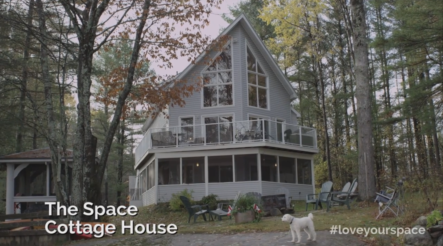
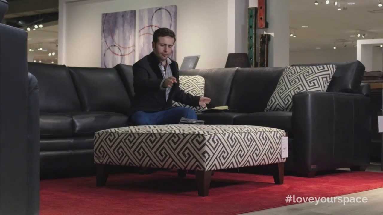
This past fall I was asked to take part in a Sears commercial / project called “Love Your Space” – airing now on the Cottage Life Network until January 12th, 2014. I was one of 5 designers given the challenge to “redesign” one of 5 tired uninspired spaces to drool worthy effect using $10,000 of furnishings from Sears Home! This was a dream opportunity to create something completely out of joy – and going on a $10,000 dollar shopping spree is pure joy!
Now pay attention everyone – Sears is giving one lucky viewer $10,000 in Sears Gift Certificate to create their own “room to love”. To enter the draw, VOTE FOR MY SPACE HERE.

To view videos of my space visit Love Your Space.
To enter the draw, VOTE FOR MY SPACE HERE.
THE MISSION

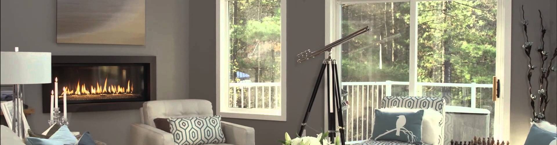
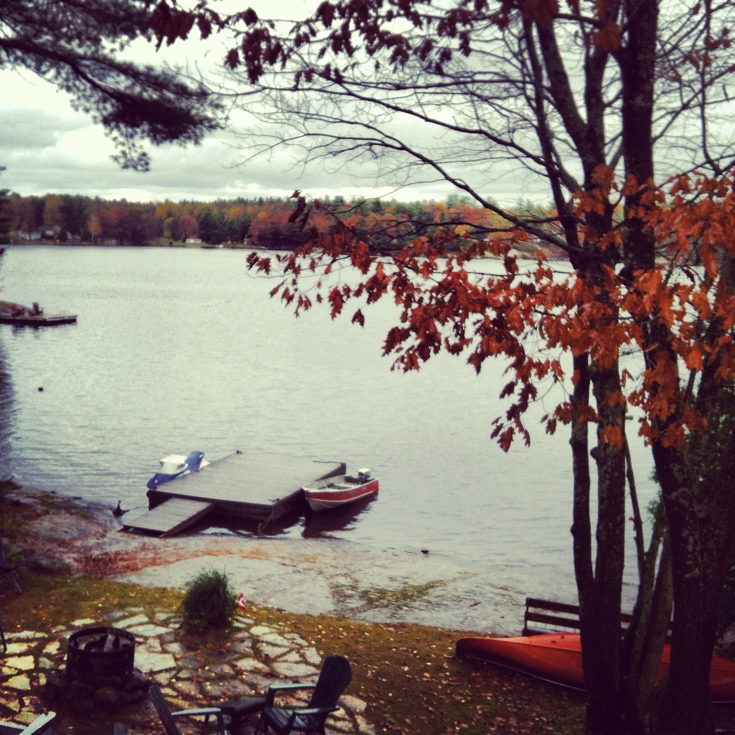
My mission was to turn a boring but soaring cottage space with floor to ceiling windows and an unusual angular floor plan into something balanced and reflective of today’s “Chic Canuck” cottage lifestyle – a versatile retreat for relaxing and entertaining friends, where cottage comfort rules without sacrificing style and elegance.

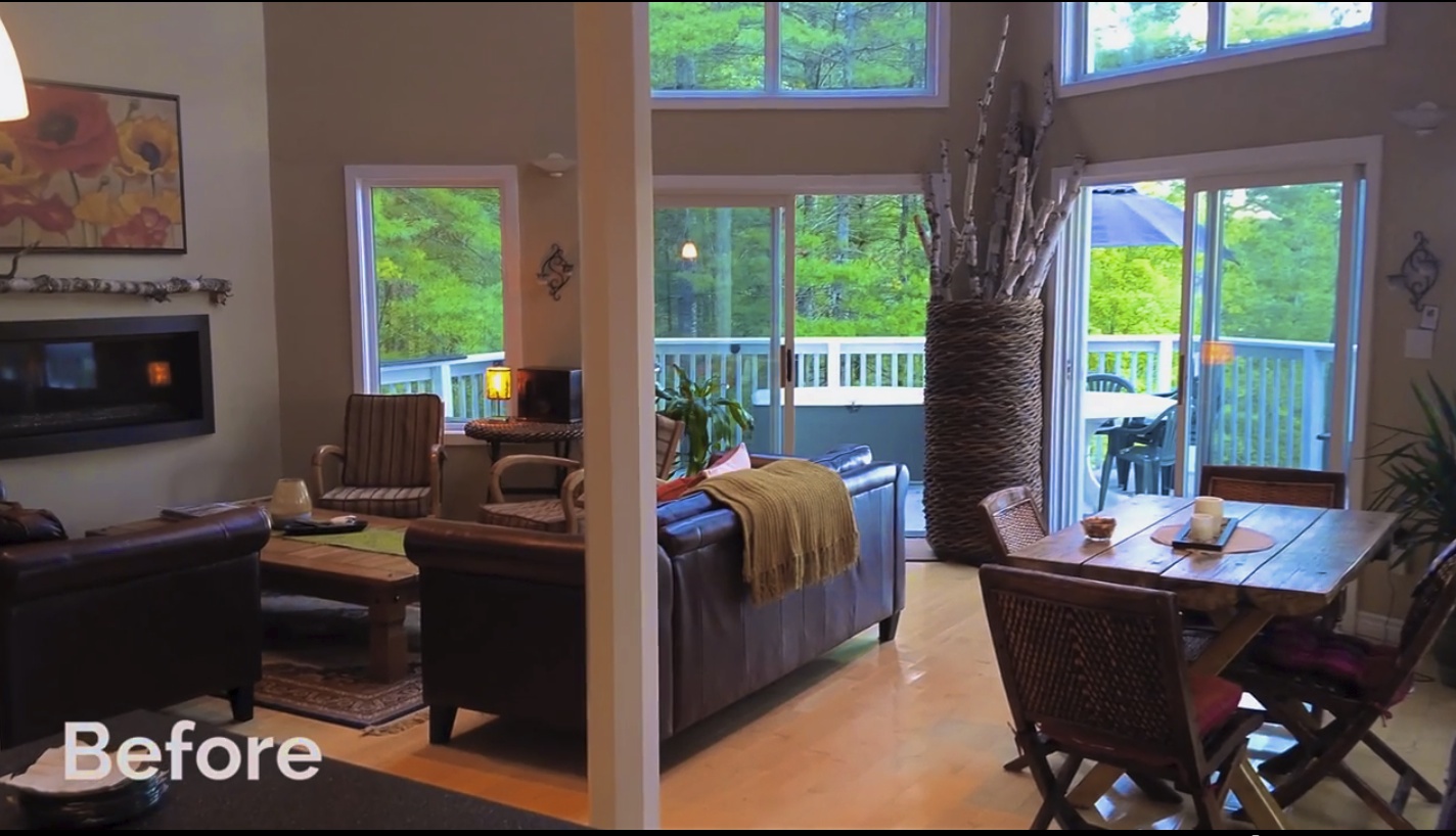
I was given only photos of the space I was to redesign: A grand cottage space with lots of natural light and dramatic windows with a view that was right out of a “Group of Seven” painting. Unfortunately, this great room was also coupled with icky beige walls, light golden coloured hardwood floors, a difficult angular floor plan, an unbalanced furniture placement, and last but not least minimal walls and multiple focal points. The space could be heavenly but it certainly was “in the rough”.
THE ORDER OF DECORATING
When I begin a project, I usually start by getting to know the client. I’m designing for pleasure: the absolute of what a home should be! Often the best designed rooms are ones that invite your own blend of warmth, style, and creativity to take center stage. Comfort, small luxuries, furnishings and accessories that speak to the clients’ unique needs, function, personality and style are all tailored keeping in mind the inherent personality, size and architecture of the home and it’s surroundings. Measurements are taken and detailed floor, furniture, lighting, and electrical plans are created amongst many other design considerations before construction even begins.

For this project, I had about 3 hours to select everything all at once and only based on rough “before” photographs of the space while the crew filmed the selection process at the same time! To view Sears’ extensive sofa fabric could have taken 3 hours alone. I think that’s why in the video when I take a seat in the Marano sofa I looked so pleased. I really pulled something quite original together very quickly in a very untraditional way of working!
TIP: Selecting furnishings, fabrics and accessories takes time – a lot of time! Take time to explore your selections – don’t shop it all in one day.
KEEP IT MOVING
The make-up artist touched me up a few times because I was really sweating from moving furniture and lamps from one part of the Sears store to the other. Let me tell you, nothing burns more calories like carrying a slipper chair across a showroom. You would think a slipper chair would be light as a feather – but not if it’s quality.
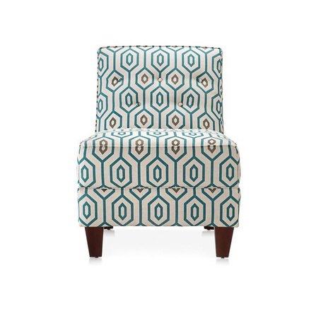
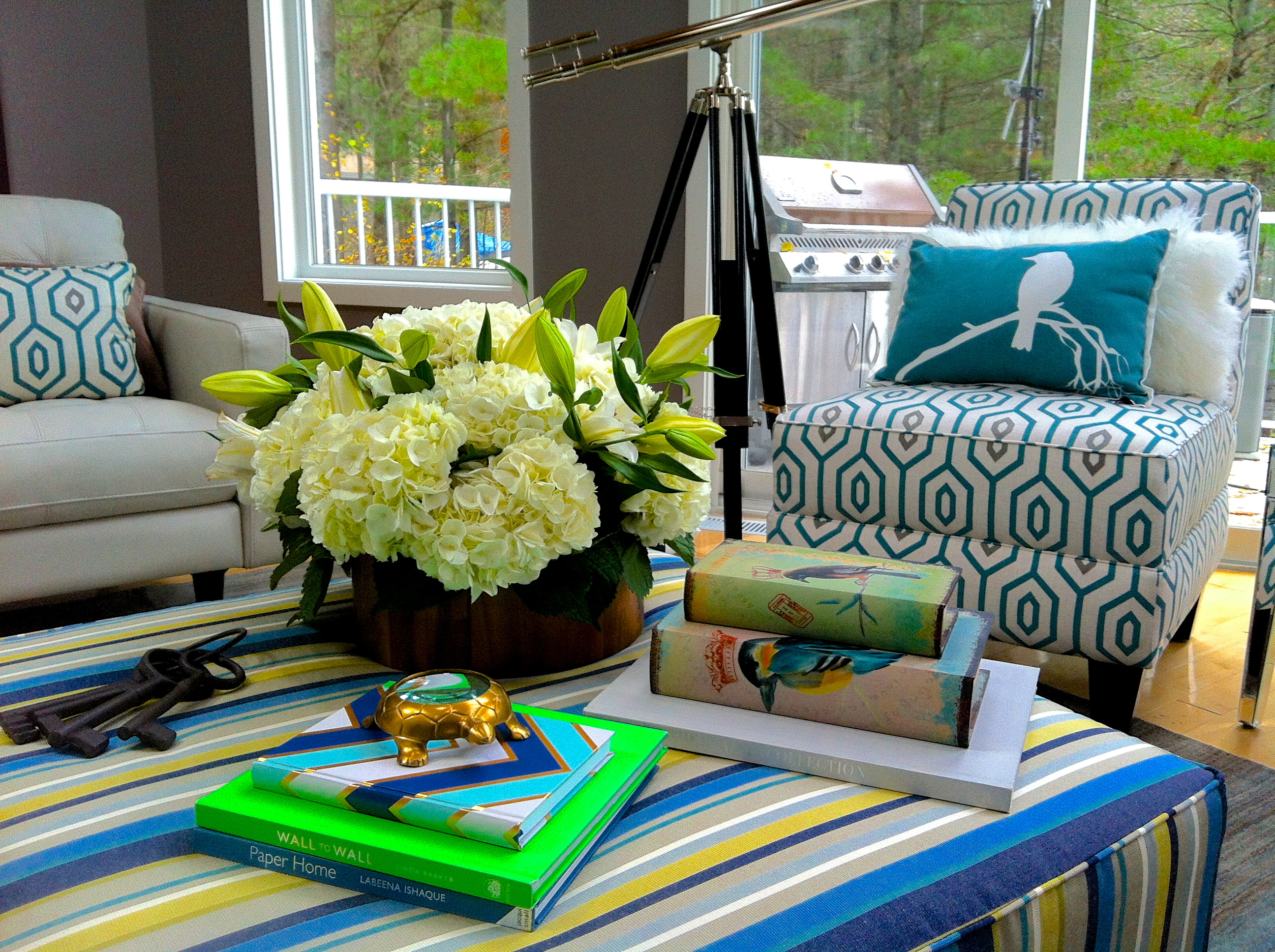
The Sears slipper chairs I selected are called the Tandem Occasional chairs. I love slipper chairs because they always look current and being armless, they are great for perching on each side at a party. Placed in front of the window they look light and airy – keeping the view of the lake in the space unobstructed! I also selected an ample sized teal geometric print fabric that pulls teal up from the ombre carpet into the room. I love that teal is making a comeback – the trick is to mix it in with other blues for a mixed water-colour effect!
TIP: I always encourage my clients to shop “like you’re the designer” and trust your instincts. Dress up – perhaps in faux fur – helps with creating realism. Bring a friend, take a selfie or two along with pictures of your fave pieces and jot down notes of what items make you feel great – along with the measurements.
Play with items in the store and try out everything! Don’t be shy when shopping and ask to move the furniture and accessories around to create a small vignette – this will help you envision the space and it’s a great way to get in shape for the holidays!
COLOUR – GREY NEUTRAL ON TREND
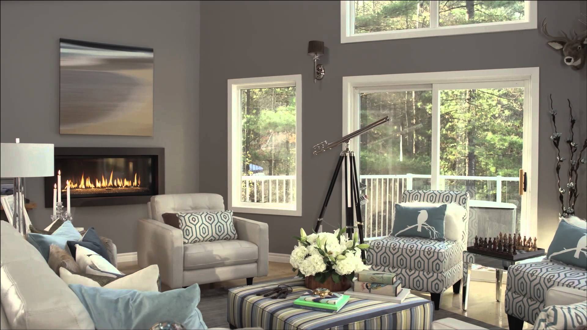
There is something very special about a space when the colours are all in harmony. The space feels neater, cleaner and more pulled together. On this project when you see your entire living space in one sweep of the eye, having the right impactful colours that work is key. I derived my colour scheme from the Ombre area rug – a blended watercolour of grey, green and teal which echoed the beautiful natural vista when looking outside.
I started by painting the cottage something more dramatic to contrast the floors and draw the eye up to really make the architectural vaulted ceilings and large window elements pop!
The room was painted in Benjamin Moore Soho Loft CSP- 10 in a matte / flat finish. Soho Loft is perhaps my all time favourite grey. Soho Loft is warm and rich, but not overly pretentious and adapts so beautifully with a variety of other colours, looking especially elegant with creams and whites. The baseboards and trim were repainted in Benjamin Moore Oxford White – CC30 in semi gloss to accent.
FOCAL POINTS – NOT 1 BUT 2!
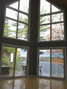
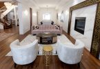
I always look at a space with an open eye and mind because picking the right focal point is crucial to create a balanced and well-designed room. The main focal point of any space is typically the first most interesting element that draws your eye and attention: this can be an architectural element like an impressive built-in, a grand fireplace, an accent colour wall, or spectacular bay window. I had 2 strong focal points to work with: the fireplace and the windows facing a stunning lakeview.
Not surprising, the homeowner made the fireplace at the far side of the room the main focal point (as most people often automatically do) – pulling everything towards it to the point where the furniture was blocking doors, limiting the flow of traffic, and leaving other areas in the room feeling forgotten and off-balance.
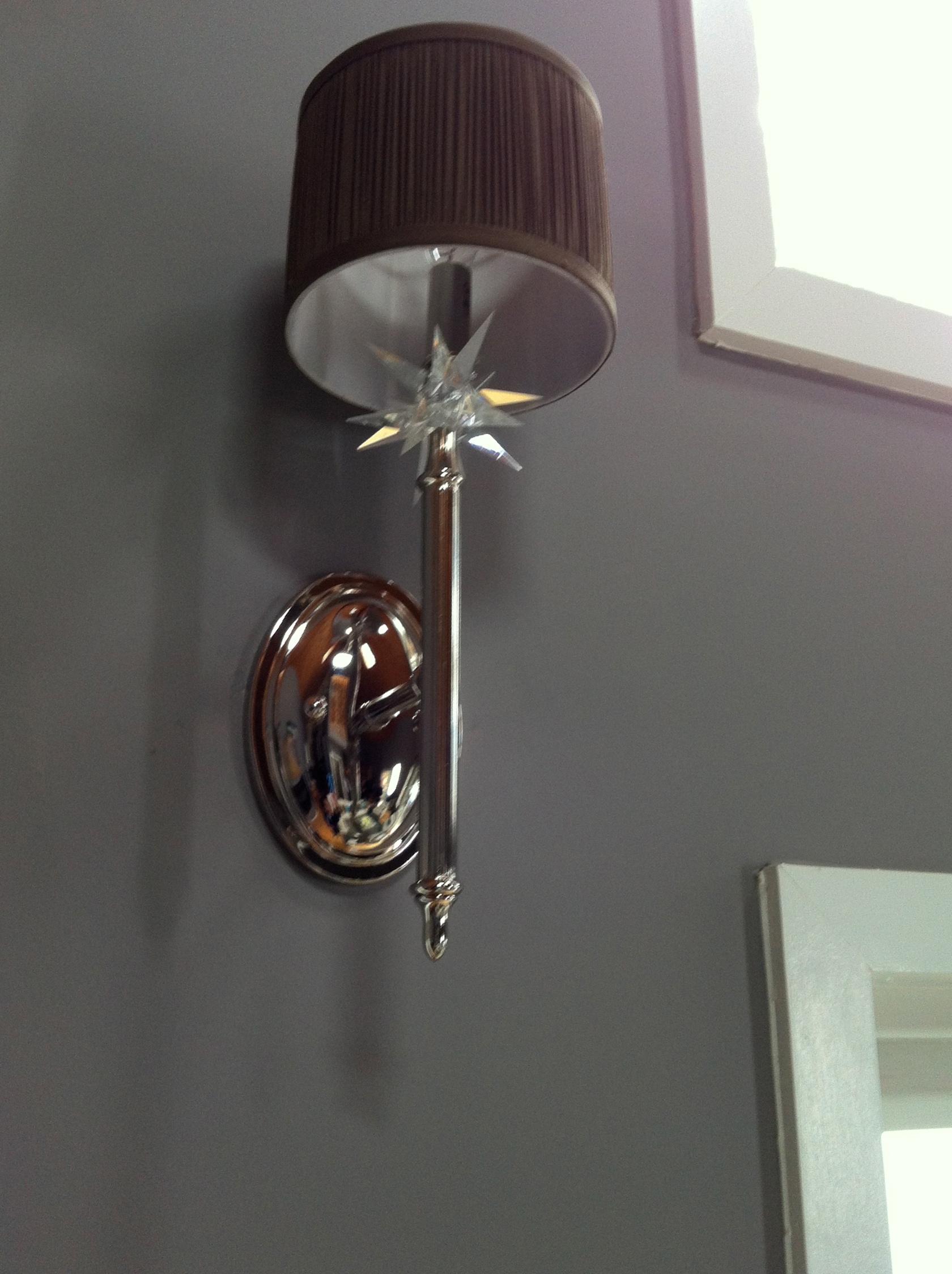
For this space, I decided that the soaring trapezoid windows and vaulted ceilings showcased a fantastic lakeview that was really the main attraction here – the fireplace becoming a secondary, less important but still impressive focal point. I accentuated the main focal point with a fantastic telescope and beautiful sconces with starburst finials flanking the windows to give homage to the outstanding views of the lake by day or by twinkling starry nights.
TIP: Consider what the main use or feature of the room is to help you decide the best focal point. Is it relaxing watching your fave Cottage Life shows on a big screen TV? Perhaps a place for chic conversation and cocktails or a space to showcase art or a collection of black & white family photographs gallery style. Try to develop one but no more than two focal points in any room.
DEFINING THE MAIN AREA
I defined the area with a large Ombre carpet and placed it center to the windows facing the lake. This meant the furniture would be placed to maximize the window focal point and vista, yet still be close enough to see and feel the heat of the fireplace. All the other furnishing were placed to be conversational with the main sofa. With this arrangement, the entire room was used and not just the half of the room closest to the fireplace.

I opted for the Chateau D’ax ”Marano” sofa – made in Italy and covered in a gorgeous dove coloured leather. It was love at first sight, with eye catching details like mid-century inspired tapered wood legs – a “very 60’s mad men vibe”. Superbly stitched button-less tufting looks bespoke and allows guests to easily move around compared to a more traditional button tufting, so there are no worries about buttons coming off or loose!
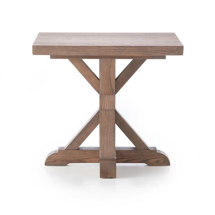
Every seat in the house should be close to a side or occasional table where you can at least put down a drink or hors d’oeuvres – especially when entertaining. This is the art of creating a great conversational seating area. The 100% Solid Ash Wood Farmhouse side tables had 6 different stain options and could work in any cool urban space as well as in a cozy country cottage setting. I selected “the Weathered Wheat” as they looked so wonderful on either side of the sofa and paired best with the lighter flooring.
THE PERFECT PLAN – NO PROBLEM?
Photo shoots rarely if ever go off with out some kind of stressful setback or thing you hadn’t accounted for. I often say a little prayer the night before. On the day of the shoot, it was glorious a crisp sunny fall morning but by the time we arrived in cottage country, It actually had begun to rain – a sort of cold “freezing drizzle” – which made getting so much fab Sears stuff up a very tall narrow staircase into the cottage a hair raising experience.
Originally I selected a chic antique brass and glass coffee table – it was pure eye candy and I thought provided the perfect bit of “Goldie Hawn Glam” to my redesign. After all, Muskoka is the Malibu of the north! But as with all design projects, no matter how well planned, you can always expect something to go awry. In this case, a very key furnishing – the gold coffee table – never made it on the delivery truck and to say I shed a tear or two is no lie.

Luckily, I had customized a very large ottoman in a stunning blue and green stripe fabric that was initially placed in-front of the fireplace. I have to admit, the ottoman looked great repurposed as “the new coffee table” evoking a slightly more relaxed casual feel – and who doesn’t want plenty of room to put your feet up at the cottage!
Despite all of these issues, I like bringing good energy on projects – it instantly infuses the whole experience with light and good vibes – which is what I ultimately set out to create – a place that rekindles the spirit and invites you to relax.
TIP: When things go wrong, stay calm and carry-on!. Sometimes you have to think outside the box and improvise. Every furniture and design plan can be and often is changed as there are many ways to decorate and design a space.
DESIGNS NEVER STOP
Although I was limited with a budget and time, the space was transformed from a darker constrained odd space to a space that was like a breath of fresh cottage country air – light and airy with a comfortable lux factor that suited the spectacular natural views.

Over time, a great chandelier maybe selected and hung over the grand seating area and that compliments the beautiful starburst sconces on the wall. Perhaps a cool reclaimed wood plank cladding could surround the fireplace wall to create a grand accent focal point in the future.
TIP: We change over time and never stay the same – and so should your space. There is truly never one way or best way to design a space so feel free to change things up.
THE PERFECT ENDING
In the end, the project was a great success. A huge thanks in any project always goes to the crew of people who help put it together and put up with a designers “diva like” insistence on many small details. ie. “The painting is a tad bit low – can I see it higher- no wait – place it over there – no wait – place it back again – no wait – place it higher again!” It was a great day made even better by wine with the homeowner to celebrate a long – not so relaxing day at the cottage!
I think by the end everyone wanted to live in the newly redesigned cottage. The rain stopped at the end of the shoot and shining through the windows – a most glorious sunshine glistening on a most glorious view of the lake captured in the “after” reveal at the end of the video. Visit my space, vote, and see for yourself what great cottage living can be like.
To see videos of my space, visit Love Your Space
Nicholas Rosac
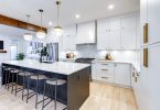
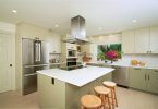
Photo Gallery – Click on images to enlarge


Latest posts by Nicholas Rosaci (see all)
- Glamorous Office Design - April 25, 2024
- Nicholas Rosaci’s Modern Canadian Cottage Design Board - April 25, 2024
- How Do You Make An Easter Special? - April 25, 2024
Love this 🙂
I love the new furnature in Sears. I would love to re decorate a room in my house.
Great decorating and design ideas! The space looks stylish, elegant and inviting. Excellent work Nicholas! 🙂