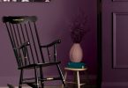
I’d like to take a closer look at one of my favourite colours of the moment, Barcelona Orange. It’s a hot and vibrant colour that can be used in a number of ways. As a brilliant, modern orange, it works well in a contemporary setting, but it can also be used for a retro mid-century modern look. I based it on the colour used copiously by the Impressionists, in early advertising and in 1960s decoration. You can use it with greens like Antibes or as a bold accent colour against Antoinette, Coco or Olive. Remember, a little really goes a long way!
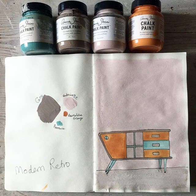
I’ve been thinking a lot about colour and style recently, so I have been working on getting a body of drawings together that show how each colour can be combined. Sometimes a colour that may not be top of your list is exactly what is needed to make a scheme really work.
In my sketch (above), I played around with a modern-retro colour palette, using Barcelona Orange and its complementary Provence on this imaginary mid-century modern sideboard. The sideboard sits against a wall painted in Antoinette and the floors are painted in a wash of Coco, which I think brings the whole scheme together beautifully.
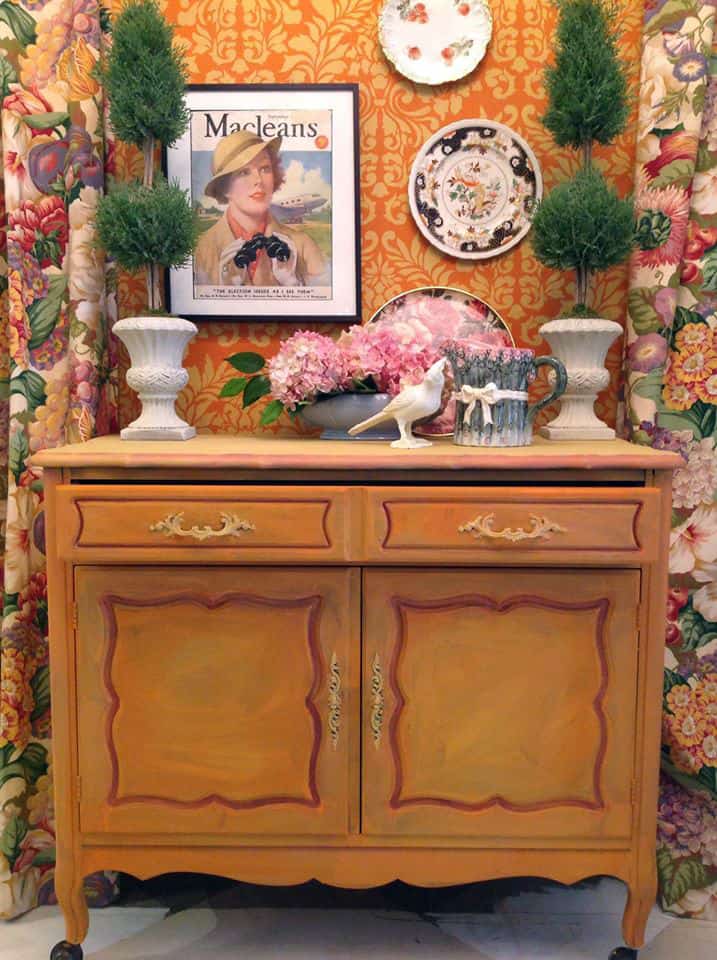
Photo: Red Living, Courtenay, B.C.
My Stockist Tony McCloskey of Red Living in Courtenay, BC, chose to use Barcelona Orange as the main colour in this playful project (shown above). Tony loves vintage colour and style, and this really comes across in the way he has painted and styled this space. He painted the sideboard in Barcelona Orange, introducing other colours like Arles and Primer Red, and layering the paint in watercolour-like washes. The wall is also painted in Barcelona Orange with the stencils applied in a lighter orange that he created by mixing Barcelona Orange together with English Yellow.
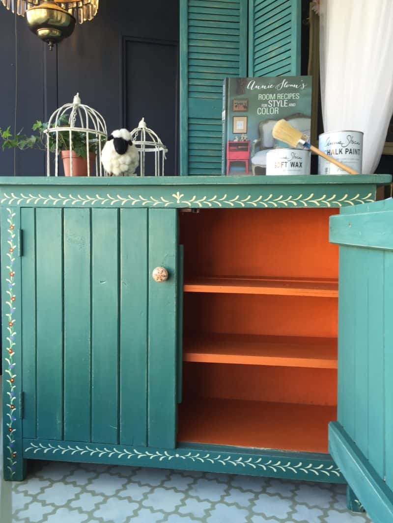
Photo: The Painted Bench, Hamilton
Melanie Anderson, my Stockist from The Painted Bench in Hamilton went for a bohemian colour combination on this cupboard (above). For the outside, she created a soft green blue. She painted the inside in Barcelona Orange, creating a brilliant pop of contrasting colour. I love the way she hand-painted the folk motif around the outside, too.
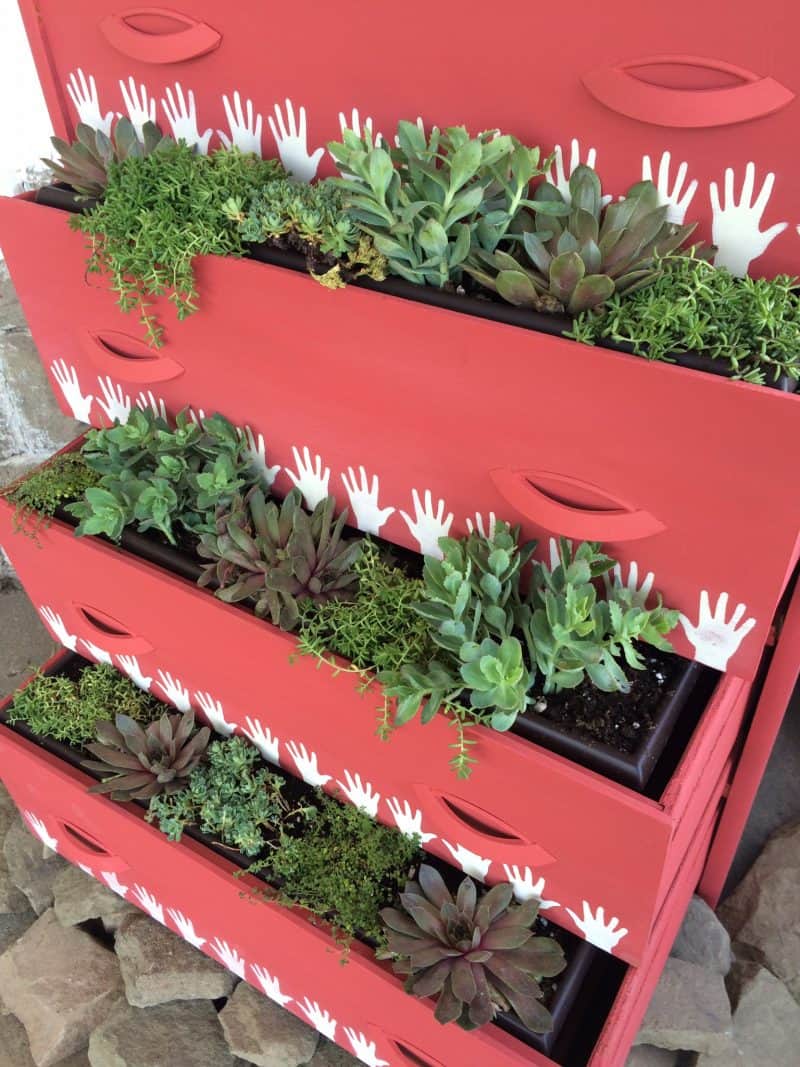
Photo: Carte Blanche Upcycled Furniture and Accessories, Moncton
All my colours mix together so that any colour can be achieved. If you want to try painting something in a coral colour, try starting with Barcelona Orange. I love this example from my Stockist Mélanie Paulin from Carte Blanche in Moncton. She mixed together Barcelona Orange, Arles and Emperor’s Silk to create this lovely coral colour for her “succulent garden” planter. She then used my Hands stencil along the fronts of the drawers before planting them. She kept this piece outside all summer, and simply changed the look for Christmas by replacing the succulents with cedar branches, lights and pinecones!
Latest posts by Canadian Home Trends (see all)
- Dining Room Design Tips - July 2, 2025
- Practical Luxury in Forest Grove - July 2, 2025
- The Hidden Value of Great Design - July 2, 2025