We gave two designers the same before image and two drastically different budgets. Then we asked them to tell us how they would fix this home’s curb appeal! Jane Lockhart tackled the “Save” version, adding dimension to exterior of the home with a few cost-effective upgrades. Michelle Cook took the “Splurge” approach, give the house a complete upgrade including a second storey addition.
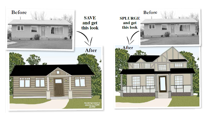
Digital Renderings based on Original Sketches by Angela Gauthier
Jane says “Save on Your Curb Appeal”

Original Sketch by Angela Gauthier
The Concept: This house appears one-dimensional. Adding a peak over the front door and extending it forward will make the house appear larger. This home can also be changed by adding more contrast in the exterior colour scheme. A black roof with thatched patterned shingles will add a quaint feel. Darker trim and lighter siding will help create dimension. The scale of the house is nice as it isn’t too big. The neutral colour scheme works overall and makes for a good basis to add more elements.
The overall goal would be to transform this house into a Craftsman style bungalow. This is a highly desirable design style for many homeowners as it’s an organic style in Canada and fits many neighbourhoods across the country.
The Products:

Longview Handleset (Baldwin Hardware), Kendra Trellis Doormat (Pottery Barn), All Weather Windows (All Weather Windows), Antique Glass Wall Lantern (Living Lighting), House Number (Baldwin Hardware), Barrington Craftsman Door (All Weather Windows)
Michelle says “Splurge on Your Curb Appeal”
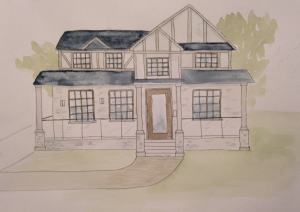
Original Sketch by Angela Gauthier
The Concept: This simple, rectangular home is a perfect footprint for a second storey addition. In this concept, the main floor layout hasn’t changed. I would add a few bedrooms and a bathroom upstairs to allow this family to stay in the neighbourhood they love and grow with their home.
I was conscious of the home fitting into its existing environment, so I kept the look progressive, clean and modern but not so much that it dominates the street.
I chose a variety of textures to clad the home. Stone veneer, stucco and wood are layered in complementary colours. Keeping the heaviest texture at the bottom of its exterior grounds the visual weight of the home.
When considering a renovation, a general dollar value to work with is $250 per square foot. This 860 sq. ft. addition would cost approximately $215,000, completely finished, inside and out. Depending on finish selections, the price may vary.
The Products:

The Zonix by Fanimation (Living Lighting), Cuzco Glass Insert and Door (All Weather Windows), Hanging Lantern and Wall Light (Living Lighting), Teak Porch Swing (All Things Cedar), Cambridge Shingles (Lowes), Cabana Collection Patio Sectional (Canadian Tire)
As Seen In Canadian Home Trends Magazine Summer 2014
Latest posts by Canadian Home Trends (see all)
- 2026 Design Trends: The Evolution of Home Design - April 4, 2026
- Expert Bathroom Design Secrets from Canada’s Best - April 4, 2026
- Treasure Hunting: Discovering Unique, Locally Made & Vintage Home Décor - April 4, 2026

