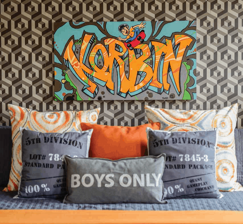
Julie Grainger, a paramedic, and her husband, David Grainger, who works in banking, wanted a bedroom for their son that would “grow” with him. “It was time for our 8-year-old son, Korbin, to have a ‘big boy’ room,” Julie states. She wanted a design that was “timeless, fun, and unique” that could be updated to suit his needs over time.
Julie and David are renovating their ten- year-old, 2,600 square foot home, room-by- room. Korbin’s room, Julie comments, “was a compilation of mismatched furniture suited to a child of a much younger age.” Both Korbin and Julie worked with designer Catherine-Lucie Horber on style choices for the room. It now personifies what Catherine-Lucie calls Korbin’s “great daring personality.”
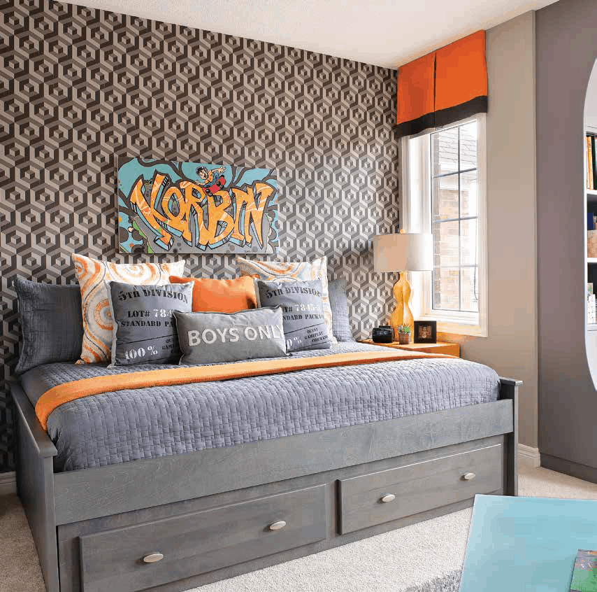
With its high-tech wallpaper and street grey colourings, Korbin’s bedroom is edgy with a skateboarding aesthetic. Angles, geometrics, and ovals are repeating motifs. They give grey zigzag energy while having a ‘kid’ glove fit with Korbin’s love of the game Minecraft, and skateboarding. Julie says “The wallpaper was definitely a splurge item. It will suit any style changes we make.” The room’s accessories are a budget- wise way to reflect new design trends.
The concrete coloured greys of the bed, wallpaper, book shelves, and carpeting are a foundation. “We wanted to give him a room that reflected his passions while ensuring it would have longevity as his hobbies and sports change,” Catherine- Lucie remarks. The grey carpeting balances the room’s colour zips and zaps. It also enhances the room’s detailing as seen in the bed’s brushed metal drawer pulls.
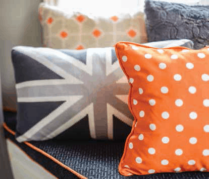
Korbin “chose the wallpaper and pillow fabrics,” Julie notes. He wanted vivid speedy colours in the room. “We focused on his top colours, using them as funky accents,” Catherine- Lucie remembers. The ‘graffiti’ art hanging connects the room’s motifs, colours, and urban style.
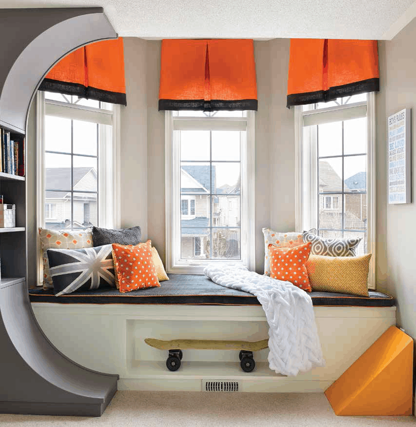
The window‘s bookshelf is inspired by skateboarding ramps. It provides storage as does the window seat. Most important are the hidden compartments that keep Korbin’s treasures. Classic in design, the double bed, with its generous storage drawers, will suit his needs as he grows. “I usually select items that are not necessarily made just for children,” Catherine- Lucie comments. The room’s angled activity table is actually two painted repurposed tables.
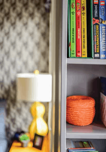
“I was thrilled to see how much bigger we made the room feel. The bay window became the ‘star’ piece with custom cabinetry,” Catherine-Lucie states. The bedroom, now organized and coordinated, uses classic-style elements aided by edited accents like the room’s tangerine-coloured lamp to make a statement about Korbin’s passions, pep, and pizzazz.
When Korbin saw his finished room “he fell over and pretended to faint,” Julie says. “Before the renovation, he only used his room for sleeping. Now we have trouble getting him out of there.”
“Friends and family love it! If you saw the ‘before’ pictures, you would see that this was a much needed upgrade!
We are so pleased with how everything came together. It exceeded our expectations.”
Text by J. Lynn Fraser
Photography by Aurora Robinson
Sources:
- Space Designed by Catherine-Lucie Horber
- Photographer, Aurora Robinson Photography
- Bedding, HomeSense
- Graphic Pillows, HomeSense
- Bed, Toronto Kids Furniture
Latest posts by Canadian Home Trends (see all)
- 2026 Design Trends: The Evolution of Home Design - March 31, 2026
- Expert Bathroom Design Secrets from Canada’s Best - March 31, 2026
- Treasure Hunting: Discovering Unique, Locally Made & Vintage Home Décor - March 31, 2026


