In 2011, Marie Kondo taught us about downsizing our lives, and nearly a decade later, we’re still digging those minimalistic vibes. If you’re a fan of all things frill-free, you’ll like this roundup.
Minimalistic design doesn’t have to be boring; in fact, it can be the opposite. With less stuff, the focus shifts more to the fine details of the few items you do have, like this beautiful fossil (“Ammonite”) sink.
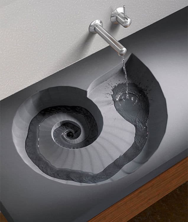
Photo Source: gizmodo.com
Minimalism also doesn’t necessarily mean monochrome. This minimalistic bathroom idea incorporates pink and green, as well as brass, wood, and some much-appreciated geometrical diversity.
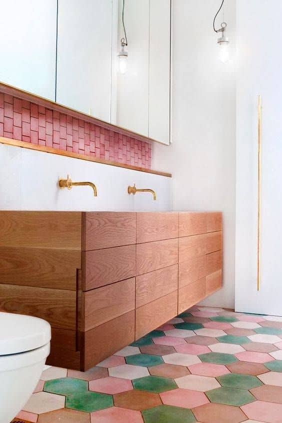
Photo Source: domino.com
Perhaps one of the more prominent aspects of minimalism is visual weight, which is an idea that can transcend any one particular stream of design. Things that are visually bulky restrict light, air, and energy flow, unlike this concrete chair, designed by Omer Arbel, which serves its purpose in the most un-presumptuous manner possible.
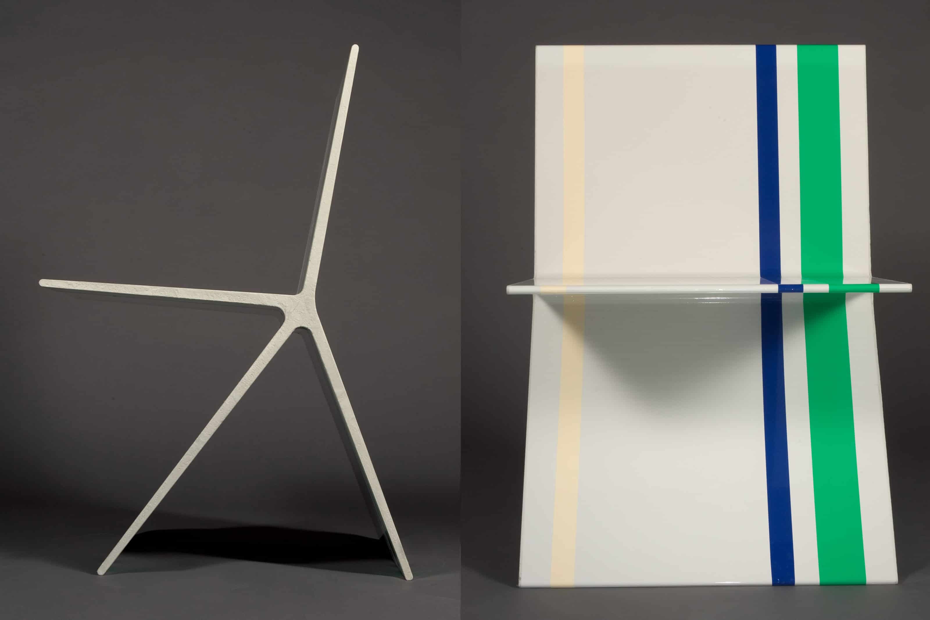
Photo Source: omerarbel.com
One of the best ways to embrace your small space is to embrace minimalism. This kitchen may lack square footage, but the simple, grey and mustard color scheme, the barebones table, and the open shelving keep it from feeling claustrophobic.
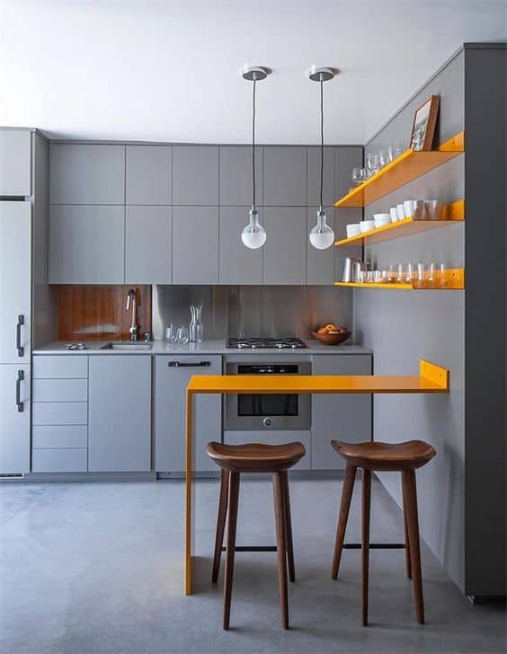
Photo Source: homebnc.com
On the topic of visual weight, we love the way the designer of this bookshelf thinks! Even though this piece is maze-esq, it’s uncomplicated to the eye, while still managing to make a statement.
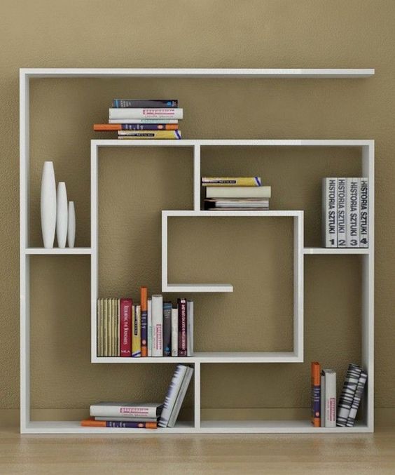
Photo Source: futuristarchitecture.com
Last but not least, something clever to lend some sass to an otherwise barren wall; minimal-ista approved.
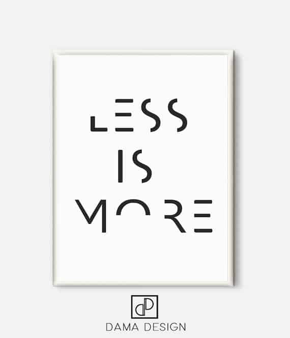
Photo Source: etsy.com
Latest posts by Canadian Home Trends (see all)
- 2026 Design Trends: The Evolution of Home Design - May 2, 2026
- Expert Bathroom Design Secrets from Canada’s Best - May 2, 2026
- Treasure Hunting: Discovering Unique, Locally Made & Vintage Home Décor - May 2, 2026


