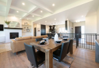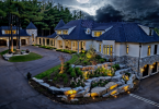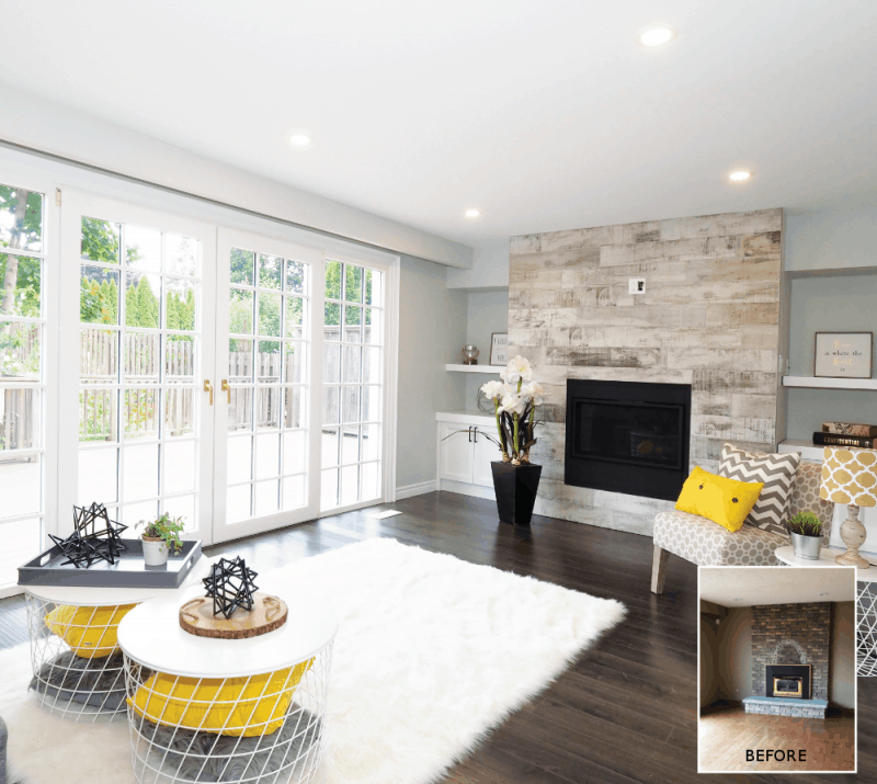
Creating a Modern Vintage Renovation. An outdated home gets a modern update with a nod to its original character.
FRANCESCA COSTA was INSPIRED by THE OVERALL DESIGN FOR THIS RENOVATION? We wanted to keep the character of the home and play off of the solid wood oak doors throughout. We went with a vintage feel with black fixtures and white cabinets. Then, we added a punch of modern with the navy blue island and gold hardware.
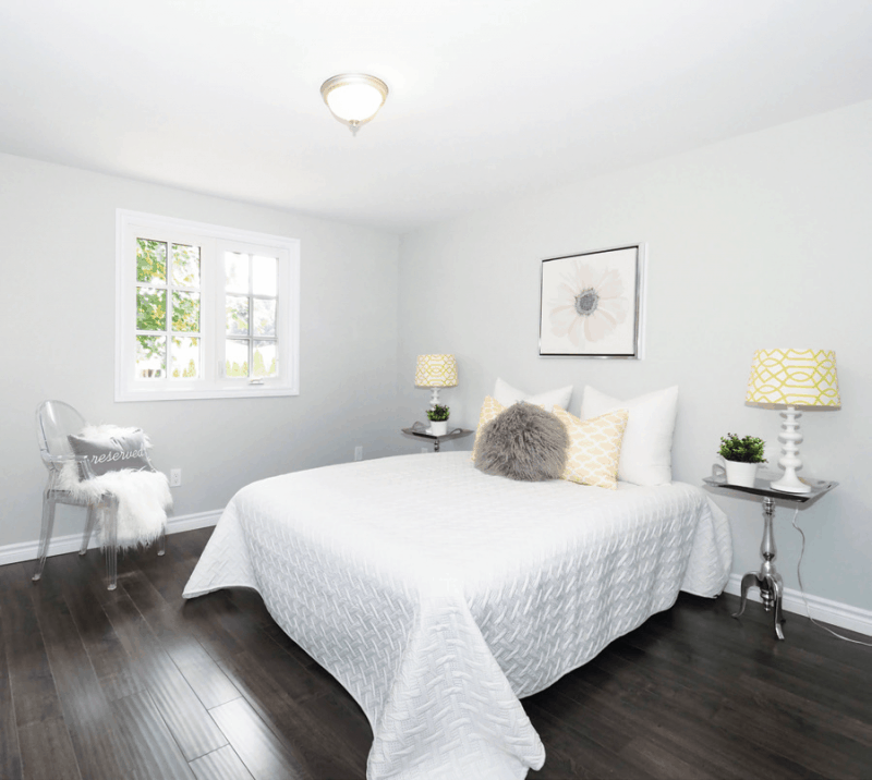
The biggest challenge with this home was the layout. Sidesplits have interesting layouts. Most people either love them or hate them because there are so many closed off rooms. We decided on an open concept layout to maximize the space and make it feel more open. Doing this means removing some walls, putting up others and the challenge of figuring out which ones to do.
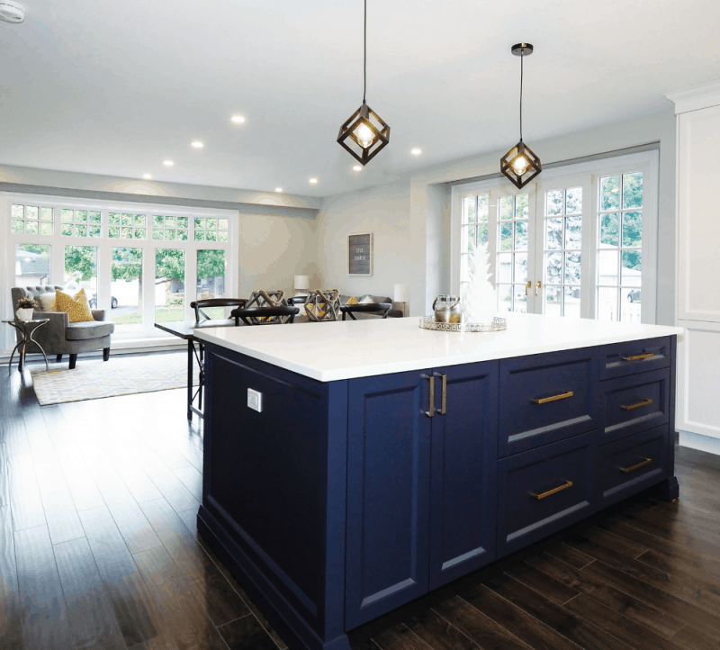
To DESCRIBE THE FINISHED SPACE IN A FEW WORDS, they WOULD BE: Modern, classy, elegant and bold.
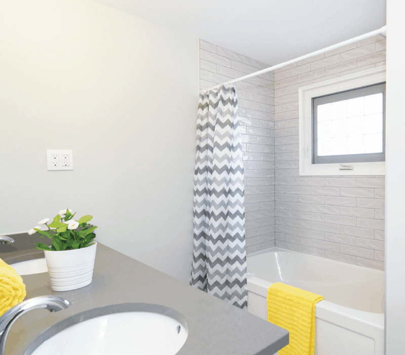
The most common mistake is that they don’t touch everything. If you are going to remodel, you have to make sure the look is cohesive. Creating a Modern Vintage Renovation is if you create a modern space but don’t remove the outdated popcorn ceiling because it’s time-consuming, you end up with an unfinished look. The same goes for staircases and handrails which are another common thing that homeowners will leave because it’s too much work but the result is an outdated or unfinished feel!
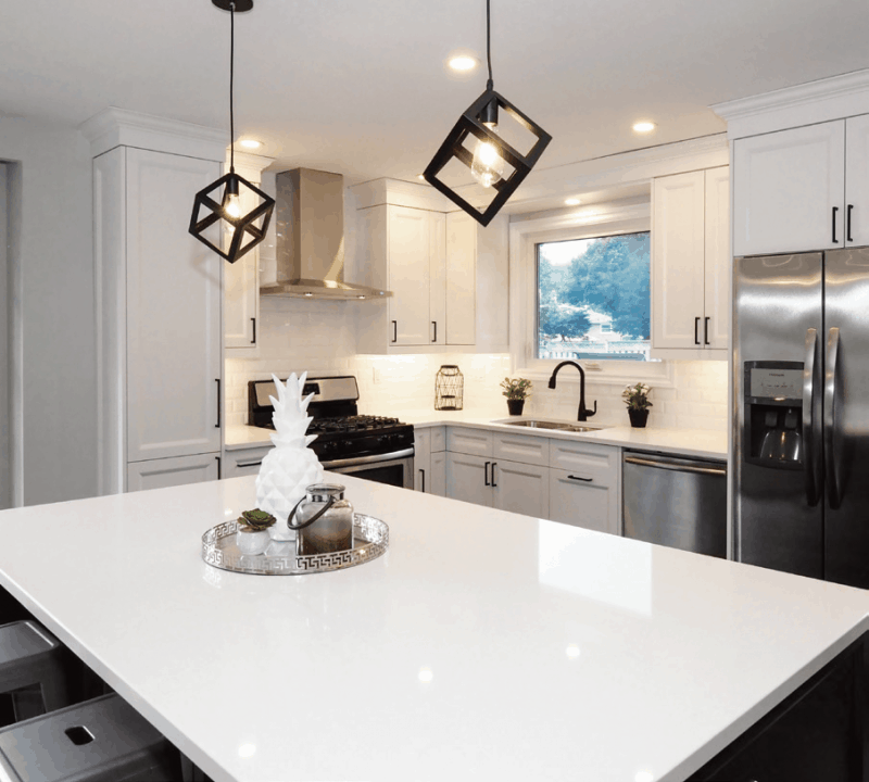
When choosing pieces for a renovation, we prefer to splurge on items that will make the house unique and fabulous, like the wine/coffee station in this house. To save, we focus on shopping around and we scope out deals like clearance sales, tax free events, etc. – Francesca Costa

For more great ideas, click here.
For more unique decor items for your home, click shopCHT.com.
Latest posts by Canadian Home Trends (see all)
- 2026 Design Trends: The Evolution of Home Design - April 12, 2026
- Expert Bathroom Design Secrets from Canada’s Best - April 12, 2026
- Treasure Hunting: Discovering Unique, Locally Made & Vintage Home Décor - April 12, 2026


