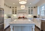
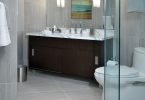
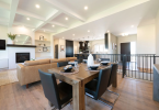
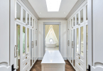
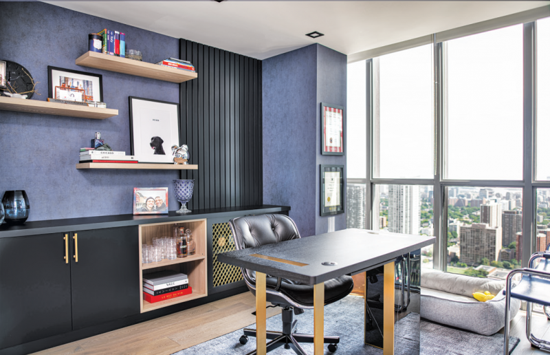
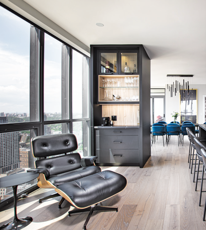
After 10 years, this condo space needed an update! While the overall layout would remain the same, the goal was to create three distinct zones within the main living space: dining, kitchen and family room. The final space needed to feel like a home that they could entertain in. The homeowner also wanted to convert a third bedroom into a home office.
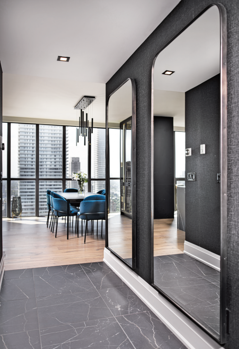
On the top of the homeowner’s wish list was a black kitchen. This darker color scheme is the key element through-out the space and allows for more creativity then the more common white and gray color palettes.
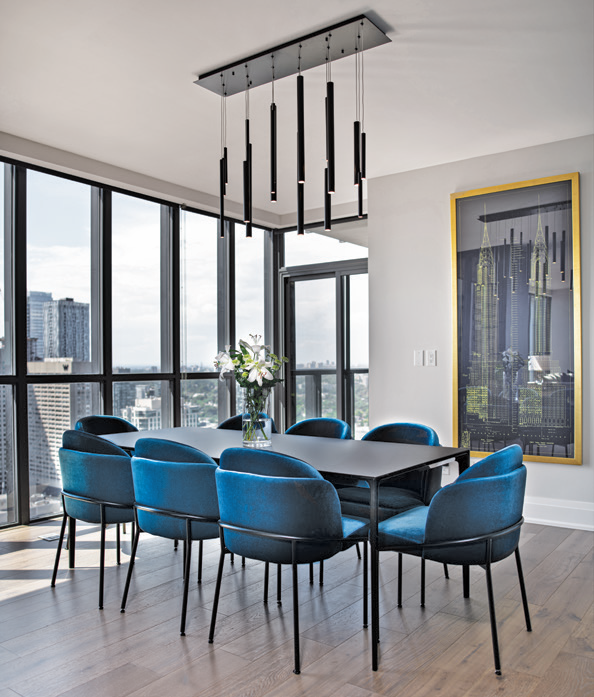
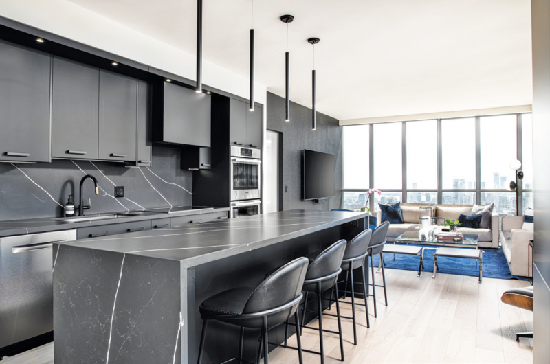
To stay within budget, they used existing pieces where possible including the doors and bathroom vanities. Keeping the structural layout the same was also a budget friendly decision. This allowed room in the budget to splurge on a stunning yet sophisticated Versace wallpaper in the front hallway and a beautiful LED chandelier in the dining area that matched the tube lights over the waterfall island.
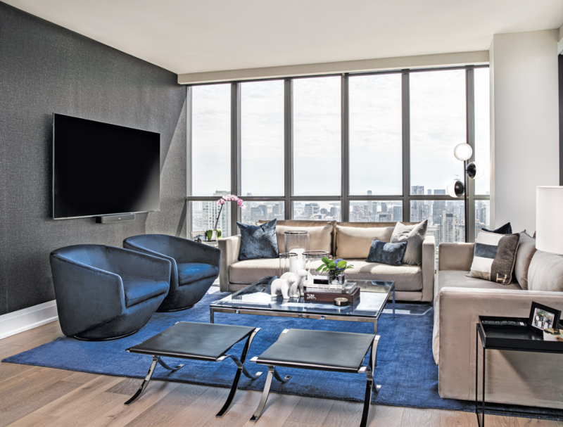
Creating a unique space can be tricky. It is important to work with a builder and designer you can trust. The homeowner’s wish list is the starting point of the design process but then you need to trust your builder/designer to execute that vision! – Heavy Duty Homes, www.heavydutyhomes.com
Latest posts by Canadian Home Trends (see all)
- 2026 Design Trends: The Evolution of Home Design - April 16, 2026
- Expert Bathroom Design Secrets from Canada’s Best - April 16, 2026
- Treasure Hunting: Discovering Unique, Locally Made & Vintage Home Décor - April 16, 2026

