My Favorite Feature
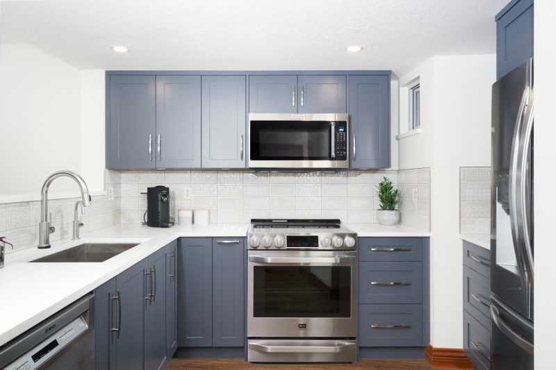
I love the way the subtle light gray tones in the decorative tile tie with the starkness of the blue cabinetry. The backsplash tile came in a variety of patterns and we had them laid out as a stacked formation to put them on display.
The Concept
For this vacation property, we wanted to create an out doorsy cottage feel with a Mediterranean twist. The cohesive finishes fit the tone of the space well as they embody the refreshing, light, and calm color palette that the clients loved.
The Scope
This home was originally built in the 90s and the clients wanted an updated kitchen that maximized the use of the space.
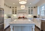
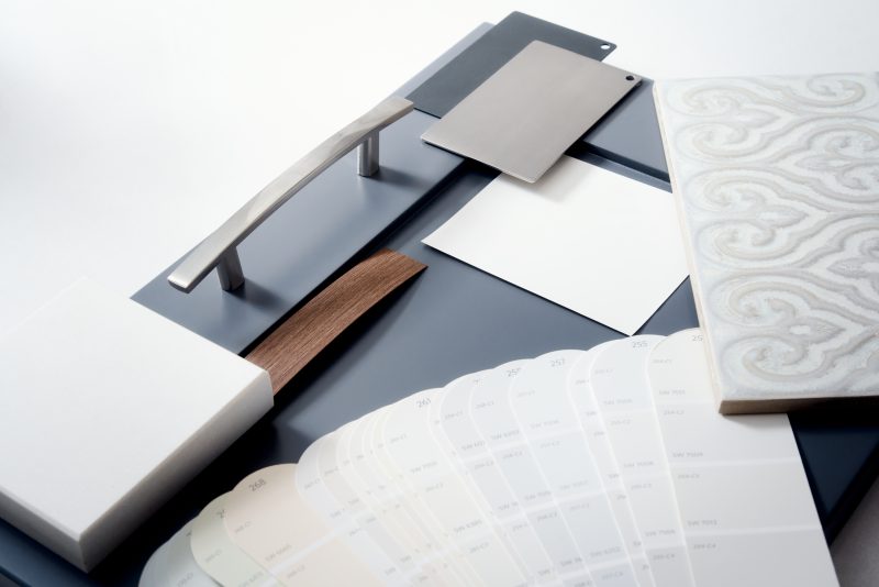
To give the kitchen a new look, we replaced the original wooden shaker doors with a painted slab door with brushed nickel hardware. We finished it off with a white quartz countertop and decorative tile backdrop.
We kept most of the layout the same as it worked well for the home. The one change we made was to remove a pony wall to allow for a more open concept space that would be easier to use when entertaining guests at the cottage.
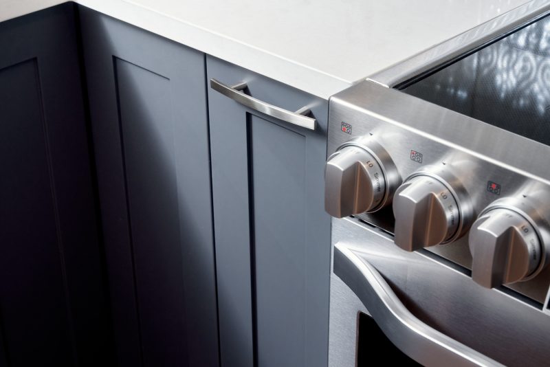
In addition to an updated look and improved flow, we also wanted to increase functionality within the space. We installed pull out drawers in the deep cabinets to minimize the reach the clients would have to make to retrieve pots and pans as well as utilized a swivel plate to optimize the lower corner cabinetry space
Latest posts by Canadian Home Trends (see all)
- 2026 Design Trends: The Evolution of Home Design - April 3, 2026
- Expert Bathroom Design Secrets from Canada’s Best - April 3, 2026
- Treasure Hunting: Discovering Unique, Locally Made & Vintage Home Décor - April 3, 2026

