Designer Melissa Davis creates a beautiful home for her family.

Text J. Lynn Fraser, Photography Stephani Buchman, As Seen In Canadian Home Trends Fall 2015
Melissa Davis wanted a warm home environment for her son, while having space for entertaining friends in her three-year-old, 650 sq. ft. condo. “I loved the convenience a condo offers, but was worried I’d have to compromise on the size of furnishings,” Melissa comments.
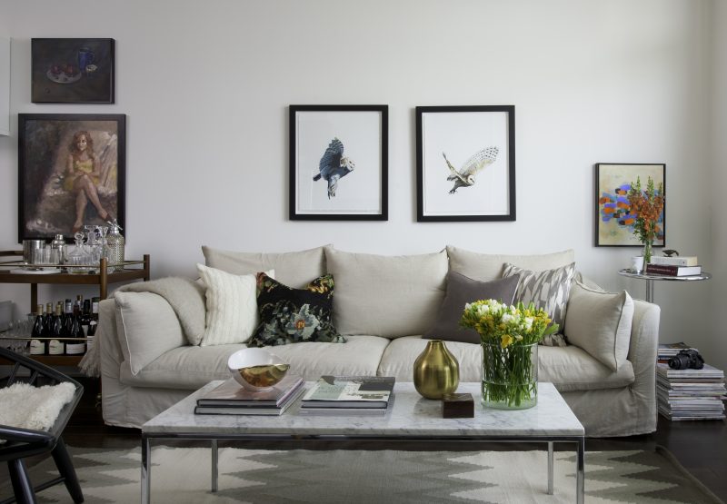
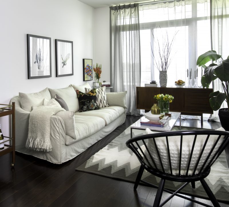
Long, lean, low profiled furniture allows for unobstructed views. Judicious, vintage, furniture choices such as a teak credenza and a coffee table ‘glazed’ with Carrara marble enabled Melissa to balance the masculine feel of her original, contemporary furniture. The warm, textured vintage furniture facilitates an open dialogue with softer pieces including a Montauk sofa in addition to a custom walnut and metal dining table.

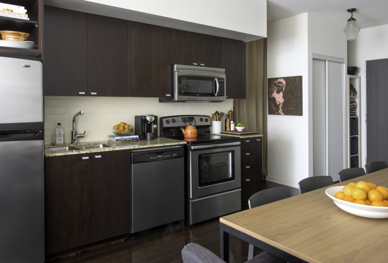
Melissa focused her attention on the dining and living areas of the condo. “I opted to do an oversized dining table. I purchased storage benches that do double duty. They add seating and storage.” Wall- mounted cabinets free up floor space. The ongoing conversation of materials and colours is continued with the use of complementary colours.

“I wanted to balance the dark counter top and black accents on the kitchen appliances. I opted for a clean and contemporary light in matte black,” Melissa notes. Grey painted chairs blend with the dark wood floors—sustaining visual continuity throughout.


“Doing several small pieces of furniture in a small space actually makes a space feel more cluttered and small,” Melissa advises.
“I wanted it both elegant and comfortable,” Melissa says of her living room. Reflective surfaces add diverse light sources. This adds to the perception of a bright, loft -like room. “Th e open slim frame of the living room table keeps the space open. Its white marble pulls together the white cream and grey palette,” Melissa observes. Strategically curated artwork enhances the sense of height for the condo’s 8 ft . high ceiling. Reed, thin framed art, as well as, the slender legs of chairs and tables also add lightness. Well-tended throws add ‘architectural’ detail to the silhouettes of chairs.


It’s SO small,” says Melissa of her bedroom. “I opted to place the bed on the wall in full view from the living room, so it creates a nice focal point.” The master bedroom’s ‘landscape’ is characterized by a series of eye-pleasing contours. As an airy arch, the graceful headboard is functional while allowing for the wall’s expanse to be highlighted—thus adding width to the room. A contoured tower of books increases the perception of the room’s height while engaging with the throw pillows’ colours. “By using open chairs as side tables it feels more open and casual and they are great for extra seating in a pinch!,” Melissa states.
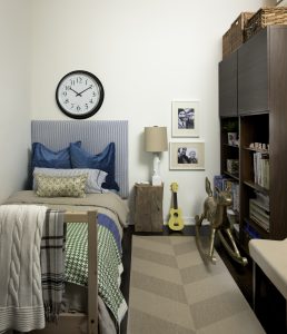
Melissa used textiles strategically in her son’s bedroom. “By putting the focus on the bed with lots of pattern and textures it adds interest but keeps the space still feeling tidy and open.” The storage units’ colour matches the floor. She observes that this “lets them blend and appear more tidy.”
“I wanted the condo to be a comfortable home for my son and I, with space to entertain friends and have large dinner parties.”
Sources:
- Space Designed by Melissa Davis, www.melissadavis.com;
- Photographer, Stephani Buchman, www.stephanibuchmanphotography.com;
- Table, Space Furniture, www.spacefurniture.ca;
- Dining Chairs, IKEA, www.ikea.ca;
- Dining Pendant, CB2, www.cb2.ca;
- Dining Benches and Storage, IKEA, www.ikea.ca;
- Table Cloth, IKEA, www.ikea.ca;
- Vase at Entrance, HomeSense, www.homesense.ca;
- Lamp at Entrance, IKEA, www.ikea.ca;
- Accessories on Dining Table, HomeSense, www.homesense.ca;
- Pot on Stove, HomeSense, www.homesense.ca;
- Red Jug on Counter, HomeSense, www.homesense.ca;
- Cutting Board on Counter, IKEA, www.ikea.ca;
- Black Chair in Living Room, West Elm, www.westelm.ca;
- Sofa, Montauk, www.montauksofa.com;
- Coffee Table, What The Vintage, www.whatthevintage.com;
- Bar Cart, West Elm, www.westelm.ca;
- Painting over Sofa, Canvas Gallery, www.canvasgallery.ca;
- White and Gold Accessories on Coffee Table, Nate Berkus for Target, www.target.com;
- Vase on Coffee Table, HomeSense, www.homesense.ca;
- Rug at Entrance, Nate Berkus for Target, www.target.com;
- Rug in Living Room, West Elm, www.westelm.ca
Latest posts by Canadian Home Trends (see all)
- 2026 Design Trends: The Evolution of Home Design - March 31, 2026
- Expert Bathroom Design Secrets from Canada’s Best - March 31, 2026
- Treasure Hunting: Discovering Unique, Locally Made & Vintage Home Décor - March 31, 2026


