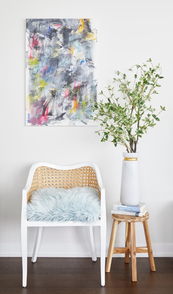
 Bright and Airy Design – THE NEIGHBORHOOD OF CORKTOWN is one of the oldest in Toronto, best known for its up-and-coming potential. Location-wise, you can’t beat it—a fact which isn’t lost on a young professional couple and their small dog, residing in a bright three-bedroom corner suite in the east end of the community.
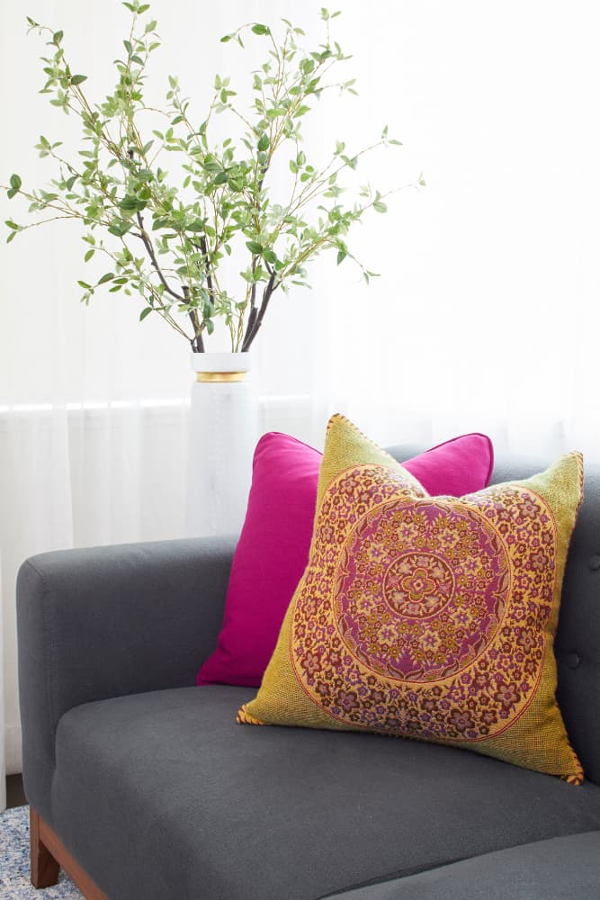
Their condo encompasses 1,200 square feet, lively pops of pink, orange and green, and a veritable palette of textures. According to Principal Designer, Linda Mazur, the homeowners didn’t have a specific design vision, but they knew they were looking for something a bit less conservative. Linda notes that designing this small space was all about embracing the unexpected.
 With her clients’ objective in mind, Linda formulated the color scheme, opting for a uniformed fusion of color and natural light. “In the kitchen, we kept everything very tone-on-tone,” says Linda. “Though the kitchen is very white, the beautiful marble backsplash not only becomes a focal point in this space, but also highlights some of the warm gray tones that have been used throughout the condo.” She continues, “It’s a small space that opens right into the main living space, and as such, we wanted to maintain a sense of cohesion in the design while still allowing each specific area to have its own personality.”
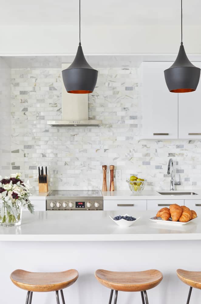 In keeping with the bright and airy design of the home, Linda chose pure white for the kitchen. For the rest of the home, she opted for light gray. “It’s very warm with a slight gray undertone and works as a lovely neutral, complementing the various colors, wood tones, and the white of the kitchen,” says Linda.
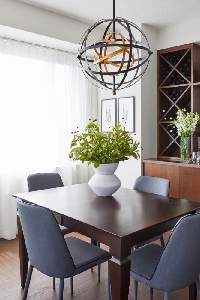
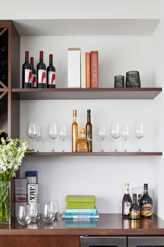 Wood tones were generously incorporated throughout the space, at the request of the homeowners. “We designed a custom built-in wine bar for the dining area, which is great for entertaining but also provides a great storage solution for them,” says Linda. “This balanced beautifully with the custom barn door we had made in similar tones.” The custom wine bar and barn door are splurge items and the costs are countered by less expensive furnishings, accessories, and lighting.
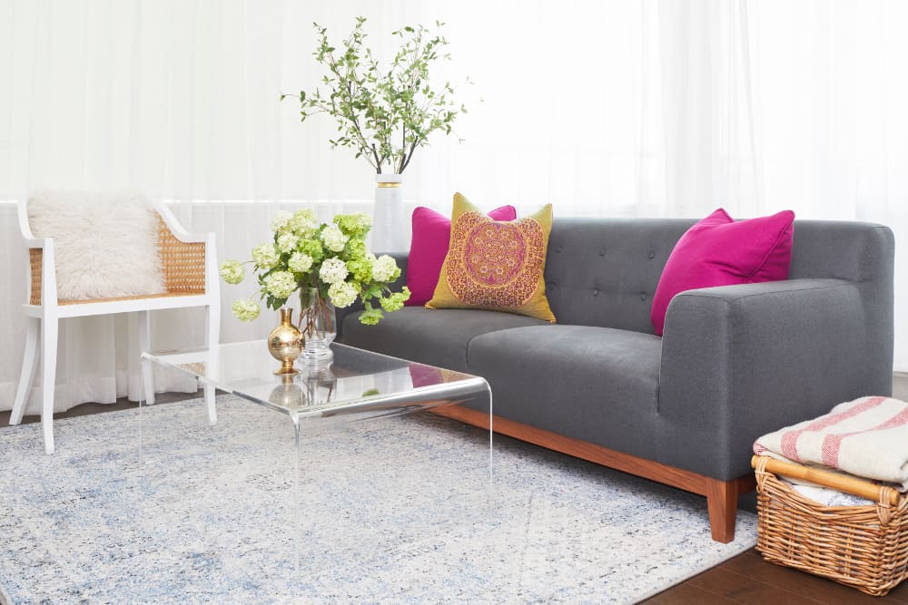 “I really like playing with textures and patterns, especially in a smaller space such as this,” says Linda, referencing the rattan chairs and the alpaca throw pillow. “The alpaca throw pillow is such a fun addition, it adds a bit of whimsy and softness to the space.”
When asked about her experience designing a small space, Linda divulges that this project was right up her alley. “I design a lot of small spaces, both condos, and houses in the city. As space is at a premium, you really need to put thought into the items that are essential,” says Linda. “Working in lighter colors is often favorable in smaller spaces, but don’t shy away from introducing bold colors, texture, or patterns into your space to add character and personality.”
Sources:
- Space Designed by Linda Mazur
- Photography, Jason Hartog
- Sofa And Coffee Table, Structube
- Lighting, Other Furnishings And Accessories, ELTE MKT and casalife
- Tile Backsplash, Moscone
- White Rattan Chair, CB2
- Kitchen Barn Door And Custom Wine Cabinetry, custom through Linda Mazur Design
- Artwork, Nadia Lloyd
The following two tabs change content below.


Canadian Home Trends magazine gives you a personal tour of the most stunning homes and condos across Canada. You'll be inspired by a selection of accessible home décor products, trend reports, simple yet stylish DIY projects, and much more. In each issue, you are given the tools to recreate designer spaces you've always dreamt of having at home, in-depth renovation and design advice, colour palette and furniture pairings, and Canada's best places to shop.
Latest posts by Canadian Home Trends (see all)
- 2026 Design Trends: The Evolution of Home Design - April 11, 2026
- Expert Bathroom Design Secrets from Canada’s Best - April 11, 2026
- Treasure Hunting: Discovering Unique, Locally Made & Vintage Home Décor - April 11, 2026




I really like the touches she used to create a friendly happy space.
Love those kitchen bar stools and the barn door.
I love the bar stools and the barn door.
Love the Bright & Airy
Really Nice
Love the Light and Bright Home Reno. Looks so clean
I love the kitchen backspash, and the wood; it would be too sterile without the wood to ‘warm’ it up.
Essentials only…no clutter !
oooh i love those hanging pendant lights – SO chic!!