Redesign Renovation for Teenage Family.
HOMEOWNERS, JANET AND VICTOR, AND THEIR TWO TEENAGED SONS LIVED IN THEIR HOME FOR 15 YEARS BEFORE DECIDING IT WAS TIME FOR AN UPDATE. Their property contains four floors, three bedrooms, and a basement. At 2,640 square feet, the homeowners knew a design overhaul was no small job, so they secured award-winning designer Yvonne Whelan to head the project.
Save for a few special requests, Janet, an IT professional, and Victor, a finance executive, put their trust in their designer. Says Yvonne, “I sent them a mood board and we went from there. The goal was to bring in some fun and not to be too serious, but always classy.”
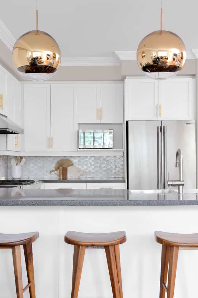
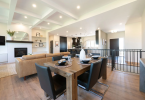
Though the home was well overdue for an interior update, the project was born from a desire to renovate the kitchen. “We wanted a fresher look and to brighten things up a bit,” says Janet. “One special request was to maintain an eat-in kitchen. It was important for us to have a proper table around which our family could easily gather every day for meals.”
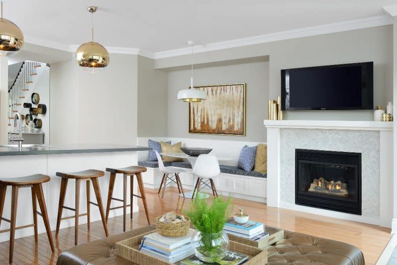
In this redesign renovation for teenage family, from the outset, the kitchen had good bones. As such, Yvonne chose to keep the layout and cabinetry intact. After redesign, the kitchen boasts custom millwork, a modernized fireplace, and custom banquet – ideal for convening as a family. Yvonne also opted to paint the cabinetry, and change the backsplash, hardware, sink, and faucet. She divulges the sphere-shaped pendant lights in the kitchen were a splurge made possible by saving on replacing cabinets.
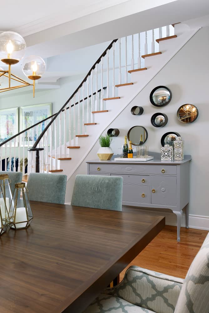
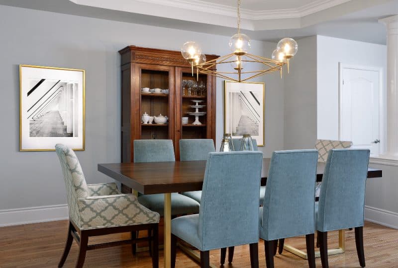
The furniture interspersed throughout the home is a mix of old and new. “They had some beautiful pieces that were investment pieces, but the homeowners were open to upholstery upgrades and painting,” explains Yvonne. “They were also open to suggestions to add new pieces, especially built-in options, to maximize their space.”
As for the color scheme, the homeowners credit Yvonne. “The great thing about working with Yvonne was that she really took the time to get to know our style and understand our family’s day-to-day living preferences. Using these insights, she narrowed down all of the numerous design choices and presented them to us in a way that was less overwhelming than trying to source everything ourselves and make decisions on our own.”
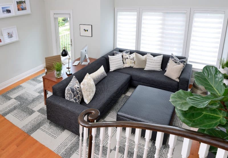
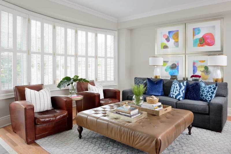
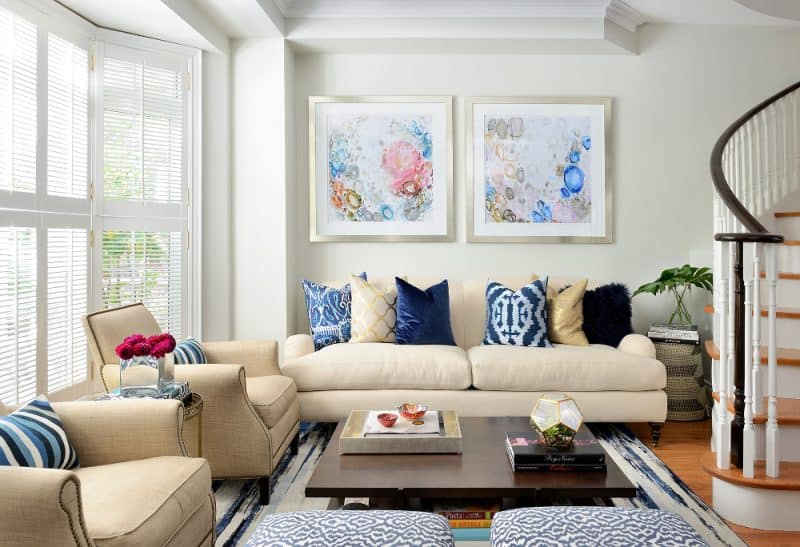
On the main floor, the designer opted for a trend-forward greige for the walls. Vibrant accent pillows and polychromatic artwork serve to permeate any monotony. Says Yvonne, “The homeowners love color so I brought it in wherever possible.”
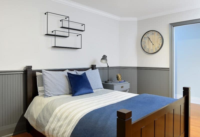
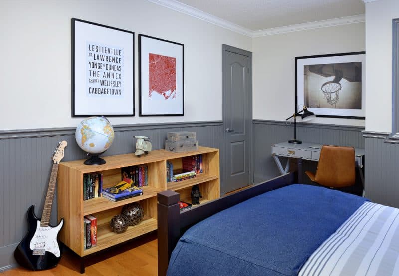
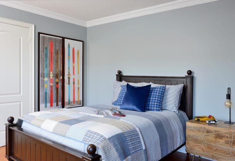
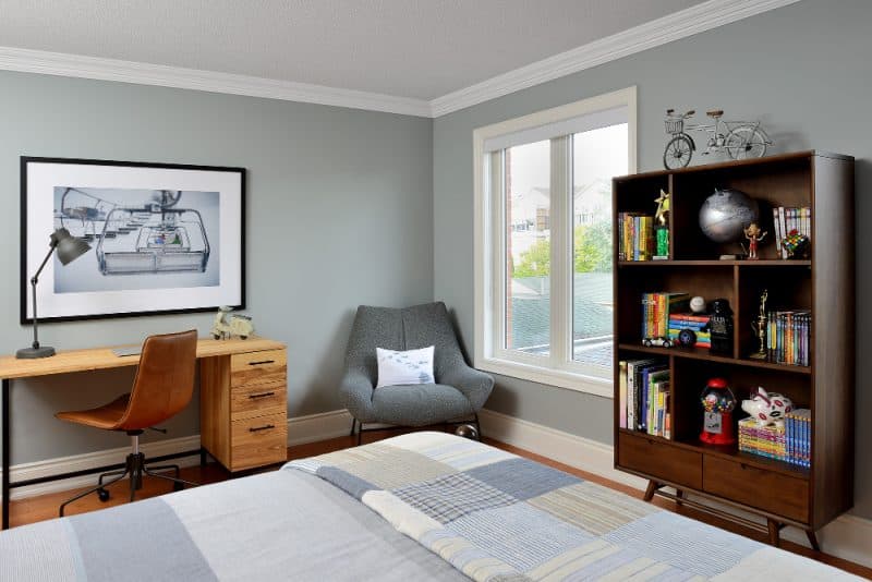
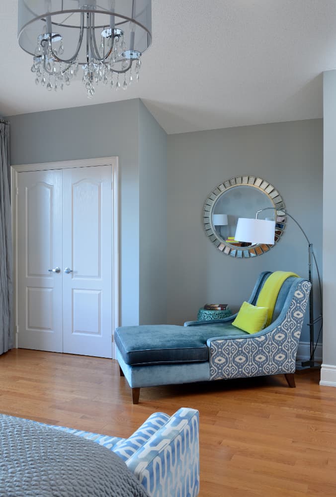
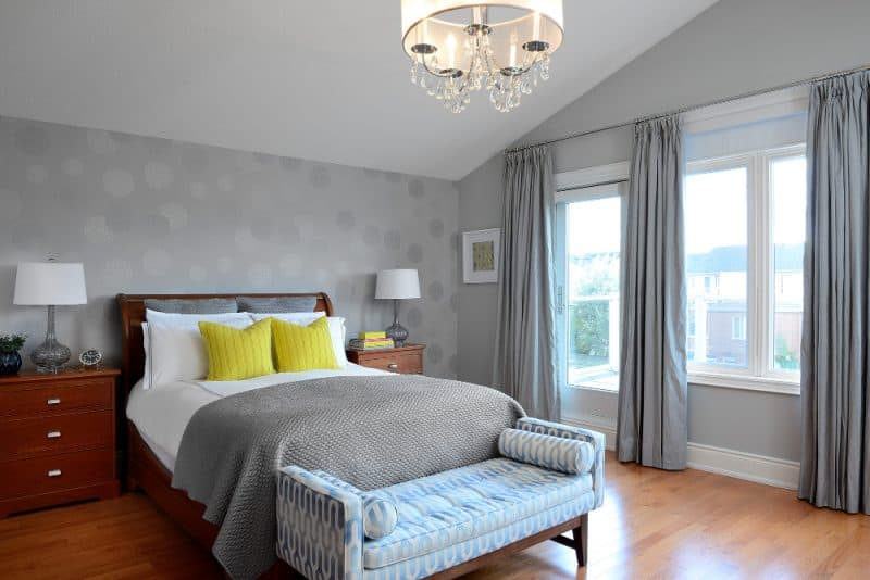
“As for the bedrooms, we wanted calming and timeless colors to stand the test of time,” says Yvonne. She cites the circular motif wallpaper as the jumping off point for the rest of the master bedroom design. “We kept
the homeowners’ beautiful bed and dressers but updated the hardware. We also brought in stunning drapery, art, lamps, a chandelier, and a new custom bench and chaise.”
Post-renovation, the family has nothing but positive things to say about their like-new home. “My favorite thing is that the design aesthetic flows everywhere throughout the house and feels consistent,” says Janet. “Every room reflects our personal style and we all feel comfortable in the space. I look around and feel both a sense of calm, and excitement about the home we’ve created for our family at the same time.”
Sources:
- Space Designed by Yvonne Whelan, www.yvonnewhelandesign.com;
- Photography by Larry Arnal, www.arnalpix.com;
- Pendants, Tom Dixon – Klaus by Nienkamper, www.klausn.com;
- Cabinet Hardware, Upper Canada Hardware, www.ucshshowroom.com;
- Custom Millwork, Greystone Custom Cabinets, www.greystonecabinets.com;
- Kitchen Light, Nuevo Living, www.nuevoliving.com;
- Cabinetry Painting, Paint Core, www.paintcore.ca;
- Backsplash, Saltillo Imports, www.saltillotiles.com;
- Stools, Shelter Furniture, www.shelterfurniture.ca;
- Pillows, Tonic Living, www.tonicliving.ca and HomeSense, www.homesense.ca,
- All Art, Celadon Art, www.celadonart.com and On the Wall Custom Framing Design, www.onthewallframing.ca;
- Kitchen Table, Elite Living, www.eliteliving.ca;
- Dining Room Light, ELTE, www.elte.com;
- Mirrors, Mercana, www.mercana.com;
- Bedding, PB Teen, www.pbteen.com;
- Wall Shelf, CB2, www.cb2.com;
- Master Bedroom Wallpaper, Primetime Paint and Wallpaper, www.primetimepaint.ca;
- Bedding, ELTE, www.elte.com and West Elm, www.westelm.ca;
- Drapery, Drapes of Art, www.drapesofart.com;
- Loft Rug, Flor, www.flor.com
For more unique decor items for your home, click shopCHT.com.
For more great ideas, click here.
Latest posts by Canadian Home Trends (see all)
- 2026 Design Trends: The Evolution of Home Design - April 7, 2026
- Expert Bathroom Design Secrets from Canada’s Best - April 7, 2026
- Treasure Hunting: Discovering Unique, Locally Made & Vintage Home Décor - April 7, 2026

