Designer Ami McKay,” Nena says, “Did a fabulous job of translating that into reality.”
Three, custom beveled, glass windows welcome sunlight into the foyer. Ami reintroduced design elements from the original home. “We were in love with the oak hardwood floors in the old home. We had to include them in our new design,” Nena remarks.
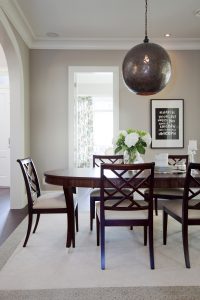
The dining room’s rich palette, on the foyer’s right, underlines the understated glamour of the furniture. Nena notes the metal Moroccan chandelier’s light “creates a gorgeous pattern on the ceiling.” Ami advises “When choosing lighting for any space think of: scale, visual space, and contrast. Lighting gives a room personality.”
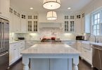
Just off the dining room, is the kitchen and pantry with their craftsman-style touches. The island’s veined granite inspired colour choices for “the entire house” Nena states. With its cabinets stained dark to complement the dark hardwood floors, the island enables Nena to cook while watching the adjacent family room’s TV. Glass pendant orbs echo the delicate glass inserts in the kitchen’s cabinets. “I saw them in a home magazine. I HAD to have them, so I ordered them online,” Nena says.
Woven through the home’s décor are silvery metallics and softly spoken, graphic prints — both trends for 2015. The family room’s accent pillows and Roman blind present sophisticated blues. Beveled glass in the coffee table evokes the stepped edges of the home’s crown moulding and paneling. Framed family photos restate the home’s motif of darks paired with neutrals.
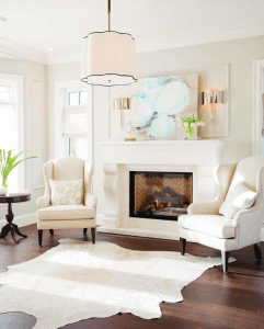
With subtle metallic glitter, the living room is a comfortable airy alcove. “The palette for this room: layered shades of linen whites, with soft blue and a bit of chrome,” Ami observes. The scalloped chandelier and light sconces reprise the feminine curves of the wingback chairs and the fireplace’s scrolled pedestals. Ami notes the “central pendant has a lovely black ribbon edge detail that is a treat for the eye.” Fine details provide continuity for a home’s overall design as they are interpreted in furniture, accessories, materials, and textures.
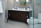
The ensuite’s lexicon of glass, tile, and stone is articulated with a postmodern inflection. The freestanding, claw-foot bathtub is a sculpted interpretation of a traditional form. Tradition is also enunciated in the stone trompe l’oeil bathroom ‘rug’. Mosaics and tiling reflect light while visually expanding the space.
Tradition and trends blend perfectly in the home. “When the final design was done, we were overwhelmed. Friends and family have been impressed beyond belief. We are incredibly proud of our home,” Nena enthusiastically states.
Text by J.Lynn Fraser
Sources:
- Space Designed by, PURE Interior Design, www.purebyamimckay.com;
- Photography, Janis Nicolay, www.janisnicolay.com;
- Tiles, Creekside Tile Company, Julian Tile, www.juliantile.ca;
- Appliances, Wolf and Sub Zero, www.subzerowolf.com;
- Drapery, Natural Textiles, www.naturaltextiles.com;
- Art Over Fireplace, Ronna Ander, www.ronnaander.blogspot.com;
- Kitchen Accessories, The Cross, www.thecrossdesign.com
Latest posts by Canadian Home Trends (see all)
- 2026 Design Trends: The Evolution of Home Design - March 26, 2026
- Expert Bathroom Design Secrets from Canada’s Best - March 26, 2026
- Treasure Hunting: Discovering Unique, Locally Made & Vintage Home Décor - March 26, 2026


