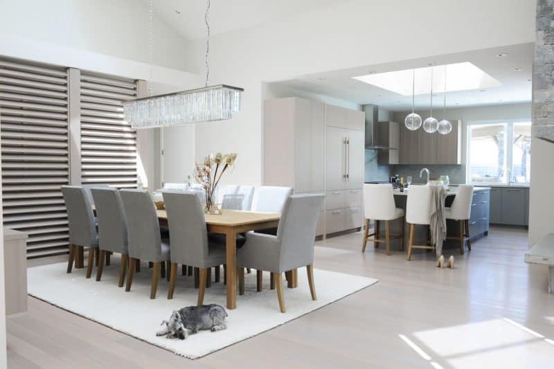
 After having built multiple homes in the past, the homeowners, a couple in their sixties, were looking for a home they could retire in. They wanted a light and bright color scheme with plenty of room to entertain their large family. “The goal of the project was to bring in as much light as possible,” says Designer Sarah-Marie Lackey.
It was also important to have everything on the main floor for ease of access that would allow them to age in place. The home features three bedrooms on the main floor and a two-bedroom suite in the basement for guests.
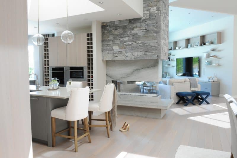 “The kitchen is my favorite room in the home,” says Sarah-Marie, “I love how clean and integrated everything is!” The homeowners entertain regularly and needed an open space with plenty of room for family and friends to gather. The kitchen features cabinetry in a mix of bluish-gray tones and wood finishes for a very soothing color scheme. A side-by-side panel ready refrigerator and freezer blend seamlessly into the cabinetry and integrated wine storage keep favorites on hand for easy access when entertaining.
The kitchen island offers additional seating for guests or a nice place to enjoy a cup of coffee in the morning. Above the island is a large skylight, one of many in this home. The homeowners value privacy but also wanted plenty of light. While windows are a great way to let in light, they would have needed to be covered for privacy so instead of adding additional windows, skylights were introduced throughout the home to bring in natural light.
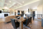
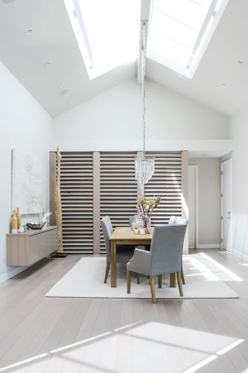 How to maximize your lighting with a formal dining space with a large table sits next to the kitchen and continues the color scheme of soft neutrals and wood tones. Another skylight over the dining table adds natural light to the space. The dining room had a hallway off to one side that was open, leaving a view of the bedroom doors from the dining table. “The homeowners wanted to keep the hallway light and bright,” says Sarah-Marie, “but being open to the hallway took away from the formal feel of the dining room.” To solve this issue, full-length screens were custom fitted to create separation between the dining space and hallway while still allowing light to flow between. The screens create the perfect solution and become a decorative feature in the space at the same time.
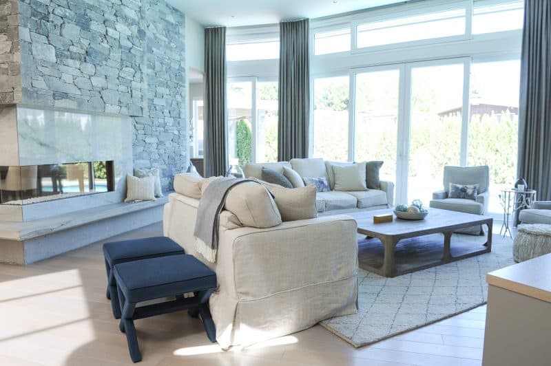 One of the focal points of this open-concept space is a stunning three-sided fireplace with a stone surround that can be seen from the entrance, kitchen, dining and living room. “It really helps to ground the space,” Sarah-Marie shares. The fireplace provides a visual connection from room to room and brings welcoming warmth to all four spaces when in use.
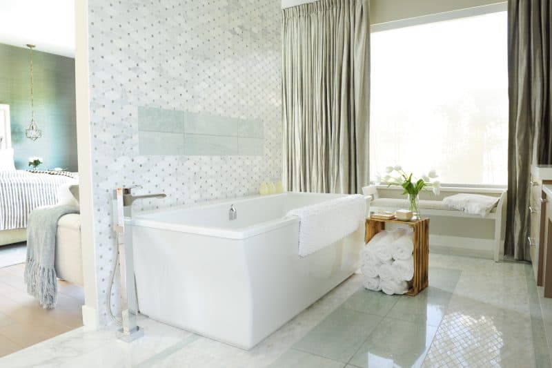
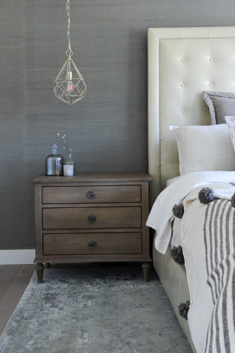 Another place where the homeowners wanted an open concept feel was the master bedroom and ensuite. To create the right balance between open concept and privacy, the toilet is set into a small, separate room off to the side while the rest of the ensuite is open to the master bedroom. The spaces are defined by a partial wall that acts as the backdrop for a beautiful, freestanding tub. The ensuite features tile flooring, and the custom built-in vanity in the same wood tone as the bedroom flooring, carry the color through and create a seamless feel.
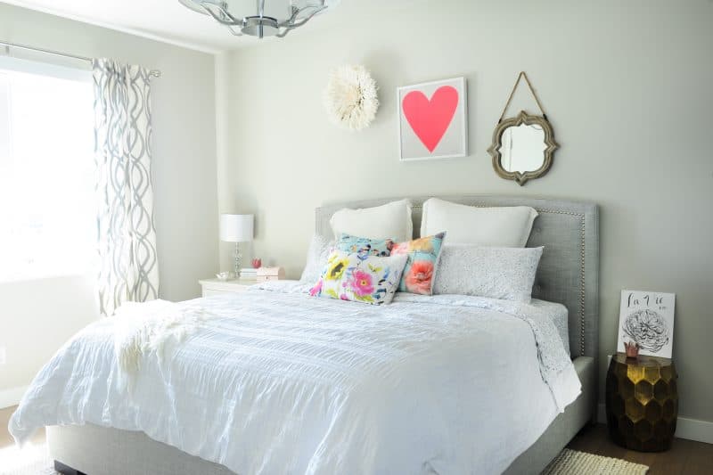
 The homeowners have a very close family and they love to have their children over for sleepovers so one of the bedrooms was specifically designed with their small granddaughters in mind. “This final detail was the perfect finishing touch in creating a home their whole family can enjoy,” says Sarah-Marie.
 Sources:
- Space Designed by Sarah-Marie Lackey, www.sarahmarieinteriors.com;
- Photography by Tracey Ayton Photography, www.traceyaytonphotography.com;
- Foyer And Kitchen Lights, Arteriors, www.arteriorshome.com;
- Stairwell Lights, Moes Home Collection, www.moeshome.ca;
- Dining Room Light, Restoration Hardware, www.restorationhardware.com;
- Appliances, Wolf and Sub Zero, ca.subzero-wolf.com/en/wolf;
- Vanity And Millwork, Old World Kitchens, www.oldworldkitchens.com;
- Countertop, Kryptonite Stone, www.kryptoniteproducts.com;
- Sofas And Side Chairs, Lee furniture purchased through CF interiors, www.cfinteriors.ca;
- Coffee Table, Restoration Hardware, www.restorationhardware.com;
- Drapes, The Natural Textile Company, www.naturaltextiles.com;
- Bed, Jordan’s Home Furnishings, www.jordansfurnishings.com;
- Side Tables, Chaise At End Of Bed, Dining Table, Dining Table Chairs, Bar Stools, Restoration Hardware, www.restorationhardware.com;
- X Stools, Jonathan Adler, www.jonathanadler.com
The following two tabs change content below.


Crystal Williams
As Online Editor for Canadian Home Trends Magazine, Crystal has a passion for design and decor. She enjoys browsing the web to find new, exciting decor ideas, DIY projects and unique products to share with her readers. With formal training in graphic design and a background in the event planning/design business, Crystal looks at design from all angles to give readers a fresh perspective.
Latest posts by Crystal Williams (see all)
- Blended Styles Viva Magenta Living Room Design Board - April 10, 2026
- Holiday Family Room Design Board - April 10, 2026
- Modern Farmhouse Dining Room Concept - April 10, 2026




Light is good.
absolutely stunning! I love how light and inviting the space is. The sky lights really make a difference by adding in extra light
Really liked the island with a large skylight over it .
I love the light and appreciate all of the information in this article.
I love the openness of these large rooms. With all the light that comes in. I would love to have more light coming into our house one day. It makes everything so bright and clean looking also. I love it!
What a difference light makes to a space! Its not only having enough windows, it’s choosing the right light fixtures for the space