While the idea of a monochromatic room can be quite appealing, it is often very hard to execute. You might find that your space lacks variety and contrast, rendering it dull and uninteresting. Here are three trade secrets for creating a monochromatic room that is magazine-worthy.
Text by Paige Johnston, As Seen In Canadian Home Trends Magazine Winter 2014, Digital Exclusive
Combine Textures
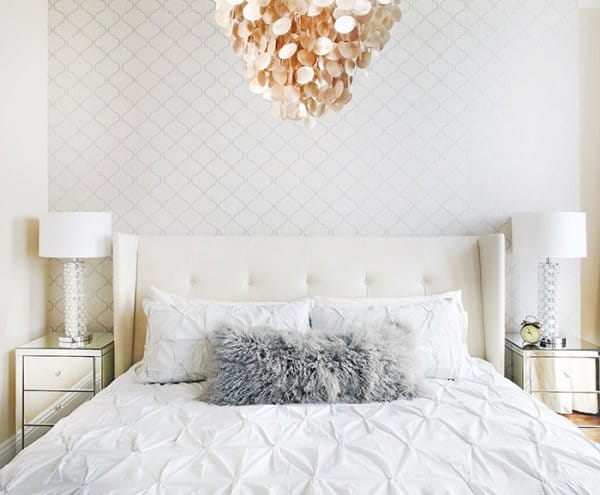
Texture plays a crucial role in injecting depth into a monochromatic room. Without combining various textures and surfaces, your eye will read everything in the room as flat. Different textures include wood (reclaimed, walnut, espresso finished, etc), glass, mirror, lacquer, leather, fabric (linen, velvet, silk, etc), and metal (gold, iron, chrome, etc).
In this bedroom, we combined wallpaper with a subtle motif, a leather headboard, mirrored side tables, a natural shell pendant, and a textured fabric bedspread to create a beautiful monochromatic space that is visually interesting.
Bed, Sunpan, www.sunpan.com; Mirrored side tables, Style in Form, www.styleinform.com; Chandelier, West Elm, www.westelm.com; Wallpaper, Graham Designed by, LUX Design, www.luxdesign.ca; Photography by, Lisa Petrole
Latest posts by Canadian Home Trends (see all)
- 2026 Design Trends: The Evolution of Home Design - March 19, 2026
- Expert Bathroom Design Secrets from Canada’s Best - March 19, 2026
- Treasure Hunting: Discovering Unique, Locally Made & Vintage Home Décor - March 19, 2026


