While the idea of a monochromatic room can be quite appealing, it is often very hard to execute. You might find that your space lacks variety and contrast, rendering it dull and uninteresting. Here are three trade secrets for creating a monochromatic room that is magazine-worthy.
Text by Paige Johnston, As Seen In Canadian Home Trends Magazine Winter 2014, Digital Exclusive
Layer Patterns
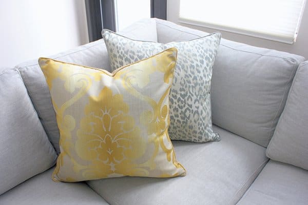
As with textures, layering patterns will help to create
a more dynamic look. Don’t be afraid to mix different
motifs, especially in your fabrics. An easy way to do
this is with throw cushions!
In this living room, we layered a
leopard print pillow with a damask
patterned pillow.
Pillows, Peridot Calgary, www.peridot.ca, Custom sofa, Van Gogh, www.vangoghdesigns.com; Designed by, LUX Design, www.luxdesign.ca; Photography by, Aynsley Kirk
Latest posts by Canadian Home Trends (see all)
- 2026 Design Trends: The Evolution of Home Design - March 25, 2026
- Expert Bathroom Design Secrets from Canada’s Best - March 25, 2026
- Treasure Hunting: Discovering Unique, Locally Made & Vintage Home Décor - March 25, 2026


