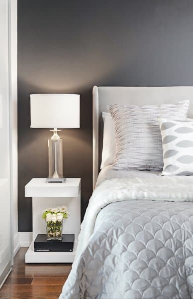
While the idea of a monochromatic room can be quite appealing, it is often very hard to execute. You might find that your space lacks variety and contrast, rendering it dull and uninteresting. Here are three trade secrets for creating a monochromatic room that is magazine-worthy.
Text by Paige Johnston, As Seen In Canadian Home Trends Magazine Winter 2014, Digital Exclusive
Vary Your Colour Shades
For the finishes, furniture, and accent pieces that you
choose, make sure to vary the shades of your chosen
colour. This will not only work to add visual interest to the
space, but will help, too, to make it feel larger. If you are
painting your walls, pick a feature wall and paint it a dark
shade within the palette you’re working with.
This bedroom, by LUX Design, has
chosen gray as the colour for its
monochromatic theme. Take a look
at the varying shades of gray used.
The headboard is the lightest gray, the
bedspread a medium gray, and the wall
behind it is painted a dramatic dark gray.
Bed and Side Table, Sunpan, www.sunpan.com; Bedside
Lamp, Homesense,www.homesense.ca/en/index.asp;
Designed by, LUX Design, www.luxdesign.ca; Photography by, Lisa Petrole
Latest posts by Canadian Home Trends (see all)
- 2026 Design Trends: The Evolution of Home Design - March 30, 2026
- Expert Bathroom Design Secrets from Canada’s Best - March 30, 2026
- Treasure Hunting: Discovering Unique, Locally Made & Vintage Home Décor - March 30, 2026


