(NC)—Bold, exterior colour is something we love to see on holiday homes in exotic places. Why is it then that we shun it for the exterior of our own home?
While we want our paint investment to stand the test of time and feel it should blend into the streetscape, colour experts like Janice Lindsay of PINK colour + design tell us that the back of our house can tell quite a different colour story from the front.
“It may seem strange to choose a different palette for the back,” says Lindsay, “but in fact, we use the back of our home quite differently.” The back is more personal and less formal, she observes. “And since you never see the front and back at the same time, they don’t have to be the same colour.” Lindsay advises to make a smooth transition on the side, and then do what you like. Have fun.
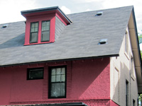
The terra cotta rose colour on the back is more exciting, exotic and family friendly than the front's behave-yourself-neutral. It blends with the red brick on the side of the neighbour's house. Colour design by Janice Lindsay.
“Think about where you would like to vacation, and choose your backside colours to take you there. It will feel like you are on holiday every time you step outside,” she says.
From the PPG Pittsburgh Paints Voice of Colour palette, Lindsay offers this guide to colour holiday destinations:
• Whites like Winter Mood (512-1) are tropical. Add indigo blue to white for the Mediterranean (Blue Odyssey, 347-6).
• Pastels are Miami in general and South Beach in particular. Try Cedar Beige (227-4), Frosty Glade (256-4), or Bleached Spruce (208-4).
• Blacks and charcoals on the body and trim look Japanese. Try Black Magic (518-7), or Black Elegance (531-7).
• Ochre and sienna (Toffee Crunch, 216-4) evoke Tuscany or the South of France.
• For the warm and rustic feel of Mexico check out the sunny yellows and oranges of the Hacienda Style collection at voiceofcolour.com.
• A mix of bold colours can be Jamaica or Latin America. (Look at your summer wardrobe for inspiration.)
• Mixed greens melt structure into foliage and enhance the garden experience. (All greens look good together.)
Some of the same rules do apply to back and front. The eye is attracted to the brightest or lightest things, so avoid white on trim unless you have really great trim. Instead, go tone-on-tone and make the trim a lighter or darker version of the body colour. Warm grey works with all colours. Paint out ugly things in the body colour so they disappear. If you want flowers or special features to stand out, give them a backdrop of greyed or dark colours.
Painters always advise to invest in top quality exterior paint. From PPG, for example, the Manor Hall Timeless exterior line is self-priming, bridges cracks, gives one-coat coverage in many cases and comes with a lifetime guarantee. They say the modest incremental cost is well worth it.
If you want to use bold colours but feel cautious, use them close to ground level where they are less obvious to neighbours, can be easily changed but still show personality where you can see and enjoy it. Don’t worry that summer colours may seem a little odd in the winter. You won’t be sitting out there in the cold months.
www.newscanada.com
Latest posts by Canadian Home Trends (see all)
- 2026 Design Trends: The Evolution of Home Design - April 30, 2026
- Expert Bathroom Design Secrets from Canada’s Best - April 30, 2026
- Treasure Hunting: Discovering Unique, Locally Made & Vintage Home Décor - April 30, 2026

