Design by Tobi Fairley
Tobi Fairley remodeled her two-storey, 2,500 sq. ft. home with a desire to create a gracious living space for her husband and daughter. She also wanted well-groomed rooms to entertain in – especially during the holidays.
“The first thing I do is select the upholstery and the one fabric pattern in a room that will be dominant. It could be a fabric with the boldest or the biggest pattern,” Tobi observes. For a pattern palette that works, Tobi advises using varying scales of patterns “or they will fight each other.” Tobi chooses her floor coverings last. “It should definitely coordinate with the colours and patterns in the room, but it should be more subtle. You don’t want to constantly draw the eye down to the floor.”

Design by Tobi Fairley
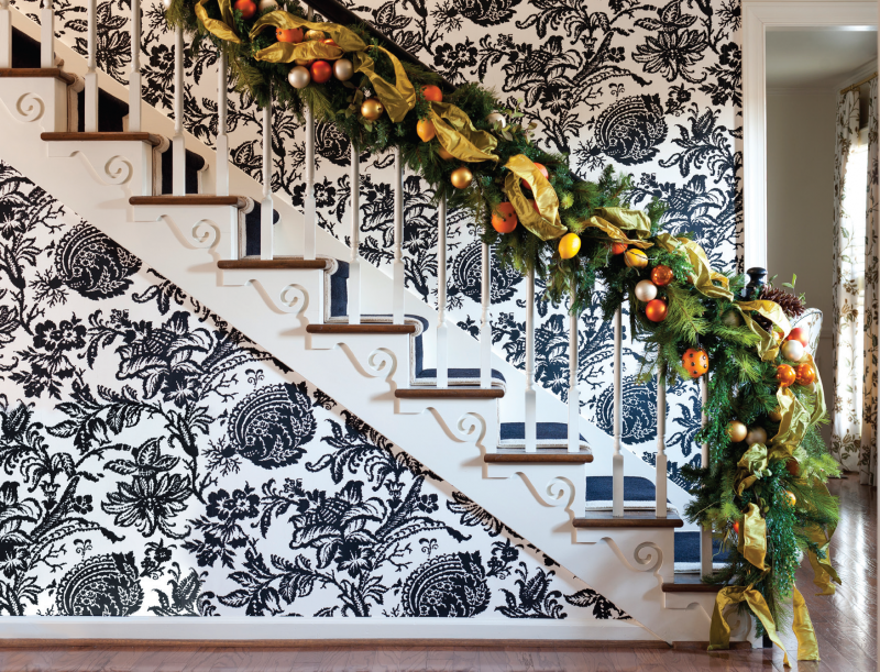
Tobi’s entry hall gives visitors an exuberant welcome. On the hall’s right hand side is a gracious staircase. Its wood detailing is outfitted in crisp white paint that frames the oversized white and black toile wallpaper. “I added the moulding under each riser to give it some architectural interest,” Tobi notes. She and her husband chose the 1970s era home because it was “built with care and a lot of detail.”
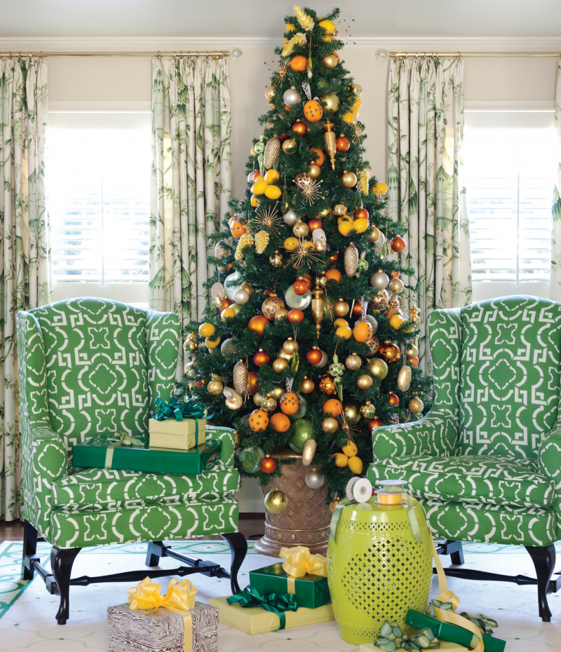
“When I design a home, I like to have the rooms flow well and a good colour story is one way to do that.” In these rooms, green is a fresh, vibrant accent colour. “The inspiration for the living room was the gorgeous green wing chairs,” Tobi comments. The living room, on the entry hall’s left side, blends traditional with contemporary design. The chairs are traditional with a twist. Their ‘brocade’ is graphic and stylized. Visually framing the chairs and Christmas tree is a window treatment of drapery and white plantation shutters.

Design by Tobi Fairley
The tree’s vibrant ornaments also appear in the family room and on the staircase. Pattern repetition creates unity in a home’s design – including gifts under the tree. The key to working with bold design statements is keeping accessories to a minimum. Tobi’s colour motifs, patterns, and bold graphics are restated in the fabric in the window drapery, chairs and accessories. This gives the rooms a cohesive narrative. Attention to detail brings all the design elements in a room together.
Leading from the entry hall is the family room where a handsome wood-paneled “replace draws family and friends together. “I wanted it to “t the clean traditional look of the décor, with a neutral colour that balances the colour of the brick.” Neutral walls, flooring, and upholstered furniture act as a foundation for the room’s patterns. The toil fabric in the chair and draperies reiterates designs found in the living room and staircase. “When decorating a mantel for the holidays, I love to remove everything that is not part of the holiday theme, and then give the mantel a lush and full look.”
“I loved how the design looked – fresh and colourful”.

Text by J. Lynn Fraser, Photography by Rett Peek
As seen in Canadian Home Trends Magazine Fall 2014
Sources:
- Space Designed by Tobi Fairley, www.tobifairley.com;
- Green Chairs, Barclay Butera, www.barclaybutera.com;
- Drapery, F. Schumacher, www.fschumacher.com;
- Paint, Sherwin Williams SW 6120 Believable Buff, www.sherwinwilliams.com;
- Wrapping Paper Designed by Tobi Fairley, www.tobifairley.com;
- Black and White Chairs, Hickory Chair, www.hickorychair.com;
- Black and White Fabric and Draper Panels, F. Schumacher, www.fschumacher.com;
- Rug, Karastan, www.karastan.com;
- Wallpaper in Hall, F. Schumacher, www.fschumacher.com
Latest posts by Canadian Home Trends (see all)
- 2026 Design Trends: The Evolution of Home Design - March 31, 2026
- Expert Bathroom Design Secrets from Canada’s Best - March 31, 2026
- Treasure Hunting: Discovering Unique, Locally Made & Vintage Home Décor - March 31, 2026


