
The Challenge: We asked two designers to create a design concept for a bedroom. The focal point of each room is a custom handmade bed that was designed and built specifically for this challenge by Grain & Burl. The mix of wood and steel creates a bed that works well in a wide variety of design styles, adding a modern touch to a rustic space, a warm natural touch to a modern space or an industrial feel to a cozy, oasis! The designers were asked to select luxury, Canadian made fine linens from St. Geneve to bring the cozy to their bed and then accessories the rest of the room as they wished.
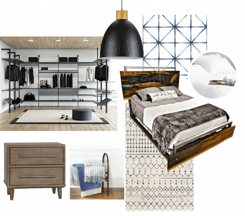
Sandra decided to use the bed in a modern minimalistic setting and paired the custom bed with plush, hotel-inspired white linens. You can see more of her look and sources here.
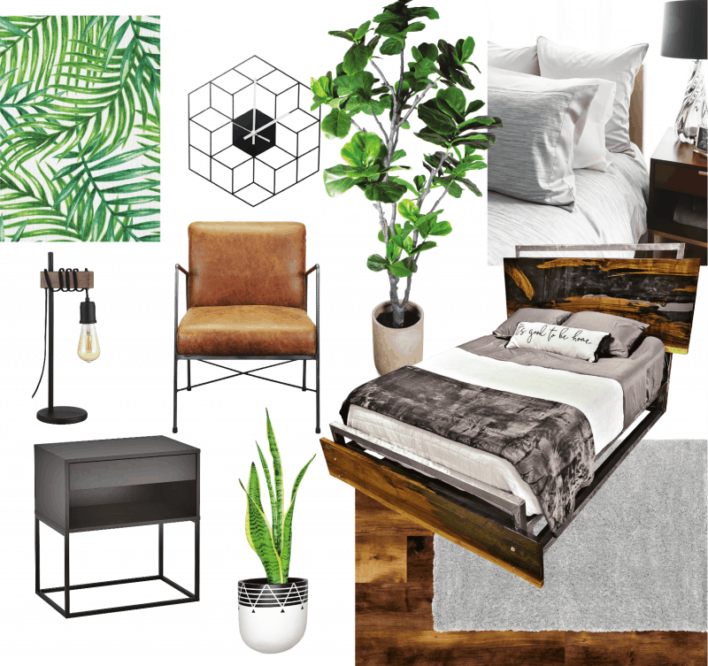
Marc choose to create a bedroom inspired by the idea of curling up in a lush, magical forest in the most luxurious linens. The look pairs nature-inspired textures, patterns and colors with clean, modern lines. You can see more of his look and sources here.
VOTE FOR YOUR FAVORITE!
Latest posts by Canadian Home Trends (see all)
- 2026 Design Trends: The Evolution of Home Design - April 9, 2026
- Expert Bathroom Design Secrets from Canada’s Best - April 9, 2026
- Treasure Hunting: Discovering Unique, Locally Made & Vintage Home Décor - April 9, 2026



Love the look of Sandra’s design simple, clean, organized space
I really like Sandra’s Minimalist look.
I voted for Marc’s bedroom concept because I love the tranquilly of green, plant-themed spaces.
I loved all the greenery.
I liked the clean lines and no fuss!
I like the modern minimalistic setting and the white linens Sandra used.
great contest
I like the nature inspired features. would be great in our cabin at the lake
Love Marc’s design concept for its greenery and lush feeling it gives to the whole look of the bedroom.
I chose Marc’s design because the clean modern style bedroom with warm tones looks inviting, tranquil, & very cozy.
Although I like both, I like Sandra’s a little more. I feel like the bed has more of an industrial look:)
I thought both designs were quite masculine but the green in Marc’s lightened up all the dark wood.
I like the modern look and the white linens Sandra used.
I like the sleek lines in Marc’s design and the wallpaper adds that great pop of colour
I voted for Marc’s because I love all the different textures
modern minimalistic looked like it had more storage.
Sandra’s Minimalist look!
Love the fabrics Marc used
Sandra must know me – exactly what I would pick.
I liked Marc’s with his use of natural textures and all that beautiful green
I voted for Marc’s space beacuse all the greenery makes me happy
I love the way Marc uses nature-inspired colours, textures and patterns in his design.
I prefer Sandras design for this bedroom. I am not a fan of plants in the bedroom.
Sandra’s Minimalist design looks so clean and organized.
Both rooms are beautiful but I like the look of Marc’s with the focus on plants and trees
Marc’s design feels like a relaxing vacation oasis!
I really liked both designs however I think Marc’s design picked up the rich colours of the bed frame in the choice of flooring and leather seating and the metals of the frame in the lighting and side table and chair frame. I also liked the pops of colour in his design making it a bit more inviting
Sandra’s design space is my style with it simplicity and clean lines
I love the greenery in Mark’s bedroom design
I like Sandra’s. It feels simple and clean.
I prefer the plants
I like the plants in Marc’s design
I really love both designs but will choose Sandra’s layout. I love the linens and fringed blankets she has on display and the organized shelving at the back of the room.
I like both but Sandra’s has a better storage in my opinion
I loved Marc’s design because of the natural leather and green added into the space.
Sandra’s Minimalist look is my fave
I voted for Marc’s design concept because it has the warmth and comfort that I like in a bedroom.
I like the concept of bringing the outdoors inside the house.
I love Sandra’s design because of the modern minimalistic setting!
Marc’s room as it has a serenity about it.
I like the hints of blue in Sandra’s bedroom.
Honestly, I like both entries but I don’t LOVE them.
I like Sarah’s minimalistic design.
I loved the textures, and the greenery.
I love the whimsy in Marc’s design
I chose Marc’s design because of the style and colour palette.
I love when plants are in a room . They add life and vitality to a space.
I’ve done the foliage, and huge dust collectors lol Turned to simple likings.
love Sandra’s design board for bedroom!! Classic and simple plus relaxing!! YESSSSSSSSSSSS!!!!
Marc’s for the greenery and bit of coziness.
I love the look of the forest
I really liked the addition of plants and greenery. I felt it complemented the wood of the headboard.
Im an outdoorsy person. Natural elements make for a warm, cozy and fresh atmosphere, perfect for sleeping
Wow! I love the feel of the forest mood that Marc set. I love the flooring and the lighting the curtains and the live plants. It’s so perfect and makes me feel at home just looking at it.
Sandra’s design simple, clean, and love the bed.
Sandra’s design looks simple, clean, and organized
I like Sandra’s style. It is a room I’d love to sleep in.
Like the lamp and leather chair
Love Marc’s as it more natural with all the greenery, looks more relaxing.
I like the warmth and the rustic look of Marc’s design.
I like the minimalist look, Sandra’s
I like the use of plants in Marc’s design because it provides colour during our drab winter months.
loving the combination of wood, leather and plants!
Actually love them both, but there is always a favourite!!!!
Both designers had similar minimalist ideas; but that extra bit of greenery Marc placed appealed to me more.
I like the look!
I chose Marc’s design because it’s so cozy and I love all the green!
I prefer Marc’s design because of the plants.
Amazing I like this look!