

|
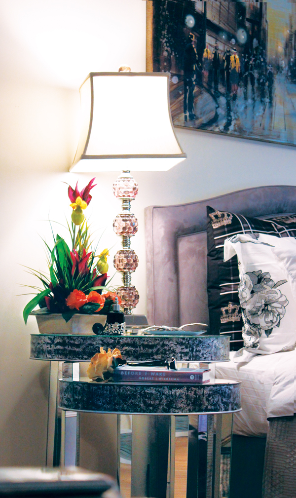
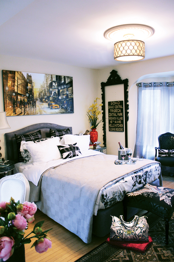
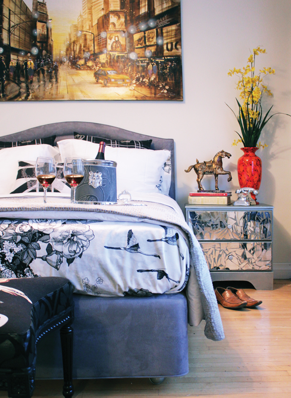
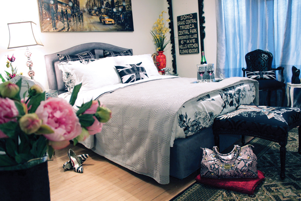
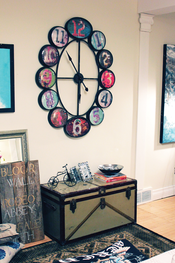
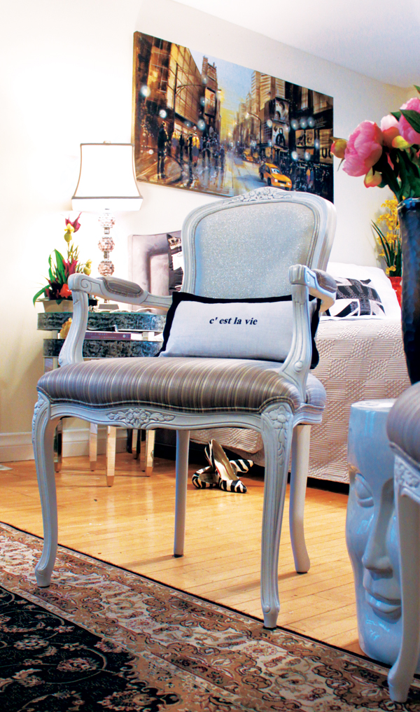
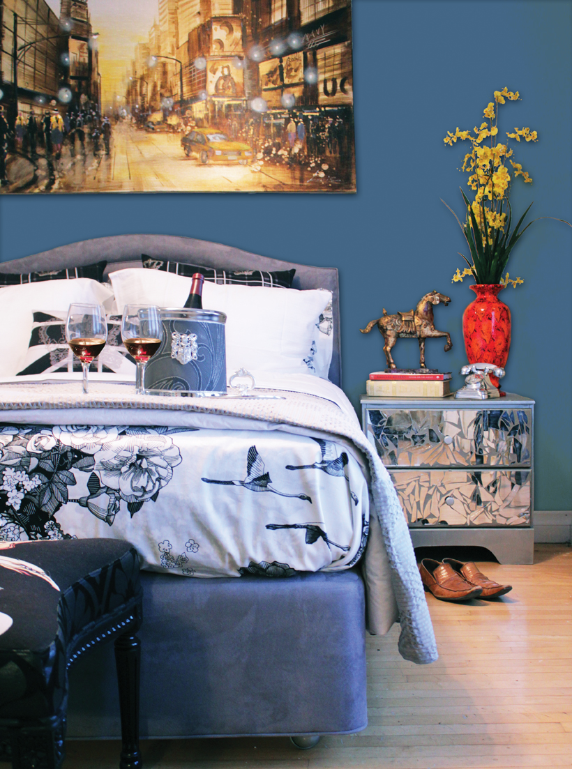
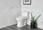
Battle of the Sexes designed by Marc Atiyolil A sexy mix of masculine and feminine accessories were married together to form this Rock & Roll space. The soft almond wall hue (Sun and Star by Para Paints- P2061-04) is complemented by the cozy grey accents (Sophistication by Para Paints P5220-14D). Each accent in the room holds a unique style yet they all blend together into the overall look of the room. The bed’s dramatic neutral colours are softened by the curves in the frame while the pattern in the ottoman resurrects the male spirit within the design. Little pops of femininity and well traveled accents fight for the spotlight while the crystal and burnished silver fixtures disperse an equal amount of light on the entire design concept. Get The Look – Sources Wall & Trim Colours: Para Paints Get The Look – From Drab to Fab Projects Ice Bucket Q&A With The Designer What was the inspiration behind the design of this room? A collection of famous rock stars’ homes. What was your favourite part of the design process? I love accessorizing and adding the final touches. It’s those small pieces that tell a lot about the personality of the homeowners. Why did you choose the colour schemes used for this space? I designed the space with a neutral colour palette in mind (Sun & Star and Sophistication by Para Paints) as to have the individual pieces make statements within the overall design. With that being said, a splash of colour (No Wake Zone by Para Paints) can also be added to accentuate certain features in the room, such as the curves in the bed frame or the reflections in the mirror side tables. What is your favourite feature in the space? I love how many different patterns, shades and textures have come together to form a dramatic design style. It’s edgy, yet somewhere you can see yourself enjoying a good night’s sleep. Of the “From Drab to Fab” projects showcased in the space, do you have a favourite? We have many of our “From Drab to Fab” projects showcased within the space. Starting with the ice bucket to the mirrored dresser. They are all close to my heart. It’s like asking which child you like better, you love them all equally. |
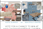
PICK YOUR LOOK CONTEST
ROOM ONE ROOM TWO

Simply changing the colour of a wall can dramatically change the look and feel of a room. Here we have the space with a soft almond wall hue (Sun and Star by Para Paints- P2061-04) in the first version and a dramatic blue (No Wake Zone by Para Paints – P5154-73) in the second version. Do you prefer the neutral almond scheme or a pop of bold, deep blue?
Tell us which look you prefer by leaving a comment below and you will be entered to win one of two great prizes!
Crystal Williams
Latest posts by Crystal Williams (see all)
- Blended Styles Viva Magenta Living Room Design Board - July 18, 2025
- Holiday Family Room Design Board - July 18, 2025
- Modern Farmhouse Dining Room Concept - July 18, 2025


The Blue wall room. Much calmer!
I like Room 2, it is more dramatic
I like the blue – it looks richer
ROOM 2
prefer the blue
I love the pop of deep blue.
I prefer Room #2; the color is more restful, especially for a bedroom.
I like room 2. The dark wall makes the light linen on the bed look brighter.
I like Room 2 the best. Room 1 is too blah.
I think Room 1 looks best. The colour is subtle but nice.
My favourite is Room Two with the blue walls!
blue!
Room 2, because it creates a restful effect, which is good for a bedroom
The soft almond wall hue
At first I would of said room #2 but after examining both of them for a little longer, I found room #1 to be more calming and the accessories looks better behind a neutral/soft colored wall. I would go for room#1 !
The almond, it is more soothing in a bedroom
I love ROOM #2. Blue is my fovorite color, its peaceful and not a hospital blue 🙂
Almond because the room just looks brighter
I prefer Room 2.
I love them both – but would probably pick the almond so that I could change up the accessories to any colours I wanted from season to season
Prefer the blue, because is my favorite color
Blue is the one I love
blue is the best one. makes everything pop!
The blue one
blue for sure
i vote for blue
Room 2 without a doubt!
neutral almond
Room 2. It draws my eye and looks more put together.
Love the 1st room! More calm & warm then the blue.
The room with the blue walls. I find it to look cozier and comfier than the room with the lighter walls.
I like the blue colour — I like more vibrant wall colours as opposed to a neutral colour.
Room one. Room two has too much blue.
Love the blue walls. We have a similar blue walls in many of our rooms.
Room 2 is my definite choice!
the first one, more luminate!
The blue wall gives the room a calmer feel.
i definitely like the blue wall in room two. makes a big difference
I prefer the blue room. It gives it more drama.
I like, “a dramatic blue (No Wake Zone by Para Paints – P5154-73) in the second version.”
the blue room is prettier and warmer to look at.
I like the blue room – the colour is much richer.
Definitely the blue room (No 2)
Prefer look one because it is calmer and I have enough jaggles trying to sleep.
I prefer room #2. More relaxing, calming. Offers a nice peaceful feeling.
Definitely the blue. It makes the objects in the room pop. In the almond room everything blurs together and it just looks cluttered.
I prefer the neutral almond scheme
Room 2 is definitely more peaceful and relaxing…both qualities you want in a bedroom.
I love the second version the best
Like the contrast of the light walls with dark accessories in room 1.
I really like room 2 with the dark blue walls. I am sooo over beige!
the blue room
blue room is more intimate and cozy
The blue wall picks up the blue everywhere else and has a great effect for sure
With so many people troubled by SAD in the winter months. I am partial to the Almond it is bright and has an illuminating effect. My pick, hands down.
The dark room “pops”.
I love room #2 – the blue one! It’s soothing and makes you want to spend a lot of time there – like a little oasis!
blue, cuz its my fave colour
Love the blue! Just makes the whole room pop!
i like the blue coloured room, blue is my favourite colour and i think it just adds a bit more personality to the space. i also like how the decorative accents complement this shade of blue.
I prefer the lighter blue shade. The dark one seems to suck up the light.
#2 is defiantly better
Blue Room
I prefer room 2 with the blue wall it looks more relaxing 🙂
Loved blue ever since I was very young. It brings out the blue in my eyes, as well as the blue shades in the painting in the picture. Would vote for the blue room
Loved blue ever since I was very young. It brings out the blueshades in the painting. Would vote for the blue room
The blue room ( number two) is well done. Very inspiring!
I just love, love, love the dramatic blue walls. It freshens the look
of every item in the room also. Not only that, but I am sure it would even
make the occupant look exceptional. I also think the darker blue makes the
bedroom conducive to a more restful sleep.
Blue very comforting!!!
I like Room 2. It has more “oomph”
number 2 of course…number 1 is too bland..number 2 is more intimate..love the mens boots..they certainly fit in both rooms
blue because it pops more!
I prefer the almond. It brightens the room and makes the blues in the rest of the room stand out more.
blue
I absolutely love the color scheme with the blue walls…it compliments everything perfectly
I love the blue!
I like room #1. Visually I think it looks more eclectic and the decor items stand out more against the neutral background. To me the decor looks more interesting and draws the eye to many different items.
prefer the almond room personally.
I prefer almond – the blue is a nice color on it’s own but I don’t feel like it goes well with the room – the almond is more calming – perfect for a bedroom, and it lets the furniture and other features of the room really stand out without taking over
ONLY BLUE WILL DO IT MAKES THE ROOM POP!
I LOVE THE BLUE
I am drawn to the blue room too! It really makes the red vase and the artwork pop.
I think for me the lighter (almond) colour would suit my tastes more overall because one
doesn’t need to worry about matching as much.
Room #2 – I lovvve colour!!
Not so long ago I would have said blue but now i’m feeling the almond more
I love the blue, so room 2 is for me. It makes the most of the accents and really makes the bed look soft and inviting. This room look creates a restful, relaxing atmosphere; perfect for sleeping.
I like the room 2 in blue. It seems less bold and bright and is more relaxing.
i like the room 2 with darker blue
Blue. There is more depth to it. Gives a sense of tranquility in the bedroom which most people need!
the blue room.
To be perfectly honest, I prefer the lighter shade but that’s because on first glance it looked more like a light lilac-blue instead of almond. The dark blue shade would not provide enough contrast and would soon tire the eye.
I love room 2 the best. The blue on the wall gives a pop of colour and ties all the accent pieces together. It’s modern and fresh. The lack of colour on the wall in room one is too plain for me and gives the room a dated feel.
I like room 2. The dark blue walls are really cozy…
room two the blue
I like the second one with the blue wall as it makes the colours really pop!
I prefer room #2 the blue room
Blue is my pick, makes the room look cool, relaxing and trendy
Room #1 – more cab be changed with that wall colour to transform the room again…
The blue room ( #2) is truly inspiring and calming!
I like look #2. The blue walls are relaxing.
I like Room #2. The light blue paint is relaxing.
I prefer room 2 with No Wake Zone by Para Paints
Hi. I like the blue room best.
The blue room is much more dramatic and soothing.
I love the blue! It’s almost the same shade as I’ve had for the last couple of years in my bedroom…what’s not to love!
I absolutely am ecstatic about the space with a soft almond wall hue (Sun and Star by Para Paints- P2061-04) in the first version because I really could really relax and experience total peace of mind, soul, and spirit!
I love the blue it makes the room look much warmer
Room #1 the light colour looks so clean and bright. I would love a room like this.
I like Room #2 because of the blue background. It gives it a warm feeling!
I like room 2 the best. The dark blue is more dramatic. Make everything in the room look better.
room one! When you look at room one your eye is drawn to all the different decorations in the room. When you look at room two you see blue and your eye leaves the room. The blue takes away!
I like room #2. The blue paint is soothing.
love no 2′ great colour
The blue room has a more dramatic effect. It brings out the colours of the rest of the room.
I like #2..the Blue is warm and almost hugs you
I like #2 better..the blue is warm and almost hugs you
I prefer #2. The darker blue background seems neater, less busy and more calming for a nights sleep.
The blue room looks more comfortable. The other one just looks plain.
I like #2.
Room two, the blue room is the nicest!
Almond is warmer looking.
I like the blue room better, it feels more rich and luxurious.
I prefer the room with the blue walls. It is very striking.
I prefer #2, it’s more dramatic, more interesting.
I like #2. I love Blue.
I prefer room #1
I prefer the blue room.
I prefer the neutral almond colouring for the bedroom. For me, it’s a bit more zen-like.
I really like the blue wall color. Very soothing.
I prefer the almond hue
I prefer room #2
Room 2 looks great.
The blue! Love the colour and how warm the room looks.
I love the light blue color…looks like most of my home!
I like the blue, which is surprising as I am not a fan of the colour blue
I like the blue as it looks warmer.
The blue room definitely
I love the dramatic blue room!
Room 1 looks best.
I love the second room, with the No Wake Zone by Para Paints – P5154-73. The word “dramatic” does not come to mind so much as “soothing”, which is what I’ve always felt a bedroom should be.
Room 2 with the blue has a nice, relaxing look.
I liked both the colour schemes, but the Almond hue is the one I would pick ultimately I think. The neutral Almond colour would add a warm ambience, soothing, calming feeling for a bedroom. Thanks!
i prefer the “lighter” room! a more relaxing atmosphere….
Room #2 is definetely my favorite; perfect harmony!
The blue room because it pops.
I prefer room two as the bolder color really makes all the elements pop.
I prefer the blue – it feels warmer to me
I love the blue. It makes the room cozy you could wind down a busy day in this room
Definitely blue room
I love the colour of Room 2
room 1, cause the blue is too dark
I like the blue
Room 1 – it looks brighter and I’d rather a naturally brighter room, any room than a darker one
I love the blue of Room 2!
I prefer the bold blue room! I love how everything stands out against it
I prefer the pop of the deep blue color for the bedroom.
I like the blue room, very soothing.
The blue is my #1 choice, the almond is nice too!
Room 1. Although I like the use of colour in the second one, it’s a bit too much blue for my liking.
Blue
“Sun and Star”-I love the almond!
I would go for the almond personally…It seems more calming.
blue is more colorful
I prefer the Blue – it really cayches my eye.
Def room 2 – calming and mature
I like Room #2, with the dark, blue walls
BLUE because it has a calming tranquil effect
It has to be almond. I don`t like colors.
Definitely the blue room
room 1
room 2
I love Room 2 with the dark blue walls – they make the room seem very peaceful like the sea
blue room
Room 1 is my favourite, seems much brighter
I like the “soft almond” paint colour as it it makes the room “pop” out at you – so that you notice everything clearly and everything is light and bright.
I prefer the Blue Bedroom
Almond! Just love that colour!!
I prefer the room #1
I like the blue as it looks restful and calming.
I like Room 2, the blue makes the room feel warmer.
love room #2 as it is richer looking
Love the blue
I prefer the blue, it makes the accessories stand out more.
I like the blue
I like the blue for it’s richness and depth.
Blue – much more dramatic and cozy
I like the blue wall its like my room!
Room 2 Love love love the blue
The blue in room two just brings it to life
i pick room one, the blue wall is too dark for me for a bedroom
I prefer the blue room for its rich, calming colour
I love the deep blue….very enveloping and calm
I love the blue room it has synergy. Looking at it makes me feel happy. The cream wall fades into the sheets.
I love the blue, it makes the room feel more relaxing and inviting !!
Blue, because it looks so much warmer and inviting.
Thanks for the opportunity!
I like room #2 -the blue room
Room Two. While Room One feels light and airy, I like the solidity of Room Two’s walls.
Room 2 , because the blue wall paint makes the room more richer.
The blue room is my favourite
The blue is far more dramatic and the contrast sets up the other accents and accessories in the room. For my taste, I should say that “less is more” would apply to this space. WAY too many decor items.
While I think both looks are wonderful I’m leaning towards the blue for the calming effect 🙂
I prefer the blue, its warmer.
I like Room 2 Love the blue
As much as i am a Blue lover…. I think that I would go with the almond.Yes boring to some, but my answer. That blue is maybe not coming across well on my laptop, it looks a bit dull.
je prefere le regime aux amandes neutre car je trouve que ca agrandit la piece.
Like the blue – more personality and interesting!
I like Room 1 with the almond wall. It seems brighter and more cheerful.
Love both looks but really love the contrast the deep blue gives the room!
I prefer the blue wall colour as I think it shows the colours on the bed to a better advantage. I don’t have any “white or shades of same” in my house. Colour makes me happy.
The blue makes the picture much more dramatic, in my opinion
Blue all the way, it is georgous!
I like Room 1
I prefer the first room
I like the blue wall paint. Very calming and relaxing.
Blue because its my fav colour
the almond is more restful. Room is lovely but too busy for a bedroom
Room #1 as it looks fresh and more roomy. More crisp and is a room suitable for male and female in my opinion…
I love the blue, the colour brings life to the room.
I prefer the blue wall. Room two. The accent colors pop more in contrast and the blue wall gives the painting above the bed the mood it deserves.
I like the almond colored room
The blue makes the picture much more dramatic, and the room more inviting.
This is a hard decision, both rooms are very elegant but the blue one has more pizzazz…… i’ll vote blue
I prefer room 1, I like pale colour
Almond sorry it is easier to change a object such as a bedspread to blue than paint a wall over .
Yay blue 🙂
I like the blue room
I prefer the blue room
I prefer having colours in my room so I’d definately go to the blue walls. Its still neutral however I feel it gives the room more personality.
While I think both look good, I prefer light coloured walls. So, my choice is the almond wall hue.
I like room 1 for the calming feel and room two for its warmth.
i like the blue/gray
I prefer room 2 because the blue wall really makes everything else stand out.
Almond….It is a soothing color for the room.
I like the blue…..it feels cozy and ‘cacoon like’ which I feel a bedroom should be!
love the blue room!!
Blue
I prefer room 2 because of the contrast the deep blue gives.
Blue is good.
I prefer the blue for the warmth
I prefer the almond. Both are nice but the blue looks a bit too masculine for my taste.
I like the light room better – the blue feels cold and unwelcoming to me.
I prefer the blue ,,, it helps to raise the character of the room and shows off some of the accessories much better than the other room … Good job on both rooms though !
I find the blue room very pretty
If the room were oversizd I’d go with the Blue to make it feel more cozy and add warmth, but for an average-sized room I’d go with the Almond to open it up and add brightness.
Room #2 (Blue); it is warmer & feels more welcoming… relaxing; just my opinion…. that how it feels….
blue… becuase it makes the other colours pop more
I am drawn to the almond wall colour, as it seems to work better (in my opinion) with the other items in the room.
I really like the blue wall.
I like the colours of the first room
I love the gorgeous, peaceful yet stylish blue room! 🙂
The blue is soooo pretty