Use Patterns, Shapes, and Lines
An interesting way to use color in a space is through geometric shapes, blocking, and lines. Think: wallpaper-like patterns, two tonal walls, and ombre. The trick part boils down which color combos will look best and most harmonious. We suggest complimentary hues that fall on opposite ends of the warm/cold spectrum. Tip: Use painters tape to create geometric patterns and straight lines, and to prevent colors from bleeding together.
Our Beauti-Tone paint suggestions for dual colored walls: complimentary hues, such as You Look Mauve-lous and Mantis Green.
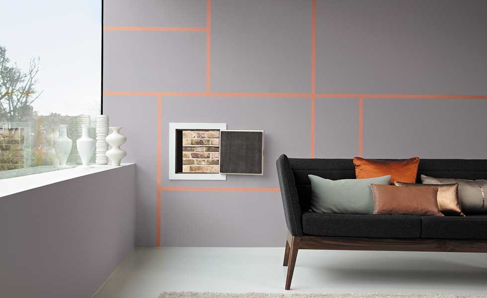
Photo Source: realhomesmagazine.co.uk
Paint Your Ceiling
Just like on your walls, the paint you use on your ceiling can add or take away visual weight. Create the illusion of a more intimate space with a dark hue on the ceiling, or make a small space seem more spacious with a light one. Tip: The most efficient way to paint a ceiling is to to begin with the corners and perimeter. To fill in the center of the ceiling, use a roller to paint in continuous, parallel lines, rolling towards yourself.

Photo Source: laurelberninteriors.com
Our Beauti-Tone paint suggestions for ceilings: Saxon Blue (to make a space feel more intimate and luxurious) or Green Glass (to make a space feel more spacious).
Create a Faux Stair Runner
An actual staircase runner can look dated and end up being a tripping hazard. A painted runner, on the other hand, is edgy, modern, and trip-hazard-free. Use the runner as an opportunity to add a bold pop of color, or use it to create cohesion between the color schemes on the upper and lower floors. TIP: Before you begin painting, you’ll want to fill any gaps between the rises and the treads using a foam filler, and smooth it over with spackle.

Photo Source: houzz.com
Our Beauti-Tone paint suggestions for painting a faux stair runner: On the Greens, Optimistic, or That Tickles for a bold pop of color.
Freshen up Your Trim
High gloss paint works best for trim because it reflects the light, making this previously neglected element of your home stand out. For a contemporary effect, paint the walls and the trim the same color, with the walls being the flat version of the hue, and the trim being a high gloss version. TIP: For best results when painting your trim, sand, and paint using short, horizontal strokes.

Photo Source: parnellpainting.com
Our Beauti-Tone paint suggestions for trim painting: Satin Slipper or Satin Sheets.
Incorporate Your Furniture
Rather than selecting the paint color for your walls based on the furniture you already own, why not expand your possibilities and restatement-ize your statement pieces. In the photo below, a previously brass statement chandelier was painted white, transforming the fixture from dated to contemporary. The basics for furniture painting are relatively straightforward: sand, prime, paint, and protect. TIP: Use a water-based protectant to ensure a long life for your paint job.
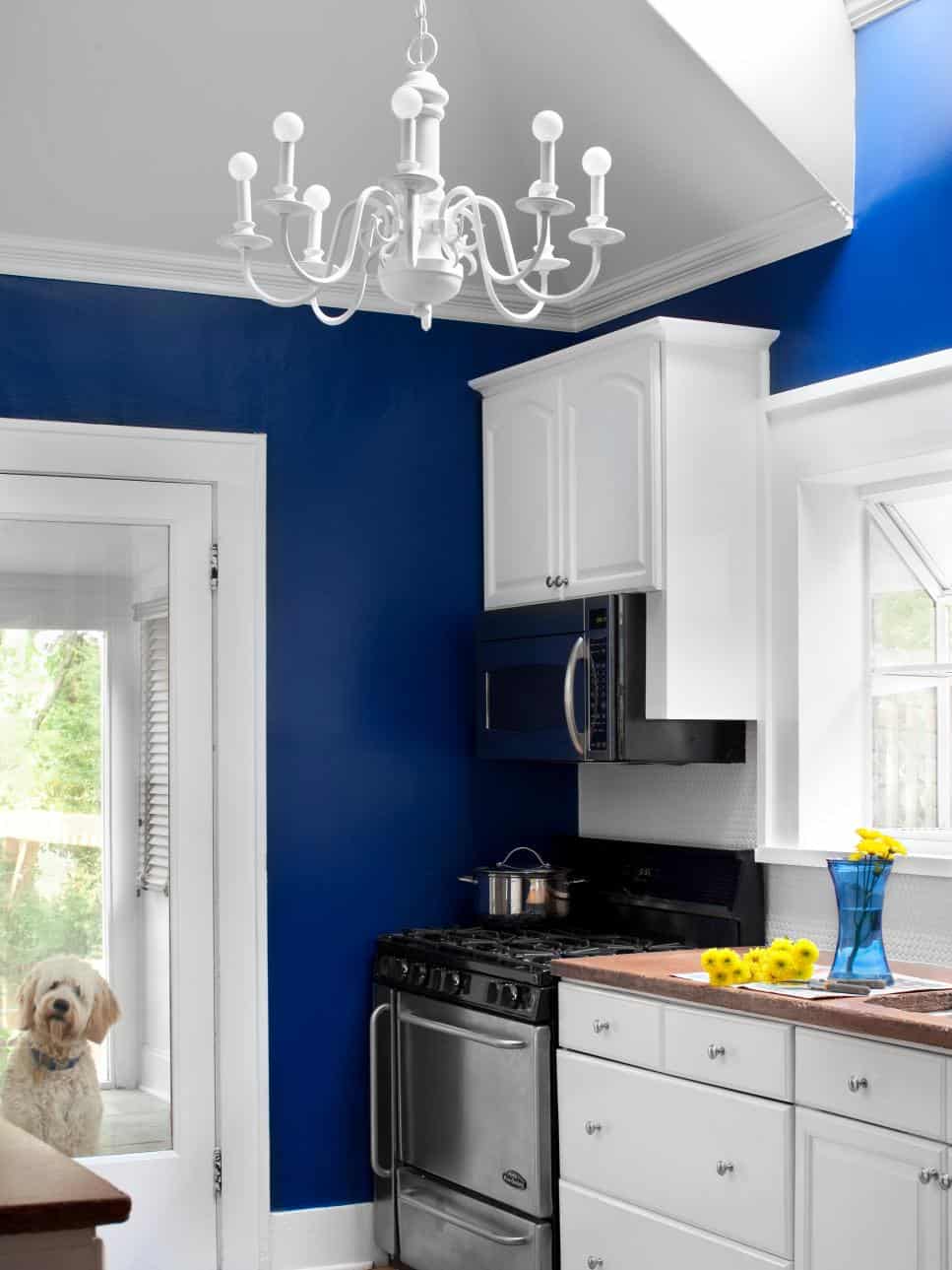
Photo Source: hgtv.com
Our Beauti-Tone paint suggestions for furniture painting: White Dew or Roman White.
Latest posts by Canadian Home Trends (see all)
- Dining Room Design Tips - July 18, 2025
- Practical Luxury in Forest Grove - July 18, 2025
- The Hidden Value of Great Design - July 18, 2025


I am on my way to buy PAINT!