This week, Pantone announced it’s Color of the Year for 2018 and once again, interior designers and color experts are scratching their heads trying to understand why. To be honest, I find that their choice for Color of the Year always surprises me a little but I am actually quite excited about this year’s color!
So what’s the color?

Pantone has chosen Ultra Voilet, a blue-based purple, as their Color of the Year for 2018. According to their website, this color is “a dramatically provocative and thoughtful purple shade, PANTONE 18-3838 Ultra Violet communicates originality, ingenuity, and visionary thinking that points us toward the future.”
Why do I love it?
This bold purple is a beautiful color. For me, it would be the perfect color to describe who I want to be – strong, bold and beautiful. For lack of a better term: purple adds “feminity” or softness to a color scheme but in a bold, strong form. And since purple isn’t the first color most people turn to for their homes, it also creates a space that looks and feels unique and memorable quite easily!
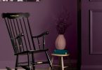
Another thing I love about this color is that a little goes a long way. Because it is a bold, dramatic color, you don’t need a lot to make it really pop. Anyone who knows me knows that I like to keep things simple so if I can make a statement with only a few pieces, I’m in! Take the space above by Kim Bartley that we featured back in 2014. A few pops of a bold purple are all it takes to add a ton of personality to an otherwise neutral space.
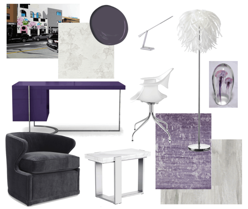
I particular love purple as an accent color for a work space or home office. Purple is often associated with royalty and used to symbolize power, luxury and ambition. It is said to symbolize wisdom, dignity, independence and creativity as well. I find that, when used properly, purple can create a space that is energizing and stimulating to the senses.A few months ago, we challenged one of our design bloggers, Designer Michelle Cook, to create a dream home office design board and she chose to use purple paired with a neutral palette, modern shapes and luxurious textures. I absolutely loved the final design board and it renewed my love for this bold color choice!
Where will you use it?
Do I think we’re going to see a sudden surge of people decorating their homes in purple this year? Probably not. Purple is one of those colors that you either love or hate and if you don’t love it, it’s an easy color to get tired of. I don’t think we’ll see a lot of people suddenly falling in love with the color. That being said, I would love to see more homeowners embracing the use of purple in their homes.
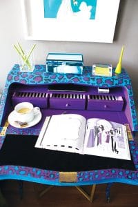
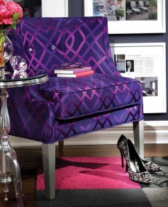
Designer Nicholas Rosaci, our DIY Editor, is known for his use of bright color as seen on the blue and purple desk makeover he did earlier this year or the gorgeous home office we featured back in 2013 that featured a deep bluish purple on the walls and a beautiful, bold purple accent chair!
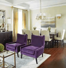

If this is a little to bold for your tastes, adding a few purple accents to a space is a great way to play with the color in a more subtle manner like Jackie Glass did in the space that we featured in 2015 which included bold purple accent chairs in the living room and a soft purple feature wall with a few bold purple accents in the bedroom. Some of the easiest ways to add this color with minimal commitment: fresh florals, vases, artwork and throw pillows.
What do you think of Pantone’s choice for 2018? Do you love it or hate it? Will you use it? Let us know!
Crystal Williams
Latest posts by Crystal Williams (see all)
- Blended Styles Viva Magenta Living Room Design Board - July 18, 2025
- Holiday Family Room Design Board - July 18, 2025
- Modern Farmhouse Dining Room Concept - July 18, 2025