Home office color choices – When selecting a color palette for any room in your home, it’s important to understand the effect that those colors will have on your emotions, energy, and focus. Choosing the right colors for your home office can play a part in maximizing your productivity and minimizing your stress. If you’re puzzling over what colors to use in your workspace (and which to avoid), check out our color psychology cheat-sheet below.
Blue, green, and violet
Blue, green, and violet are cool colors, known to promote feelings of peace and relaxation. These chilly hues are perfect for a bedroom or bathroom, but they can be counterproductive in an office setting. Most shades of grey also fall under the category of “cool.”
Yellow
On the other end of the spectrum, yellow is an attention-grabber. Yellow is associated with energy, optimism, and activity—which could work in some office settings and not others. If you have a job that relies heavily on your continuous focus, yellow can be disruptive. Alternatively, for those in creative professions, yellow can help to energize and get creative juices flowing.

Red
Red is a color that’s loaded with drama and energy. Generally speaking, it isn’t recommended to use red in a large format in a home office setting—instead, consider red artwork and accessories. Find yourself easily bored? Consider artwork, an area rug, or a lampshade that incorporates red.
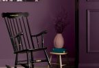
Purple
Purple is ideal for those who are creatively inspired, but also crave tranquillity. If this is you, try a warm shade of lavender.
Home Office Color Choices in Shades of white and neutrals
White and other light neutrals tend to be associated with cleanliness and organization, making them a good choice if you’re in a profession that requires concentration. Warm shades of grey are also known to have a similarly calming effect.

Green
Green is a fresh take on a neutral, evoking feelings of calm and vitality in equal parts. A shade of green with undertones of yellow is unoffensive to the eye and can promote concentration and feelings of balance.
For more great ideas, click here.
To Shop for more great decor, click here.
Latest posts by Canadian Home Trends (see all)
- Dining Room Design Tips - July 3, 2025
- Practical Luxury in Forest Grove - July 3, 2025
- The Hidden Value of Great Design - July 3, 2025