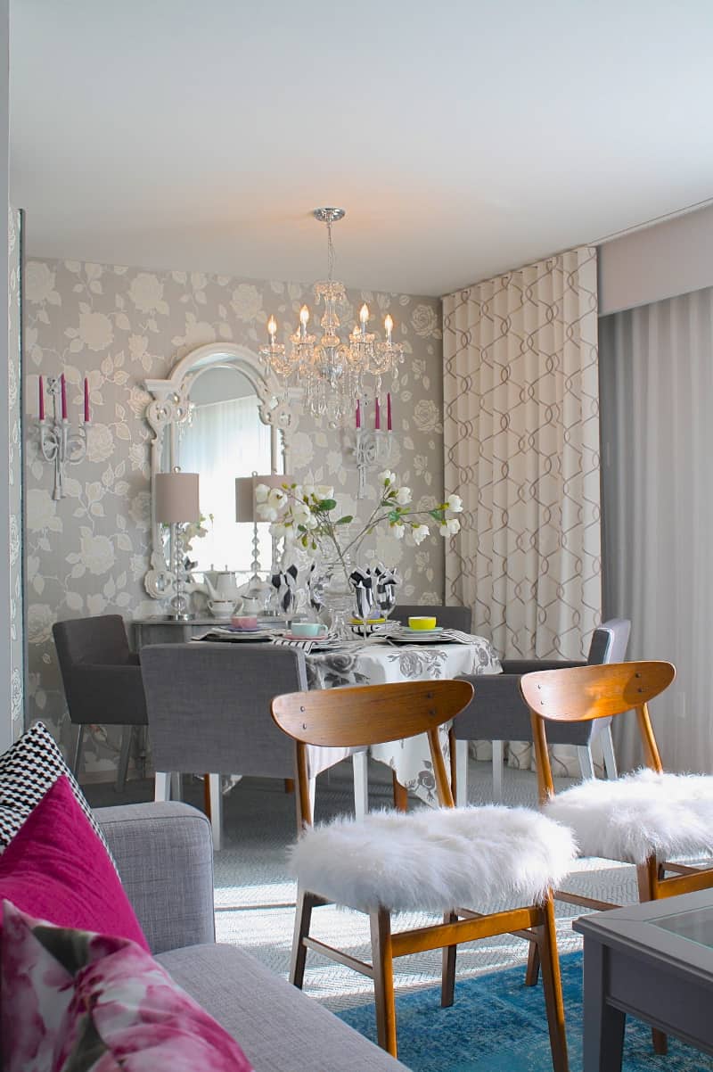
DIY Editor Nicholas Rosaci’s 100-year-old grandmother wanted to keep living in her home for as long as possible. To meet her needs, both practical and aesthetic, he created “senior-friendly” rooms that acknowledged her sophistication and elegance. Rosaci created an updated “living space, making it more friendly and accommodating for her needs, but in a stylish way.”
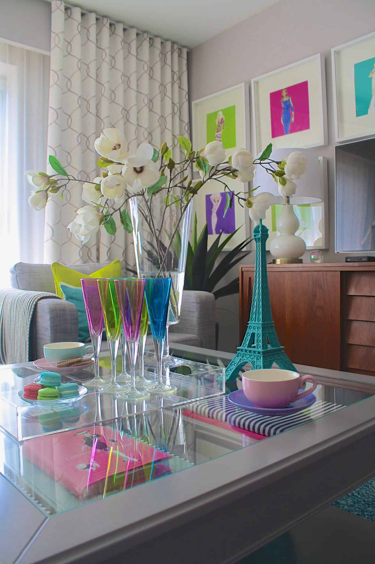
The apartment’s foyer, with a wink of whimsy, is imbued with ‘je ne sais quoi’ French style. Functional but refined the glass and chrome table is visually spare but artfully redirects light from the Eiffel Tower lamp, metal rimmed mirror, and clear glass vase. The rug and fanciful chandelier announce the apartment’s repeating motifs of passionate pastels along with French stripes. “Stripes are a perfect accompaniment to any fabric story. They provide linear edge to a very soft and feminine scheme,” Nicholas observes.
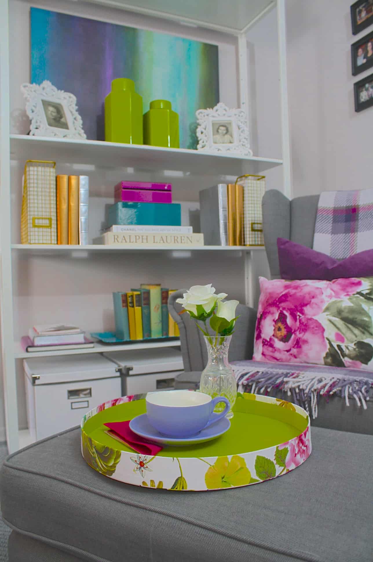
In the reading nook to the right of the foyer parading patterns are posed beside pewter greys on the walls, carpeting, and upholstered furniture. The bookshelf’s crisp white rectangles reiterate the graphic lines of the throw and framed photos. “Simply White by Benjamin Moore is a favourite colour this year and looks great when a space is punched up with colours and textures.”
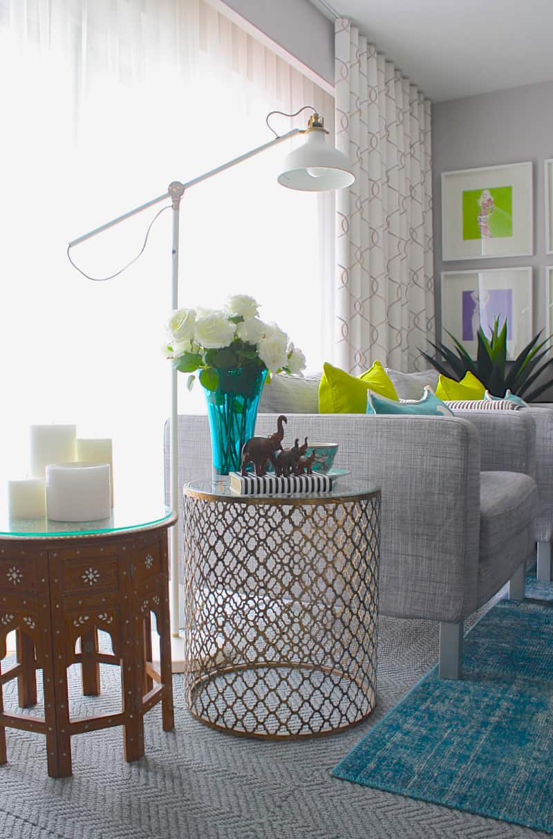
Feminine and masculine dance gracefully together in the living room. “I love rooms with eclectic furnishings. They tell a unique story,” notes Rosaci. A conservative grey suited couch and matching upholstered chairs cuddle with long limbed mid-century teak chairs. Ovals, squares, and rectangles happily co-exist in lamps, artwork, accent pillows, and tables. Glass, see through metal tables as well as slim rimmed art frames, glassware, and furniture all add a touch of transparency. “The key is to use a bit of the same colour in various parts of the space. When viewed as a whole the hits of colour have impact adding to the layered look.”
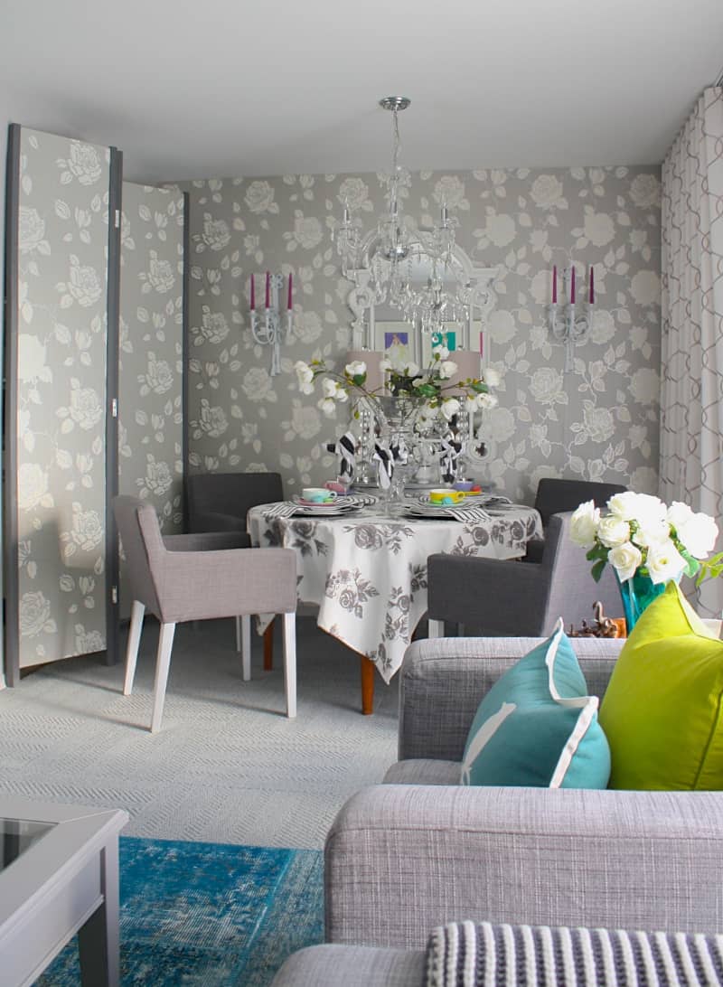
The dining area, to the left of the foyer and next to the living room, is a light sketch of elegance. The rose motif, seen throughout the rooms, as well as round glass shapes are accompanied by shades of oyster, pearl, and pewter to which stripes offer a graphic counterpoise. “We wanted the room to look like a winter garden offset by the warm teak dining room table and crisp charcoal dining room chairs,” comments Rosaci.
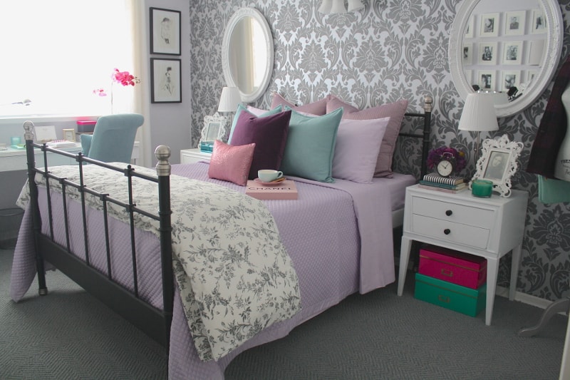
In the flirtatious bedroom the ‘brocade’ of the wallpaper and the toile of the bed’s coverlet echo the dining room’s clean interpretation of classic motifs. Here white side tables and mirrors add cool sophistication to balance the sugared pale pastels. “I love a space that incorporates whimsical elements and are eclectic in nature. The result is a built-up and layered collection of elements that truly make the space.” The Judy form, jewelry, mirrored box, and baroque framed photos add eccentric embellishment to the room’s stripes, squares, and rectangles.
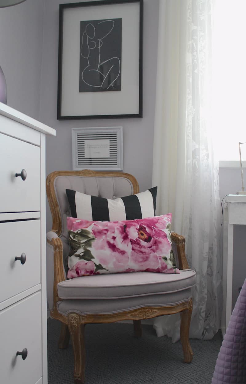
“I adored creating this space. It is a true reflection of my grandmother’s youthful spirit and style all the while being practical and functional for her needs.”
Text by J. Lynn Fraser
Photography by Nicholas Rosaci
Sources:
- Space Designed by Nicholas Rosaci Interiors
- Photography, Nicholas Rosaci Interiors
- LIVING/ DINING/BEDROOM, Karlstaad Sofa, Club Chairs, Nils Dining Chairs, Liatorp Coffee Table, Strandmon Wing Chair, Ranarp Reading lamp, Svelvik Bed, Hemnes Dresser,
Besta Burs Desk, Ribba Picture Frames, Silkeborg Teal Area Rug, IKEA Canada - Foyer Chandeliers, Urban Barn
- Dining Room Chandelier, Home Depot
- Wallpaper and Mirrors, Bouclair Home
- Drapery, Sun-Brite
- Carpet Tiles, FLOR
Latest posts by Nicholas Rosaci (see all)
- Glamorous Office Design - April 13, 2026
- Nicholas Rosaci’s Modern Canadian Cottage Design Board - April 13, 2026
- How Do You Make An Easter Special? - April 13, 2026


