Think of diamonds of sunlight sparkling on blue hues of ocean and lake. This was the inspiration for Paul and Kim Simmonds’ condo redesign. The two professionals, who work in the automotive industry, wanted a contemporary, comfortable, and inviting home with generous storage space
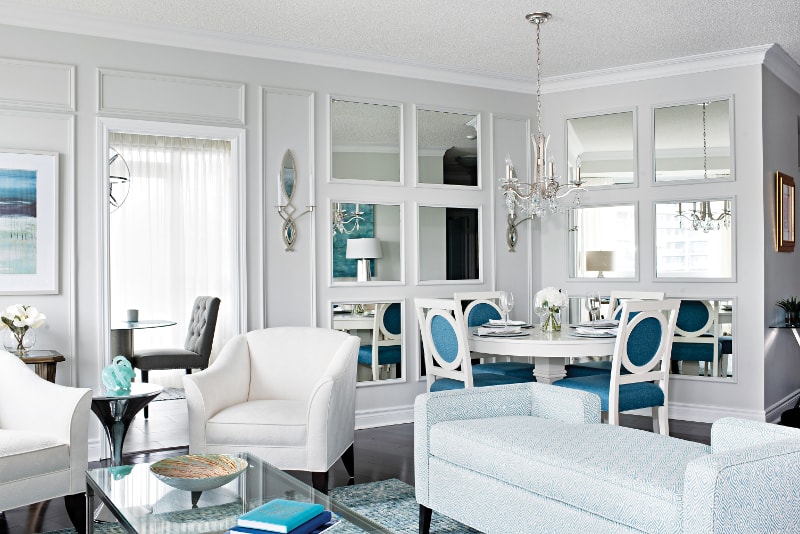
The downsizing couple turned to Designer Gabriele Pizzale for help with their 16-year-old, 2,275 sq. ft. condo’s unusual living-dining room arrangement. “We told Gabrielle”, Paul and Kim comment, “we wanted Ocean colors for the new home.”
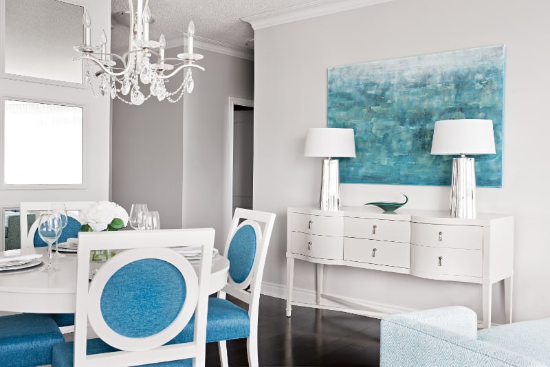
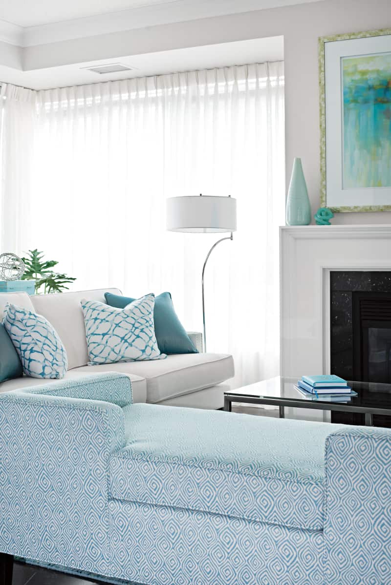
“Art and accessories updated the space and pronounced the water theme”, Gabriele observes. “We wanted to mimic water without being literal.” She adds, “as you can see each art piece from any given location; having them coordinate was important.”
Gabriele mixed classic design elements, dressed in composed glamor, with current colors and trends. She created the Miami style ambiance Kim and Paul wanted. “The design is elegant yet current”, Gabriele states.
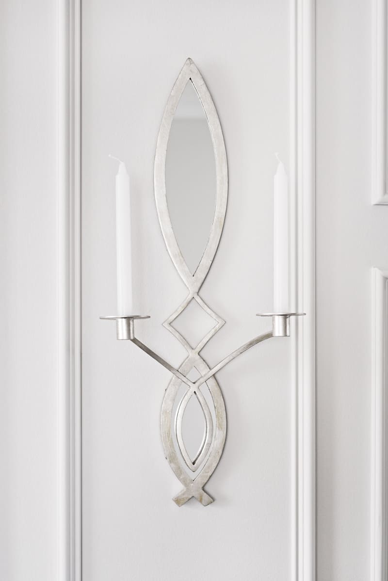
As a visitor enters from the front door, the living and dining room greets them as do the condo’s windows with their lake views. Throughout the condo’s design, reflective materials maximize the light and visual space. The dining room’s mirrors dance light as do the wall sconces. Gabriele notes that “Reflection can work in your favor when used properly.” Kim and Paul remark that they absolutely love the mirrored panels.
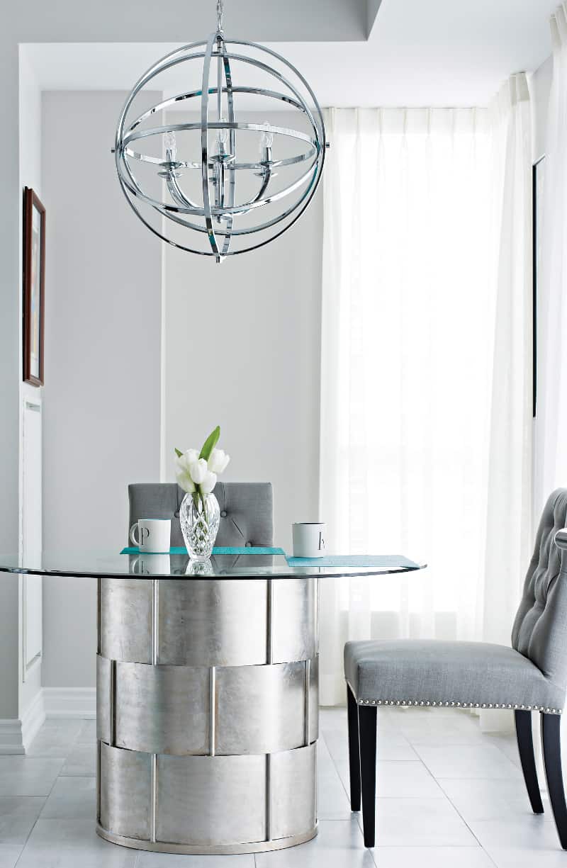
Both inward and outward sightlines are important within the rooms. The kitchen nook area is a sculptural vignette. “Paul and I selected the chandelier to make a statement when you are looking into the kitchen from the living-dining room or when you enter from the other end.”
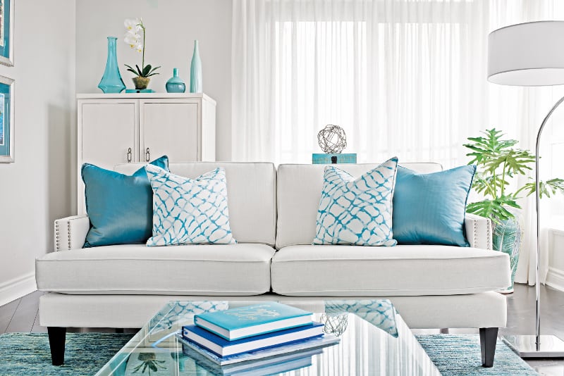
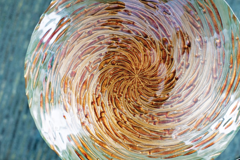
Gabriele notes that as the couple likes to entertain, the seating and flow between the spaces was important in the design. Swirls, gray lean lines, dots and dollops of metallics repeat throughout creating an edited look.
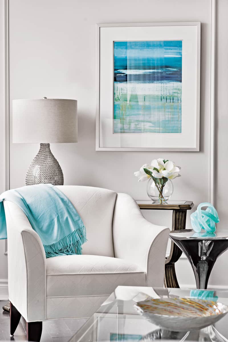
Gabriele splurged on the furnishings, as you need quality furniture to withstand use, but notes she saved on drapery and accessories. She adds that “Trends are great, especially if they align with your personal style. For some it can seem risky, and for those I recommend incorporating the theme through accessories, a table lamp or artwork”. The living room’s rug is an example of using an accessory as a trend and to enhance motifs. Paul and Kim note the “rug simulates the waves in a lake on a windy day, and the lines of the rug are raised giving it a rich look”
Comforting rather than cold, the room’s gray and blue hues are warmed by snuggly textures and materials in throws, fabrics, and furniture. “The space needed some zest and life brought into it and that’s exactly what they got!” Gabriele states.
“Family and friends were blown away by the resulting design” Paul and Kim remark. They add that shortly after completion a maintenance technician stopped dead in his tracks when he came in and just exclaimed, “wow!”
“We still can’t believe this is our home. It really is a sanctuary when we come home from work.
Text by J. Lynn Fraser
Photography by Mike Chajecki
Space Designed by Gabriele Pizzale
Photographer, Mike Chajecki
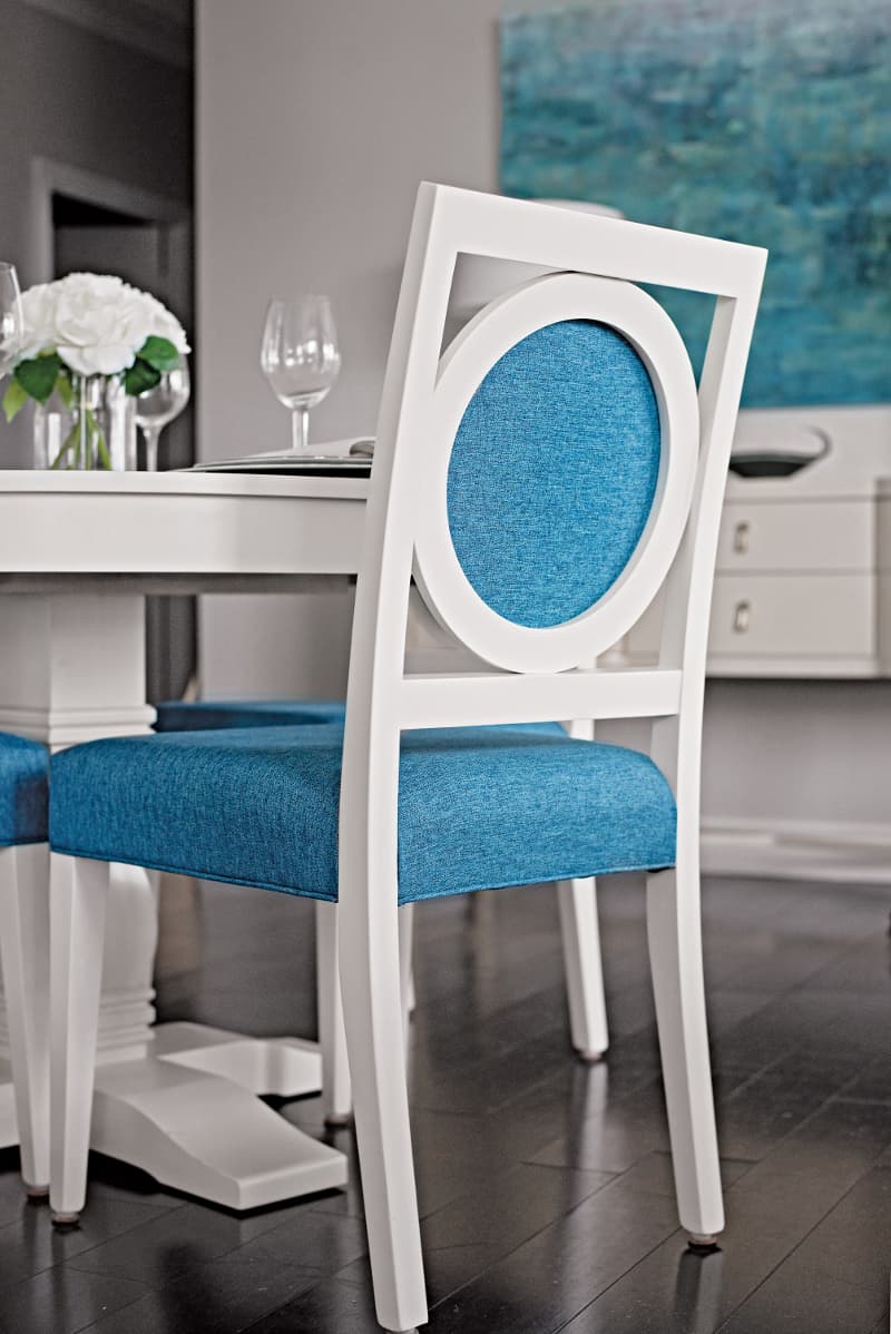
DINING ROOM; Table and Chairs, Dine Art
Chandelier, Schonbek
Art, Uttermost
Servery, Bernhardt
Table Lamps, Robert Abbey
Candle Holder Sconces, Cyan Design
LIVING ROOM; Sofa, Statum Designs
Day Bed, Designer Upholstery
Coffee Table, Artage
Drinks Table and Bar/Tall Casegood, Bernhardt
Floor Lamp and Table Lamp, Dimond Lighting
Concrete Console, Sun-pan
Rug, Surya
Art Above Fireplace, Celadon
Storage Bench, Designer Upholstery
Latest posts by Canadian Home Trends (see all)
- 2026 Design Trends: The Evolution of Home Design - April 24, 2026
- Expert Bathroom Design Secrets from Canada’s Best - April 24, 2026
- Treasure Hunting: Discovering Unique, Locally Made & Vintage Home Décor - April 24, 2026


