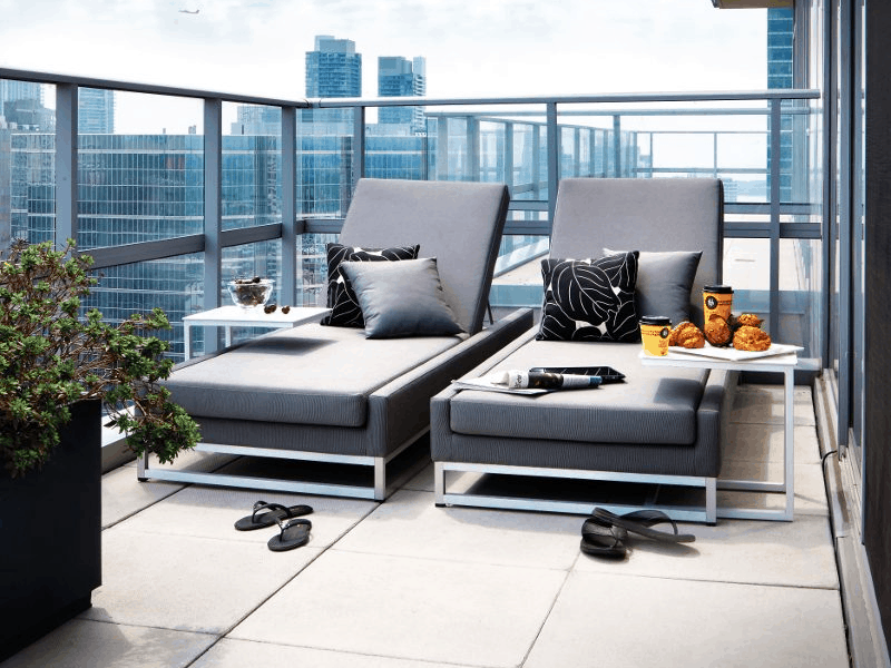
This corner condo with a gleaming view is home to a busy media production executive who travels extensively. He chose the two-floor penthouse because it offered all the luxurious aspects of a well-appointed home.
“Our mandate was to help him customize from the base building materials to suit his lifestyle and design aesthetic.” Designer Lisa Stevens says of the pied-à-terre’s design raison d’être. “It was about classic, masculine pieces with a sense of theatricality and wit.”
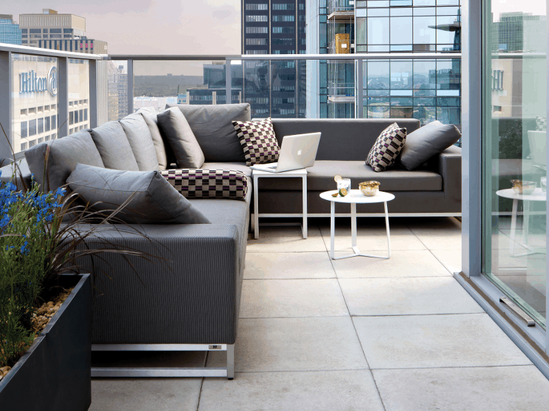
Relying on neutral gray, Stevens created a custom-made space that is both open and intimate. He already owned the sofa so Stevens built choices from his existing furniture. Stevens’ advice for designing with gray is to always stay with grays that are true gray, or on the warmer end in their tones as the warmer grays tend to play better.
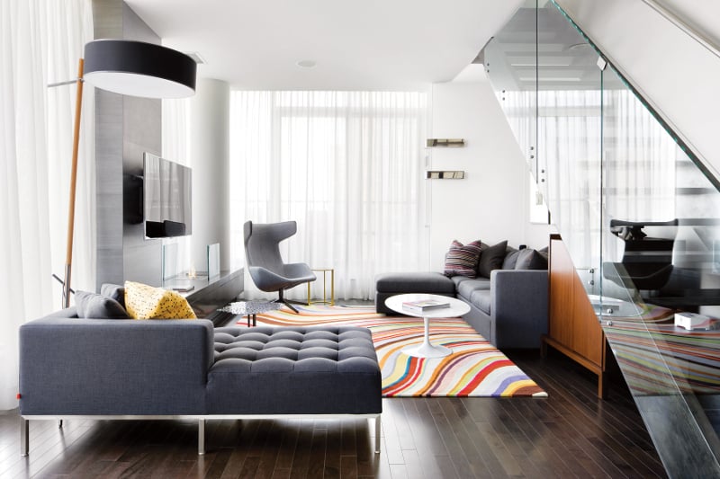
The living room’s nine foot ceilings receive a visual lift by the glass walls. The wraparound terrace also boosts the suite’s visual verve. By choosing a gray palette, attention is focused on the furniture’s shapes, such as in the upholstered chair’s wings and rounded hills of the Mies van der Rohe-esque sofa. A glass wall in the living room was grounded with a stone clad bench while the ambiance was enhanced with a biofuel fireplace.
“When adding color, choose what makes you happy and run with it! Make a commitment and be true to it,” Stevens advises. Jazzed colors, as in the accent pillows, coffee tables and rug, soften the living room and patio’s angles. These pops of color, found in geometric patterns, add a sophisticated tone to the vividness. “I might tire of a yellow sofa over time, but that enameled metal end table still makes me smile!” Stevens suggests using smaller scale pieces, like end tables, to add a real sense of style and wit without the huge commitment that larger furniture might require.
Scarce space requires ingenuity. On the second floor, the homeowner needed to maximize the dressing area storage. Lisa’s solution was to open up the entire space. This created an open concept space that included a highly customized dressing room, bedroom and ensuite.
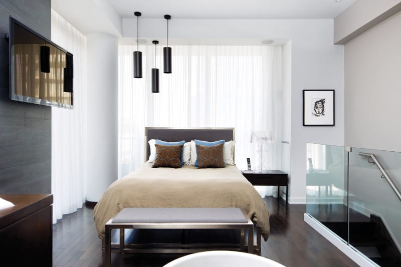
Sly humor and comfort blend in the bath area. The tub is raised, like a curved sculpture, on a plinth. Its unabashed demeanor is a witty retort to conventional design. Its circle of admirers includes the soft spoken woods of the chairs, drawers, and flooring. The bed’s pillows, in mocha and rainy blues, echo those curves as do their geometrics.
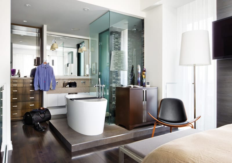
 The glass table lamp answers the room’s masculine pieces with feminine lightness. Angles and curves are cufflinked together by the metallics found in the tables, bed frame and drawer pulls. Open rectangles were a motif chosen for their strong form which gives structure to the whimsical elements.
“It’s classic haberdashery! A gray suit with a spot of color in the tie, pocket square or socks. I love hidden boisterous details in menswear,” says Lisa of the finished design. “The space, was a good reflection of the homeowner and his tastes.”
Text by J. Lynn Fraser, Photography by Brandon Barre
Latest posts by Canadian Home Trends (see all)
- 2026 Design Trends: The Evolution of Home Design - April 22, 2026
- Expert Bathroom Design Secrets from Canada’s Best - April 22, 2026
- Treasure Hunting: Discovering Unique, Locally Made & Vintage Home Décor - April 22, 2026

