IN A LIGHT-FLOODED CONDO at the heart of downtown, small space living has come to fruition in a big way. This two bedroom, two bathroom designer condo may not have a lot in terms of literal square footage, but it certainly epitomizes the illusion of space. Natalie Fuglestveit, interior decorator and the brains behind this operation, says, “Even though it was small, the homeowners wanted it to feel like their second home.”
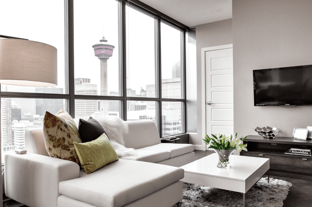
Unusual circumstances surround the condo’s outset. “They purchased this condo for their Calgary visits and for family and friends use. They enjoy using the condo for when they head to the Rocky Mountains to ski, come to Calgary for the Stampede, or just need a weekend away,” says Natalie. “Sometimes there are only one to two people staying in the condo and other times it could be as many as four to six.”
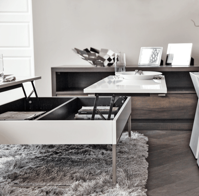
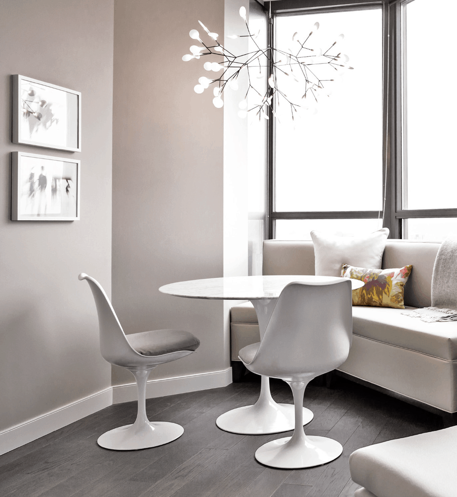
The unique intentions for the condo required the space to be versatile, beginning with the use of space in the communal living area. Concrete pillars make up the layout of the conservative 843 square foot interior, forming a sophisticated, connect-the-dot-esque maze, which the designer has used strategically to designate areas amidst the open-concept floor-plan. “We used one column to help us differentiate between the nook/eating area and living room. We designed a custom banquette bench that was designed to fit exactly in between a column and wall.” To pull the impromptu eating nook together, Natalie employed a unique lighting piece, selected not only for its physical aesthetic, but also for its skeletal structure, which gives way to natural light and the distant view of the Rocky Mountains. When asked about her use of various finishes and textures throughout the space, Natalie imparts, “Layering elements such as glass, wood, fabrics, and metals can help ensure that your small space doesn’t feel too cluttered or busy.”
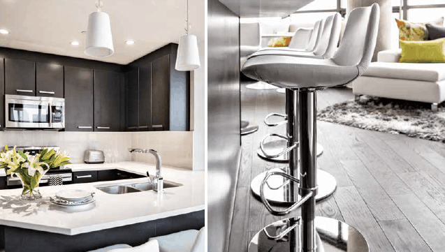
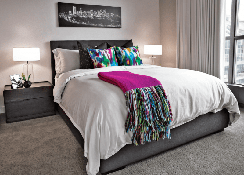
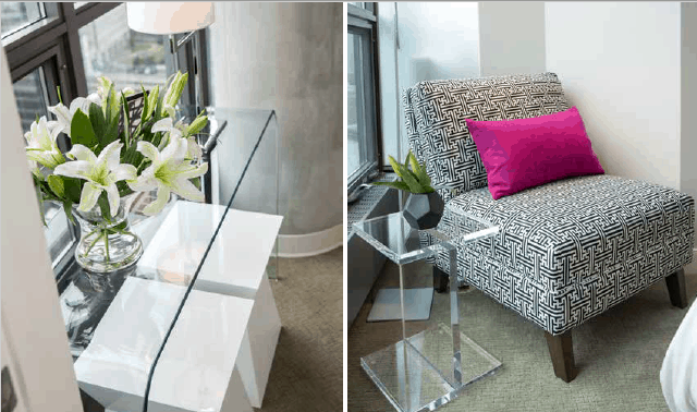
Alongside the lighting fixture, space-enhancing and space-saving measures have been utilized throughout the space. One example is the pristine armless sectional located at the cusp of the second bedroom, meant to open up traffic flow from the living area. Another is the transparent glass console table against the window in the second bedroom, intended to keep the space feeling large while not blocking the beautiful view. In the master bedroom, the queen bed accommodates storage for bedding and towels, in lieu of closet space.

In keeping with the clients’ design goal to create an elegant and modern designer condo space with luxury elements and furnishings, they splurged on a classic Saarinen dining table, tulip chairs, and a chandelier. Natalie brings the living area together via the predominately light color scheme, which extends from the walls to the furnishings, the lighting fixtures, and the ripple-fold drapery in the master bedroom. “The client wanted the space to feel light and classic.”
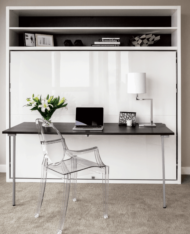
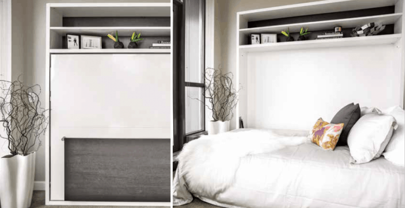
Maximizing a small space is no easy feat, but Natalie approached the project armed with strategy and know-how born from fifteen years in the industry. “When designing small spaces, it is very important to break down how you operate in the space and what elements you actually need each day – that will allow you to prioritize furniture pieces and dictate spatial planning.”
Sources:
- Space Designed by Natalie Fuglestveit Interior Design
- Photographer Lindsay Nichols
- Chandelier, Moooi
- Desk and Murphy Bed, Resource Furniture
- Bedding, St Geneve
- Saarinen Dining Table and Tulip Chairs, Design Within Reach
- Coffee Table, BoConcept
- Sectional, 4 Living
Latest posts by Canadian Home Trends (see all)
- 2026 Design Trends: The Evolution of Home Design - April 17, 2026
- Expert Bathroom Design Secrets from Canada’s Best - April 17, 2026
- Treasure Hunting: Discovering Unique, Locally Made & Vintage Home Décor - April 17, 2026


