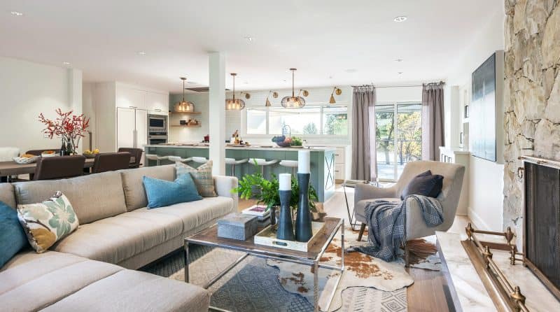
 1950s Home Redesign – When Principal Designer, Negar Reihani, was approached to redesign this Vancouver home, her eye immediately went to its good features. The 4,200 square foot property includes six beds and four and a half baths, and though it was built in the 1950s, it looks anything but dated. “My goal was to create a modern, rustic home; something that was cozy and comfy to suit a busy family lifestyle,” says Negar. “I wanted the house to look fresh, but not overly elegant and fussy so that it would still feel homey.”
With the preservation of energy and natural resources in mind, Negar was inspired to create a design that paid homage to the history of the house; a plan that would allow many of the home’s original features to remain intact. The designer joined forces with the builder and the architect, Kayvan Memary. They were unified in their plan to deliver functionality without overhauling the space completely.
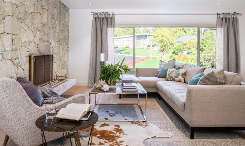 “We managed to keep the layout pretty much the same, and just changed the functionality of the rooms,” says Negar. For example, the smaller family room was converted into a formal living room and the smaller dining area was transformed into a home office. “We also saved two full-height fireplaces in their exact shape, which helped to reduce a huge amount of waste and energy rebuilding them.”
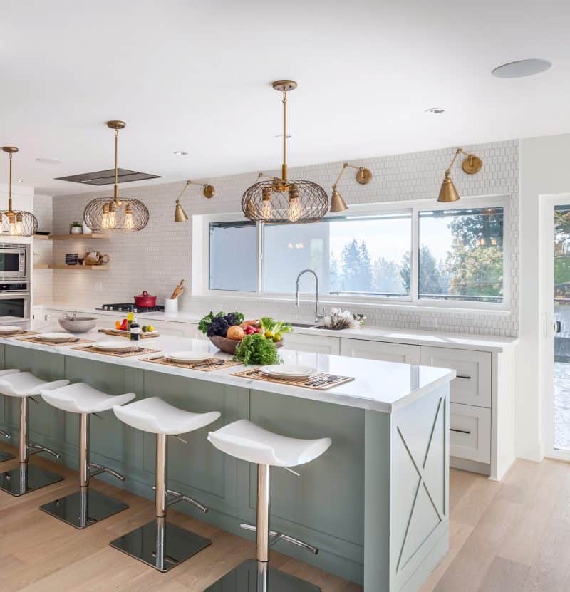 One area the team did choose to modify, was the kitchen. “We wanted to create a kitchen that was practical, low maintenance, yet beautiful,” says Negar, citing the beachy oak flooring, glazed mosaic backsplash, and the light fixtures as rustically-inspired details that make the space look and feel unfussy and at ease. In an effort to better accommodate a contemporary lifestyle, the L-shaped kitchen was expanded and opened up to what is now the family and dining rooms. To foster natural light, large windows, leading to the patio, were added. Similar forethought was given to the clean lines of the ceiling. “We aimed for a ceiling-mounted hood instead of chimney hood. This adds a very nice twist to the kitchen as you don’t see the hood and its visual weight in the space.”
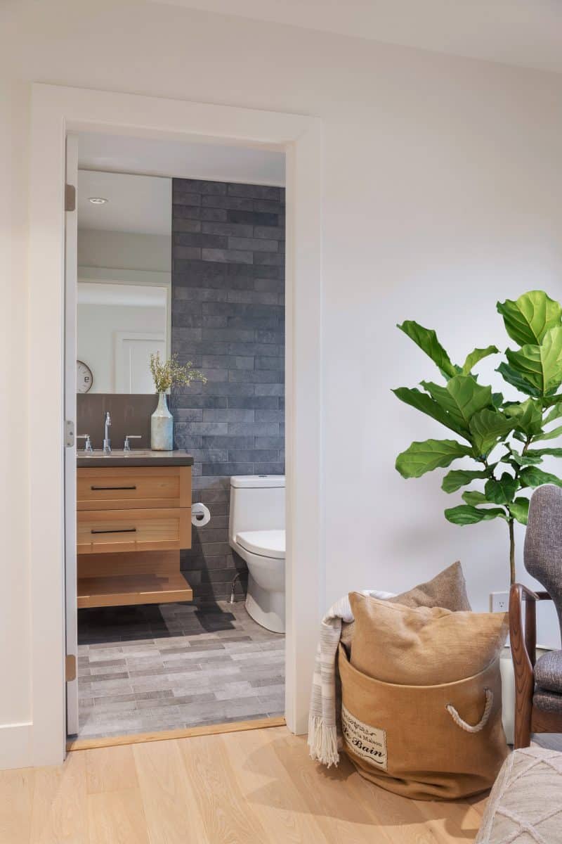
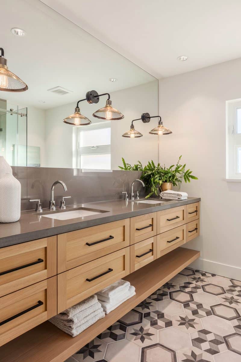 In the bathroom, Negar cites the patterned floor tiles, oak cabinetry, dark countertops, and brushed brass fixtures as being a modern take on what used to be there originally. “We literally took what used to be there and refitted it with today’s finishes,” says the designer.
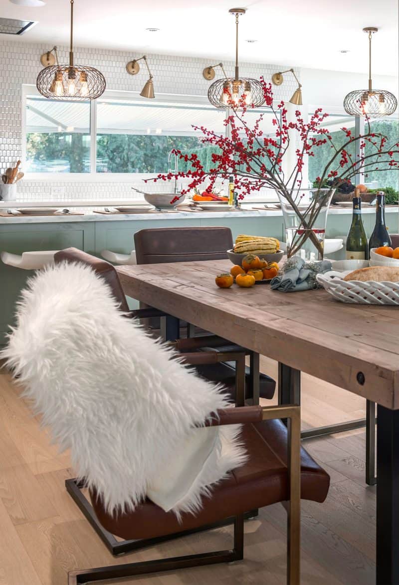 When asked if she has any advice to share with homeowners anticipating a large or small scale home renovation, Negar imparts her wisdom, born from over twenty years of industry experience. “Every kitchen and bathroom design is unique due to its needs, shape, and size. No matter the budget, I always recommend investing in one interesting element in the space, be it the backsplash, light fixture, or natural stone countertop.”
 1950s Home ReDesign Sources:
- Space Designed by Negar Reihani, www.spaceharmony.ca;
- Photography by Colin Perry, www.twocolumn.com;
- Kitchen Cabinets, Custom made by Kanox Construction, www.kanoxconstruction.com;
- Countertops, Alpine Counters, www.alpinecountertops.com;
- Light Fixtures, Robinson Lighting Centre, www.robinsonlightingcentre.com;
- Plumbing Fixtures, Kohler, www.kohler.ca;
- Kitchen Backsplash, Ann Sacks, www.annsacks.com;
- Bathroom Tiles, Ames Tile, www.amestile.com;
- Furniture, Home Ingredients, www.homeingredients.ca
The following two tabs change content below.


Canadian Home Trends magazine gives you a personal tour of the most stunning homes and condos across Canada. You'll be inspired by a selection of accessible home décor products, trend reports, simple yet stylish DIY projects, and much more. In each issue, you are given the tools to recreate designer spaces you've always dreamt of having at home, in-depth renovation and design advice, colour palette and furniture pairings, and Canada's best places to shop.
Latest posts by Canadian Home Trends (see all)
- 2026 Design Trends: The Evolution of Home Design - May 9, 2026
- Expert Bathroom Design Secrets from Canada’s Best - May 9, 2026
- Treasure Hunting: Discovering Unique, Locally Made & Vintage Home Décor - May 9, 2026




Like all the drawers in the bathroom
I love the Bathroom so much I am going to copy it at home!!
Love those light fixtures in the kitchen!
Love the lights in the kitchen, so bright and unique.
What a bright and fresh home!