Finding our House of Dreams – SIXTEEN YEARS AGO, FREQUENT FLYERS KIM AND CHRIS WERE IN THE MARKET FOR A NEW HOME-BASE. Kim, an Integrative Relational Somatic Psychotherapist, and Chris, an Incentive Travel Consultant, had a few criteria in mind for their forever home: they wanted something bigger, brighter, and better for entertaining. The couple was drawn to a three-story detached home, located in the sought-after community of Cornell.
“We saw this home and fell in love with it immediately — inside and out,” says Kim. In addition to three bedrooms, three and a half bathrooms, and a finished basement, the 2,300-square foot property boasts floor-to-ceiling picture windows and two staircases connecting the main floor to the basement. To help make the space work for their lifestyle, the homeowners secured Designer, Aimee O’Rourke.
“When I first met with the homeowners and discussed what was and wasn’t working for them, it was clear they wanted a modernized main floor they could entertain friends and family in,” says Aimee. “That’s where the idea of creating a kitchen lounge came into play.”
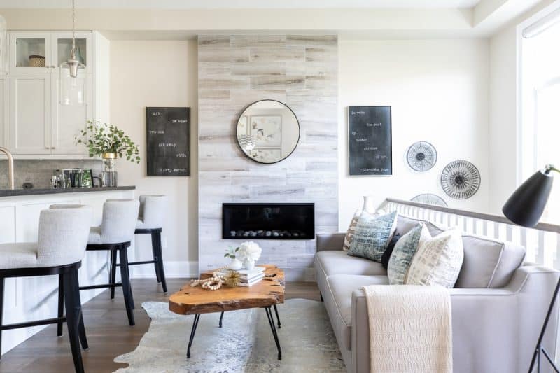
Though the majority of the main floor is an open concept, a load-bearing wall truncates the living area from the kitchen. In an effort to enhance the experience of the kitchen, Aimee introduced low levels of comfortable seating, including barstools, a sofa, and a settee. “It feels more inviting for mixing and mingling,” she notes.
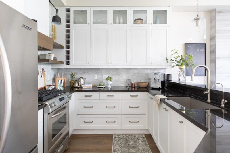
In addition to supplementing the eat-in seating, Aimee wanted to accentuate the ceiling height. To draw the eye upwards, we opted for floating wood shelving flanking a custom vent hood. Aimee also had the remaining cabinetry refaced, a Carrara marble elongated subway tile backsplash installed, and hinge arm sconces were mounted above the shelves, adding a touch of black in the process.
“When designing monochromatic spaces, I think black elements are essential as they help ground the space – like a resting spot for the eyes as they look around the room,” says Aimee.
Apart from a few dark accents, the homeowners opted for a light and neutral color scheme throughout the home. After much deliberating, all parties agreed on a color called Natural Cream. “In order to keep the main floor feeling seamless from front to back I recommended a single paint color throughout. We landed on Natural Cream as it has a subtle amount of gray undertone, blending Kim’s wish for a sense of warmth and Chris’ wish for modernity.”
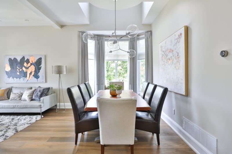
One special request the homeowners had was to create a focal wall between the main floor and second level. “We were inspired to create it aft er seeing a similar wall in another house in the city,” says Kim. Th e eye-catching wall art mounted over the landing is one of many pieces dispersed throughout the home.
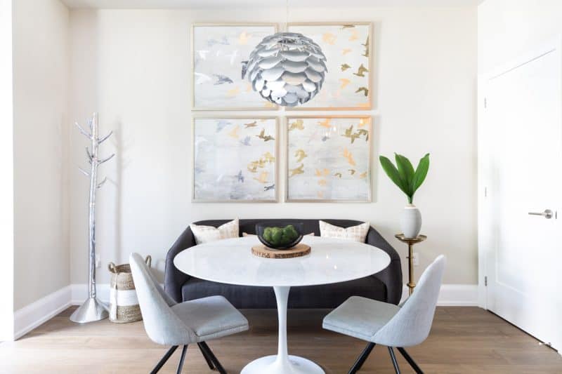
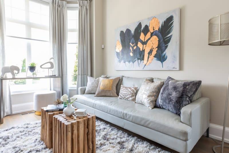
“The wall art was new and incredibly fun to source with these clients,” says Aimee. “The feathers above the living room sofa were something Kim had specifically mentioned loving the symbolism of, so when I came across the copper metallic feather art, I knew it was something we had to incorporate. It also provides a little bit of whimsy to an otherwise modern aesthetic. We added the series of metallic flying birds above the kitchen settee to tie in with the art in the living room and repeat that same feel.”
When asked where they saved and splurged on the project, Kim reveals their complete budget was $150,000. “We splurged on our gorgeous floor, stairs, feature wall, window treatments and main floor fireplace. We saved on our kitchen by keeping our dark, granite countertops, refacing our lower cabinets and replacing all the uppers for a custom, high-end look, at a fraction of the cost.
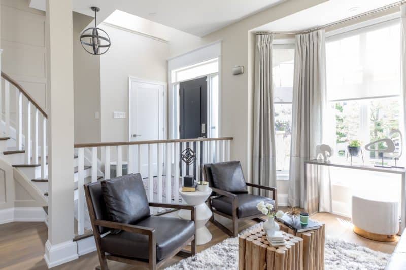
In spite of their strategic saves, the home has an air of sophistication to it. “I think that newer builds are missing key architectural elements that add character and depth to homes. The larger moldings, striking door hardware, wainscoting paneling, railing, and larger square white posts we added to the staircases were all to bring century home details to this house. Century homes have a sense of time and place, and there’s no reason you can’t layer in those architectural features into a new build so that your home tells the story of the things you love and sets you apart from your neighbors!”
“Finding our House of Dreams. First. we hired a great designer. We trusted her and loved her work.”, says Kim. “We truly enjoyed the process of renovating our space.”
SOURCES:
- Space Designed by Aimee O’Rourke, SUIT Interiors inc.
- Photography by Sam Stock Photography
THROUGHOUT:
- Wall Paint Color, Benjamin Moore Natural Cream OC-14
- Trim, Doors And Ceiling Paint, Benjamin Moore Chantilly Lace OC-65
- Baseboard And Casings, Central Fairbank
- Interior Doors, Central Fairbank, Masonite Lincoln Park Single Panel
- Engineered Wood Flooring, Purparket in Gravity Riverstone
ENTRY:
- Floor Tile, Tilemaster
- Door Hardware, Taymor
- Rug, Table Lamp And Fringe Ottoman, HomeSense
- Concrete And Wood Console, Sunpan
LIVING ROOM:
- Leather And Wood Chairs, The Goods by Van Gogh Designs
- Concrete Side Table, Sunpan
- Metal Console And Stick Wood Tables, Zuo Modern
- Leather Sofa, EQ3
- Area Rug, Surya Rug
- Toss Cushions, ELTE Market
- Feather Art And Floor Lamp, Renwil
DINING ROOM:
- Linen End Dining Chairs, LH Imports
- Table, Reemka Imports
- Bar Cart, Hudson’s Bay
- Chandelier, Universal Lighting
- Abstract Art, Renwil
KITCHEN:
- Custom Millwork, Unique Woodworking
- Cabinet Paint Color, Benjamin Moore Paper White OC-55
- Cabinet Hardware, Upper Canada Hardware, Top Knob
- Marble Backsplash, Creekside Tile
- Faucet, Gingers
- Barstools, Sunpan
- Pendants, Universal Lighting
KITCHEN LOUNGE AREA:
- Gas Fireplace, The Fireplace Shop
- Fireplace Wood-look Tile, Tilemaster
- Sofa, Van Gogh Designs
- Toss Cushions, HomeSense
- Coffee Table, Style in Form
- Side Table, Sunpan;
- Black Floor Lamp, Universal Lighting
- Cow Hide, Suyra Rug
- Black Art, Celadon
KITCHEN BREAKFAST NOOK:
- Settee, CB2
- Toss Cushions And Gray Vase, HomeSense
- Swivel Chairs, EQ3
- Marble Tulip Table, Style in Form
- Artwork Series of 4, Celadon
- Brass Side Table, Christies Antique Market
- Scalloped Light, Zuo Modern
- Black Mesh Bowl, Bouclair
For more great ideas, click here.
For more unique items for your home, click shopCHT.com.
Latest posts by Canadian Home Trends (see all)
- 2026 Design Trends: The Evolution of Home Design - April 5, 2026
- Expert Bathroom Design Secrets from Canada’s Best - April 5, 2026
- Treasure Hunting: Discovering Unique, Locally Made & Vintage Home Décor - April 5, 2026

