Renovate or Not? Sometimes the best design decision is not to change things too much. Let me explain. I was recently working with a client who wanted to update her kitchen. She consulted with me to figure out how to spend her modest budget wisely while accomplishing a new look.
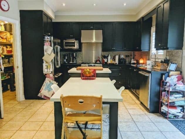
Like most people, her dream plan included replacing the cupboards to have more efficient storage within. After an honest appraisal with a critical eye, I could see that wasn’t entirely necessary. She didn’t even need to paint them – she just needed to lighten the space up and be creative with functionality, and there were far less expensive and easier ways to do that. Renovate or not when the overall footprint of the kitchen was good, so just a few adjustments to the cupboards were necessary. By adding Gliding Shelf Solutions within the cabinets, we were able to solve the efficiency issue and added extra storage on a budget, and within a short time frame. Not having to do a full demolition of the existing kitchen put money back into the budget for what truly needed doing, and splurging on the proper key elements.
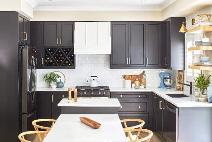
Changing out the countertops was mandatory. We needed to lighten up the space to make it feel more open, and to balance off the darkness of the cabinet color. We chose Caesarstone’s Empira White marble quartz because of its classical white base with deep grey, almost black, veins to accent and tie in the cabinet color. This beautiful countertop modernized their kitchen instantly. Plus it’s durable and easy to clean, so it’s a perfect balance of fashion and function for a busy household.
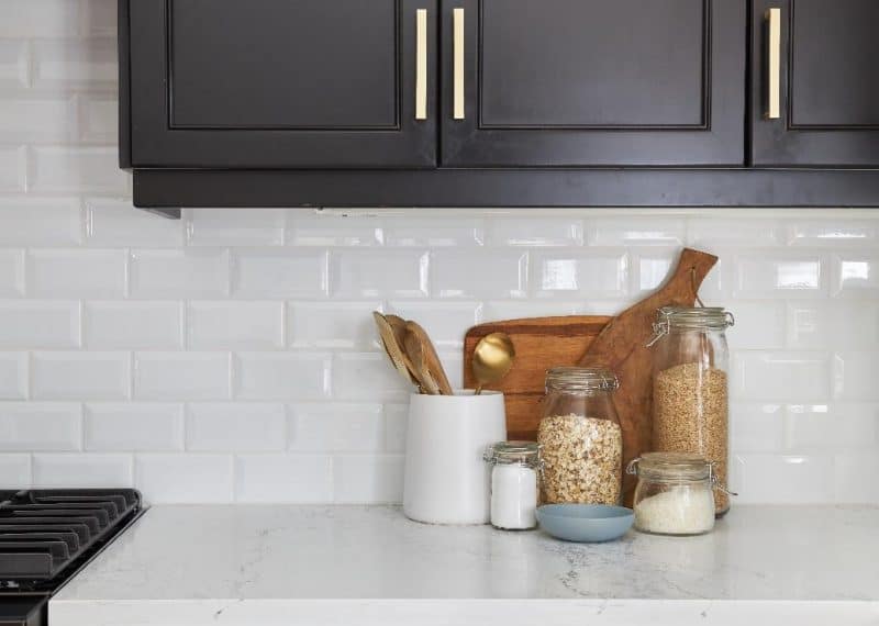
This kitchen needed a new backsplash. We chose a simple, white, bevelled edge subway tile for its elegance, simplicity, and to play off the new countertops. It is also timeless and classic, so it will not go out of style. By using larger tiles, this kitchen kept its clean lines, but the tapered edge offered elegant detailing.
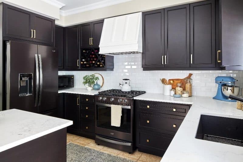
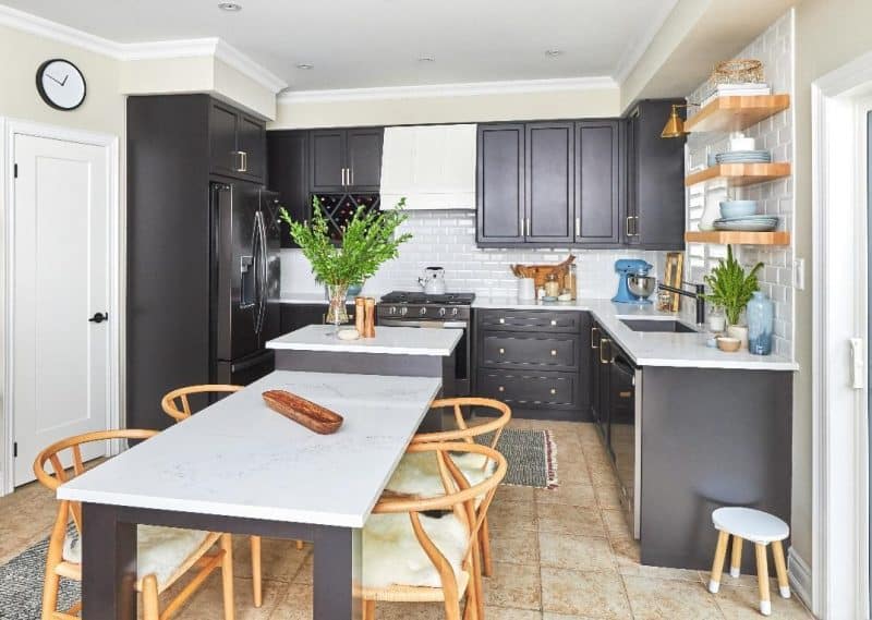
The custom range hood became the focal point of this space. We removed the small useless cabinet above the metal range hood that was more of an eye-sore than a focal point. By making it white, it pulled the color scheme of the kitchen together perfectly. And in keeping with the white of the backsplash and countertops, it adds to the openness created as soon as the valance was removed.
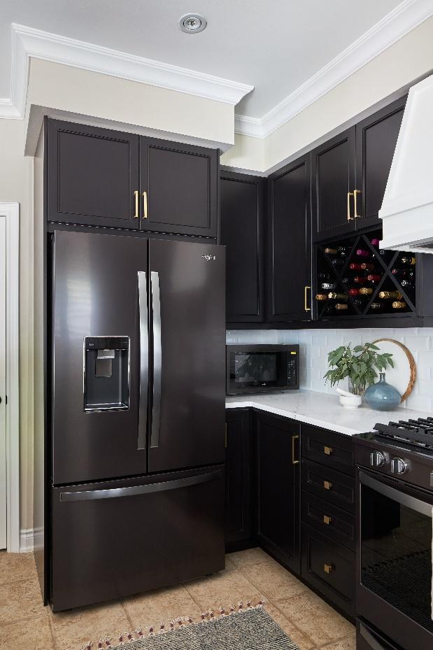
A Whirlpool black stainless-steel kitchen suite kept the continuity of color in this kitchen. I love to match cabinet colors and appliances whenever I can; making your appliances blend into the colors of the kitchen gives the illusion of a larger space, because your eye doesn’t bounce to the contrast of the cabinets and appliances. Plus, the appliances are fingerprint resistant which helps keep things looking sleek and fresh with minimal upkeep.
Having the counter-depth refrigerator further made the space more open and accessible. On top of that, the French door option allows for more clearance when the door is open, which makes it easier to have two people in the kitchen at once.
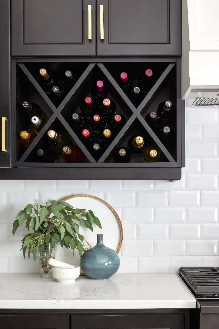
While the kitchen used to have a microwave stand to the right of the range, replacing it with a custom wine rack, color matched to the cupboards, was far more visually appealing. Fear not – they still have a microwave in the corner of the kitchen but tucked out of sight and utilizing a wasted corner.
Having new updated appliances instantly updates a kitchen, plus the bells and whistles on these appliances are amazing and adds so much more functionality. The refrigerator is one of my favorites its pantry-inspired layout, and the infinity slide shelf allows extra room your tall items. You are ultimately making the space less cluttered. The range has a touchscreen, which is something you don’t see often. It learns, adapts and suggests customized presets based on your family’s routine, which is perfect for my client and her family of four! Finally, the dishwasher has a third level rack space where you can make extra room for those hard to fit items like your large kitchen utensils. It also allows you to load more dishes, and with a family of four, there will always be plenty of dishes to wash. *For full product names and links please see below.
Wanting to keep the visual continuity, I selected an under-mount sink. Coupled with a faucet in black, the visual ascetics are modern, clean, and elegant, as well as keeping with the color scheme for a consistent flow.
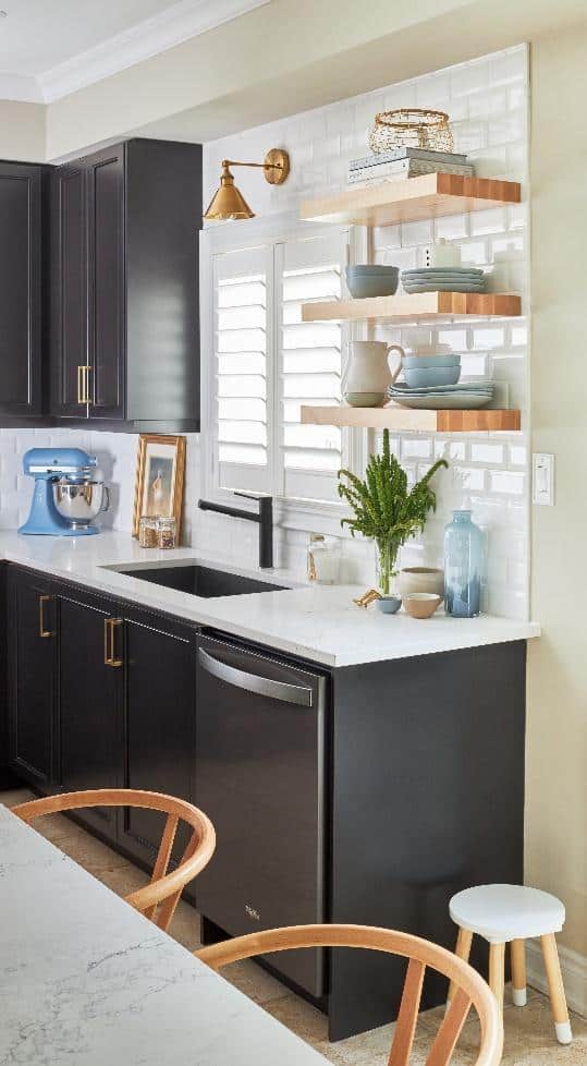
Notice the floating shelves? I removed the closed cabinets to modernize the look. By tiling that whole wall and adding the natural wood tone of the shelving it creates a more up to date, open look. I really wanted to replace the tan floor tiles but the cost, timing and mess didn’t warrant it. Instead, I used the shelves, chairs and accessories to tie the color all, making the floor seem more purposeful, instead of like the elephant in the room. It’s also nice to have an element from nature (wood) to help ground the space and add that organic feel to the design.
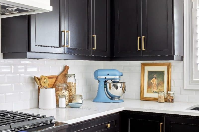
Next to tie in the little, but oh-so-important details. While the cupboards were able to be used, the hardware had to go! The new, modernized, brass handles were the perfect accents. And I was able to include a pendant light over the sink to match. I would have liked to include pendant lighting all around the kitchen, but the light locations didn’t align with the table, so this was a perfect compromise.
As I shopped for the appliances, I found an ultra-useful stand mixer in blue, and I knew it would be so useful and fun for this busy family! I choose accent pieces like the dishware and vase in a coordinating blue. The floor runners also have a blue tie in. While many people hesitate to include a runner in a kitchen, I love it. They keep your feet warm on cool days, add softness to the space and tie colors in. The secret is to buy ones that are machine washable.
Renovate or not when I know this once basic builder kitchen has transformed into a kitchen that suits the family’s modern lifestyle. I love that the cupboards were not scrapped but instead given a new lease on life – that’s the benefit of having a fresh look at what you have and a doing a little thinking outside of the box. Don’t be too quick to replace … sometimes a strategic update is the better way! And it can save you a bundle!
For more ways to answer the renovate or not question, click here.
Learn more about Whirlpool ranges, dishwashers and refrigerators:
- Refrigerator
- Range
- Dishwasher
For more inspiring ideas, click here.
For more unique items for your home, click shopCHT.com.
Latest posts by Jo Alcorn (see all)
- Kitchen Trends with Jo Alcorn - May 2, 2026
- Trendy Culinary Haven - May 2, 2026
- Modern Country - May 2, 2026

