Homeowner Terry, with the expertise of designer Ami McKay, built and designed a beautiful contemporary home.
Looking for customized functionality, Terry designed his own residence on the west side of Vancouver. This completely open concept home, in the desirable neighbourhood of Kitsilano, stands out from other newly constructed houses through its personalized design most fitting his family’s lifestyle.
After touring dozens of newly built homes, Terry quickly realized that readily available layouts just do not work for his family. “There’s always a heavy focus on the main floor and the master bedroom with little attention to the rest of the space,” he said.
In his home, the functionality of every room is worked within the elegance and trendiness of the décor. Teaming up with interior designer, Ami McKay, he was able to decorate his home using both masculine and feminine touches to make the space comfortable and inviting. “I didn’t want the same style all around but rather different features that blend well together,” he said.
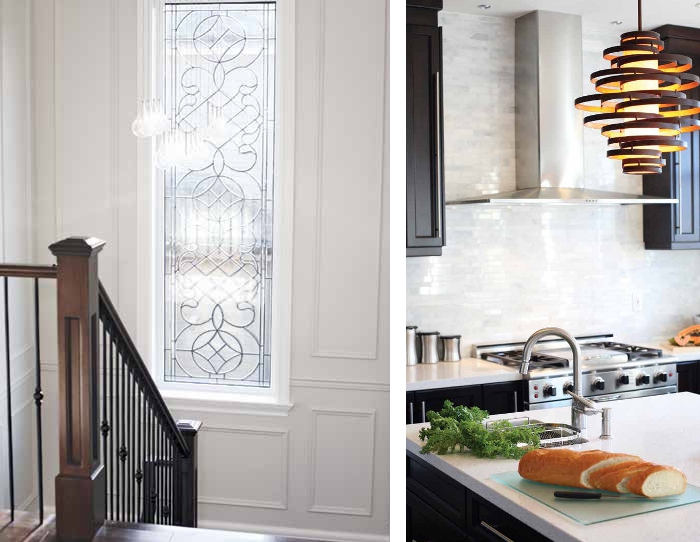
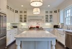
The open kitchen is very modern with plenty of straight lines within the dark-stained cabinetry to contrast with the luxurious white granite, waterfall edged island. The Carrera marble covering the kitchen’s feature wall connects the white Quartz focal wall surrounding the double-faced fireplace. This divides the dining space from the living room while keeping the open concept feel.
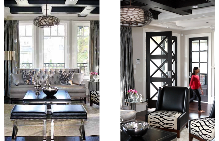
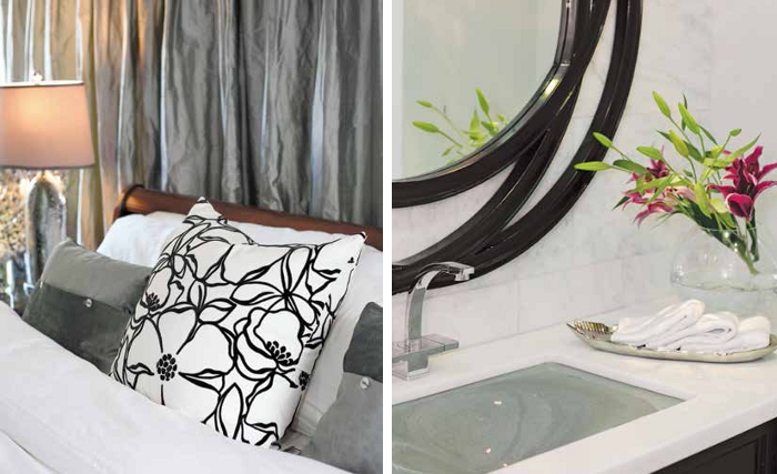
“The design concept in this home was all about contrast,” says McKay. Using a white and black colour palette with a variety of different patterns and textures, McKay brings sophistication to every part of this residence.
But it’s not just about colour. Interesting shapes and textures are used all around the house as connecting elements to complement every area, said McKay. Introducing a variety of shapes throughout the space is a signature look for McKay, who often takes an artistic approach and appreciates furniture as creative sculptures. This style is evident in the spiral shaped chandelier, which complements the kitchen’s modern feel.
A similar abstract shape is used to frame the mirror in one of the bathrooms upstairs. Following the strong contrasting colour palette used on the main floor, the bathrooms and bedrooms on the second level were designed with the same style in mind. Blacks and dark browns are seen in furniture and accent pieces, while white glams through the high-end granite bathroom counter tops.
With a background in computer programming, Terry understands the importance of fine details. This is why every corner of his residence was carefully considered. “We chose to go with more spacious and easily accessible hallways, as well as including oversized doors to make the area feel more grand,” he said. The coffered ceiling above the eating nook adds architectural interest into the space. Similarly, in the living room, reverse coffered dark wooden beams act as a focal point blending well with the geometrical that adorns the grand front entrance.
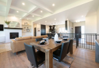
On the other end, separating the living room from the kitchen, is an eating nook with a built-in bench beneath the window and a glass top table with two chairs. This space is ideal for his kids to get homework done while he’s watching television or preparing a meal for them in the kitchen.
Text by Alaa Yassin, Photography by Janis Nicolay, As Seen In Canadian Home Trends Winter 2014 Colour & Trensd Issue
Latest posts by Canadian Home Trends (see all)
- 2026 Design Trends: The Evolution of Home Design - March 26, 2026
- Expert Bathroom Design Secrets from Canada’s Best - March 26, 2026
- Treasure Hunting: Discovering Unique, Locally Made & Vintage Home Décor - March 26, 2026

