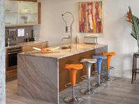
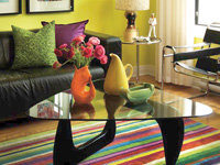
(NC)—For a long time, bold colours seemed too juvenile to use in abundance, too boisterous to let loose in a sophisticated setting. Now, designers say, they are the essential ingredient in even the most timid colour schemes.
For example, in Deco Candy, one ofthe PPG Pittsburgh Paints trends palettes for 2012, the colours are clean and energetic. Kids would happily use any or all of them in a single room.
But bold and bright colours are not just for kids. Here are the strategies for grown-ups:
Ease out of neutral. If you are not accustomed to having them around, your psyche may need to ease into bold colours. Build up your colour tolerance by introducing them into your neutral space one wall or colour block at a time.
Take their temperature.Deco Candy’s bright hues look beautiful with neutrals, as do all bold colours. Just be sure to put warm ones (red, orange, or yellow-based colours) with warm neutrals, and put cool ones (blues, greens, and violets) with cool neutrals. If you are not sure what you have, use a grey like Turtle Dove (511-4) as the main colour for wall and trim. It goes with everything. It will still work if you exchange your bold accent for another or decide to expand your accent colour to more of the room. Grey is easy to get along with.

Bold and bright hues work beautifully with neutrals. Start with a colour block to build up your colour tolerance.
Get rid of white. Colour is softened by reducing dark-light contrasts. White trim interrupts a colour scheme. Instead of white, match the trim to the walls, or use a lighter or darker version of the wall colour. If you really must have contrasting trim then tone it down to off-white (Mountain Gray, 416-1), or tan (Toasted Almond, 414-3) or the grey, Turtle Dove, all from PPG’s Voice of Colour palette. Make ceilings a lighter version of the wall colour or a lighter coordinating colour—but banish white.
There’s no such thing as too much, just too many. Colour is not tiring, but too many colours can be. Reduce the number of colours you use, not their intensity. One main colour will create an ambiance you can settle into, but you can also pair your bold colour with others in the same family because they maintain the same mood. For example, Tangerine Dream (123-7), works with Gold Buff (215-4), a dustier yellow-orange.
Don’t back off. Don’t trade the colour you love for the one that is two chips above on the stripe card. That colour is not the one you fell for at all. Instead, start small and ease in.
Reduce colour clutter. Bits and pieces of colour create a busy room. Discipline your colour palette by coordinating the accessories, art and fabrics. Or, bring in one bold, beautiful colour in a big way. As counterintuitive as that may seem, the magic of bold colour is the calm it creates. Like a magnet, it pulls forward all the variations of itself from random coloured objects, and makes all the colours sing in harmony.
www.newscanada.com
Latest posts by Canadian Home Trends (see all)
- 2026 Design Trends: The Evolution of Home Design - April 5, 2026
- Expert Bathroom Design Secrets from Canada’s Best - April 5, 2026
- Treasure Hunting: Discovering Unique, Locally Made & Vintage Home Décor - April 5, 2026


