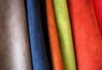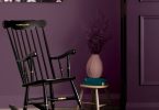
Every year, Pantone elects it’s colors of the year, setting a precedent in the realm of home décor for the year to come. Last year, the picks were two soft, calming pastels: Rose Quartet and Serenity. This year’s trend forecast recognizes colors that evoke calm, but also confidence, and include plenty of muted, earthy tones. In anticipation for the near arrival of 2017, we’ve rounded up the prevalent trends for color in the new year, according to major companies like Behr, Benjamin Moore, in addition to the widely recognized, Pantone.
Shades of green
According to Pantone, hues aptly named, Kale and Greenery, will take the main stage in the new year for home décor as well as fashion. These more earthy forest tones aren’t the only members of the green family that will be hot this year; colors named Grape Kiss and Acid Lime are included in the color forecast for 2017.
Rich florals
In contrast to the stress-reducing, forest inspired color palette, bolder, statement-making hues such as Pink Yarrow, Baton Rouge, Red Dahlia and Chrysanthemum are predicted to be just as popular in the new year.
Classic and muted
On the more subdued end of the spectrum, hues like Pale Dogwood, Island Paradise and Hazelnut add a chic subtlety to the mix, and will offer unique pairing possibilities in 2017 when paired with the aforementioned floral and forest picks.
Just plain bold
For those thirsting for a palette-changer even more adverse than the strong pink that is Pink Yarrow, Pantone offers up confident hues like Flame, Blazing Yellow, Fandango Pink, and Dazzling Blue; colors so bold, it practically says so in their names.
Latest posts by Canadian Home Trends (see all)
- Dining Room Design Tips - July 13, 2025
- Practical Luxury in Forest Grove - July 13, 2025
- The Hidden Value of Great Design - July 13, 2025
