This past summer, Mandy and I embarked on a new adventure. We’ve undertaken many renovation projects together over our ten years of marriage but our long search for the perfect renovation project was unsuccessful.
That’s when we decided to build our family cottage and film the process. To say we were unprepared for the strain this adventure would put on our marriage and finances would be an understatement! It took some creative planning and out of the box thinking to bring our dream to reality.
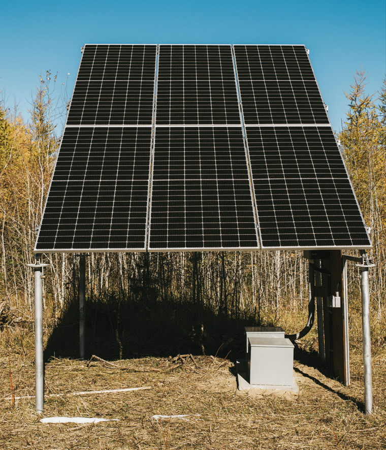
As with any project, it’s all in the planning and that’s why we started working with Aaron and his team at L.A.W Electric to help plan out the electrical and lighting plan of the cottage space. Any good design has a well thought-out lighting scheme and their expertise helped make this a reality. We also knew that we wanted to integrate solar energy into the cabin so we worked with Lorena at Evolve Green to shed some light on how to create sustainable energy for this cottage project. When it came to insulating the space, we visited Olympic Building Centre for all our insulation and drywall needs.
The first hurdle we had to face was fitting all of our dreams into the project without going over budget. A small footprint helped keep the project within budget but required some creative design choices along the way to make our vision a reality! We wanted a space that could be used to entertain which, as you can imagine, can be tricky when working with less square footage. We knew that we didn’t want
KITCHEN FAUCET AND SINK, House of Rohl, ROHL Graceline Pulldown Kitchen Faucet; Shaws Sinks; www.houseofrohl.ca; ELECTRICAL, L.A.W. Electric, www.lawelectric.ca; HVAC (FURNACE/AC/HRV UNIT), Wolseley Canada, www.wolseleyinc.ca; BATHROOMS AND PLUMBING, Wolseley Canada, www.wolseleyinc.ca; WINDOWS & DOORS, Ecoline Windows, www.ecolinewindows.ca; DRYWALL AND INSULATION, Olympic Building Centre, www.olympicbuildingcentre.ca; EXTERIOR PRODUCTS, James Hardie, Countrylane Red, Fusion Stone, Great Lakes collection in Carbon; DECKING, MoistureShield Composite Decking, Smokey Gray (Band around decks); Cathedral Stone (Centre of decks), All exterior products by CanWel Building Materials, www.domanbm.com; EXTERIOR PRODUCTS INSTALL, Above Code Exteriors, www.abovecodeexteriors.com; PAINT, Sico Paints, www.sico.ca; FURNITURE AND ACCESSORIES, Solomon’s Furniture & Appliances, www.solomonsfurniture.ca; ROOFING, Agassiz Roofing, www.agassizroofing.com; KITCHEN, Gateway Kitchen + Bath, www.gatewaycabinets.com; SOLAR SYSTEM, Evolve Green, www.evolvegreen.ca; FLOORING, Mineral Maple, Shaw Floors, Curtis Carpets, www.curtiscarpets.ca
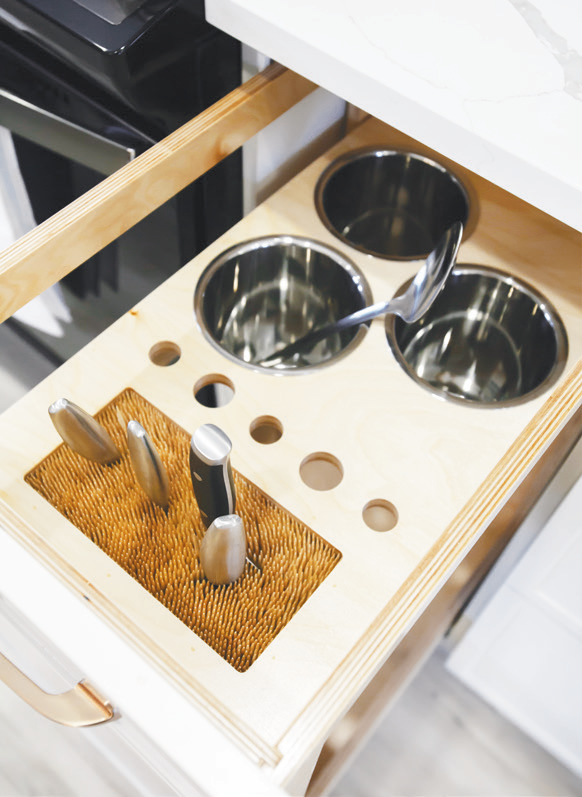
Kitchen Photos by Jessica Gollub Gateway Kitchen + Bath www.gatewaycabinets.com
to visually break up the space with different flooring so we had luxury vinyl plank in Mineral Maple by Shaw Floors from our friends at Curtis Carpets installed throughout the space. This helped the worry of wear and tear over the coming years as the floor is virtually life proof.
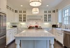
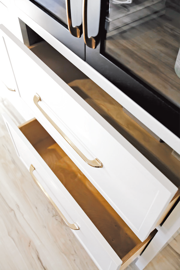
The first decision we made was to make the kitchen the focal point of the design and we enlisted the help of the design team at Gateway Kitchen and Bath to help achieve this. As you may know, we’re not big fans of overly rustic design therefore we wanted to create a beautiful, city meets country style kitchen with a large island that fills the majority of the open concept living area. The shaker style soft gray, almost white, doors contrasted with the black accents which help modernize the nod to rustic charm in the oak island. Our kitchen designer, Camelle also created a beautiful Chevron pattern in front of the island for visual interest and tie in the Chevron backsplash tile. We then paired the finishes with House of Rohl’s Graceline Pulldown black and gold kitchen faucet with their Shaws apron sink to complete the look. As the living room and kitchen are all located in the same open area, a beautiful inset cabinet was designed for the living room as a permanent furniture piece that mimics the look and feel of the kitchen to help tie the areas together. We are absolutely in love on how it all came together.

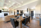
As entertaining at the cottage was top of mind, it was designed with full length covered decks along the front and back of the structure with large six foot black patio doors and black grille style windows from Ecoline Windows and Doors. This allows us to blend the outdoor and indoor entertaining areas when hosting guests. The beautiful doors and windows also allow for plenty of natural light to filter through the space, keeping that open and airy feel. We finished the living room with a camel colored leather sofa, a rustic exposed wood coffee table and accent club chair in a blue velvet and accessorized the cottage with a beachy lake life vibe using stunning pieces from Solomon’s Furniture & Appliances.
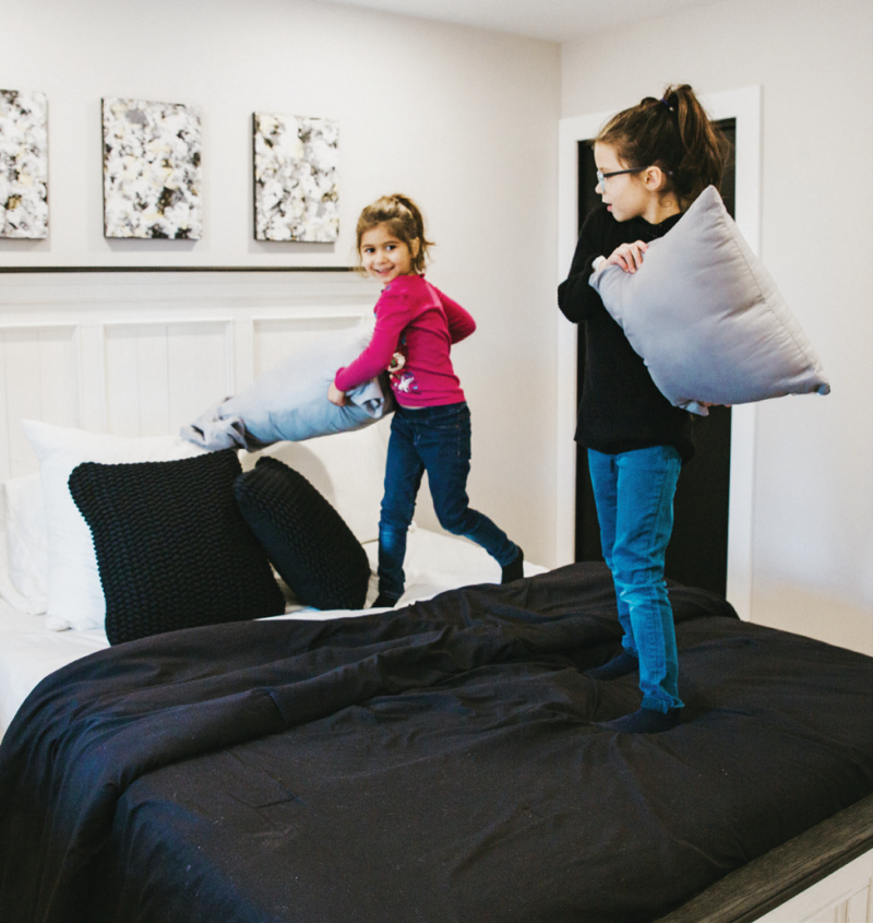
Since the cottage will be mainly used for weekends and holidays, we were able to keep the bedrooms small. After all, most of our time will be spent outdoors so the bedrooms really do not need to provide much functionality beyond sleeping. Keeping the bedrooms small allowed room for two bathrooms, one for the primary bedroom and one for the children and guests.
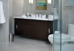
The primary bathroom is designed to be a calm, spa-like oasis. Our inspiration came from Sico’s beautiful calming color, Cool Current (6199-42). The earthy green wall color creates that calm, welcoming feel while beautiful marble finishes and black accents keep the space feeling luxurious and modern. Mandy worked closely with our friends at Wolseley Canada on selecting all of these beautiful Kohler pieces from their Tresham collection. When we decided to build, we knew that we had to streamline the process as much as possible to keep on schedule. That’s why we loved how we were able to get everything under one roof from Wolseley Canada including all our plumbing pipes, fixtures and even our HVAC system to keep our cottage cool during the summer and hot on cold winter days. Their knowledge and expertise really took the stress out of planning our cottage oasis.
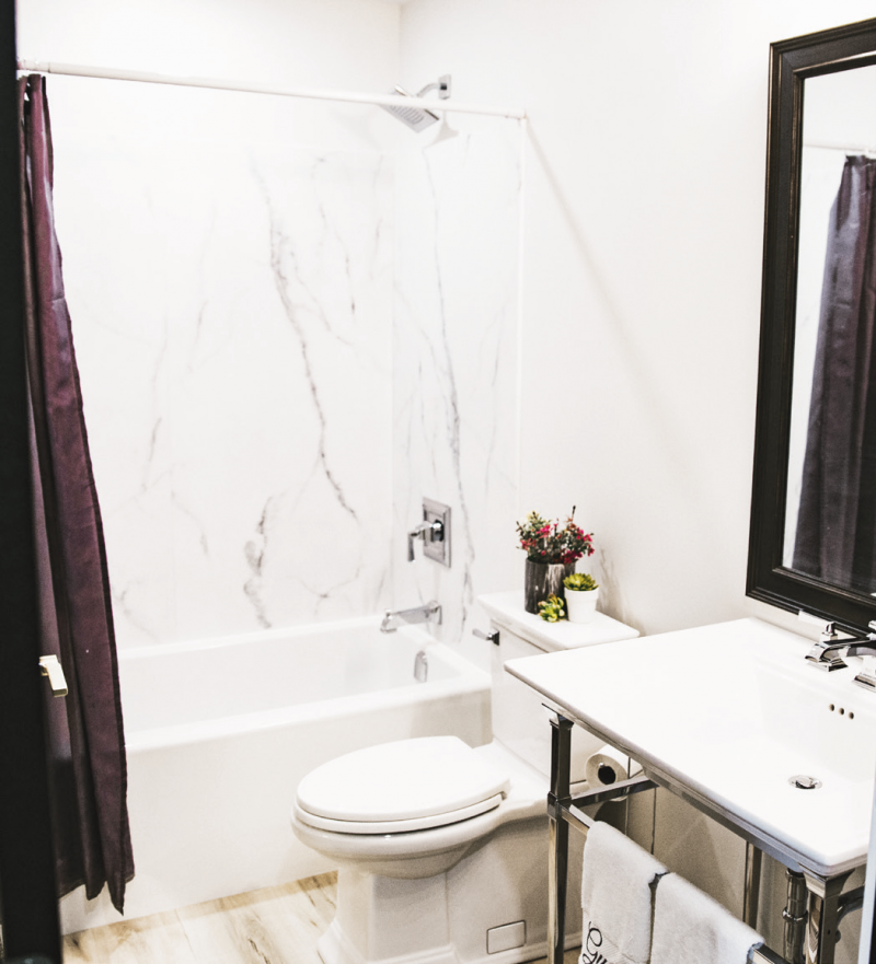
When it came to designing the kids’ bathroom, we wanted a bright and timeless space that they would enjoy! This bathroom features beautiful pieces from American Standards’ Town Square S collection. American Standard took all of the hard work out of the design process with their collections that are easy to choose from and most importantly easy to install. We loved the crown moulding design of the collection and how it was complemented with timeless finishes. As parents, cleanliness of our kids’ bathroom was also important and that’s why we were so impressed with how their toilet repel bacteria and even the overall design of the toilet makes it easier to clean!
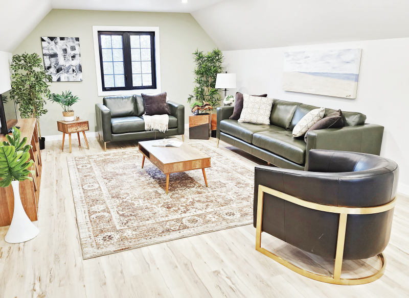
The design of the cottage created a large, open loft area above the main cottage. Through-out the process, the plan was to use this space as a man cave that I could have as my own little getaway. As we neared the end of the build, we realized we had not thought about entertaining when weather was uncooperative. In the end, the decision was made to use the loft area as a flex space that would offer space for guests to gather as well as space that we could use as a family when weather did not permit outdoor activities. The room now houses a sitting area with a TV along with a table and storage space for games, toys and other items that we can use to create memories when stuck indoors. This flex area could also be used for additional sleeping space should we entertain overnight guests.
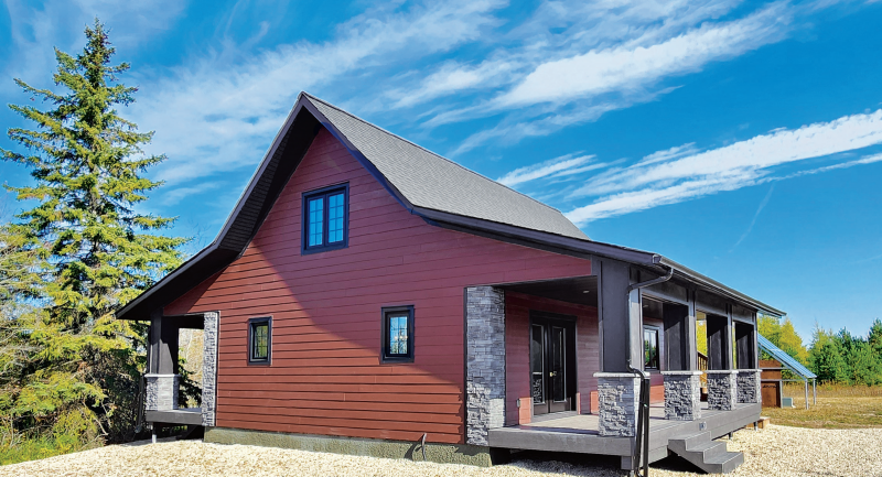
For the exterior of the cottage, we wanted to continue that city meets country style so Mandy visited CanWel Building Materials as they carry some of the best exterior finishes in the country. We chose a stunning James Hardie siding in Countrylane Red as our main color which allows the cottage to really stand out among the forested landscape. Matt and his team at Above Code Exteriors installed the products flawlessly onto the cottage! Instead of pairing this with a traditional white trim, we chose a black accent that gives the look a more modern, urban feel and pairs well with our windows and doors. The black accents also help tie together the roofing shingle that I helped install with Agassiz Roofing. For the two decks, CanWel Building Materials helped us select two different deck tones from MoistureShield Composite Decking, Smokey Gray to frame out the decks and Cathedral Stone for their centres. This creates a beautiful mix of gray and beige to keep these decks looking timeless as trends evolve and change. One thing we really loved about MoistureShield is their Cool Deck technology which makes the material cooler than other composite decking. This feature reduces heat by up to 35% to help keep our feet cool while walking on the decks during hot summer days.
After 6 months of tirelessly working on our family getaway, it is finally complete and we look forward to enjoying it for years to come.
Latest posts by Canadian Home Trends (see all)
- 2026 Design Trends: The Evolution of Home Design - April 2, 2026
- Expert Bathroom Design Secrets from Canada’s Best - April 2, 2026
- Treasure Hunting: Discovering Unique, Locally Made & Vintage Home Décor - April 2, 2026

