Holly and her husband weren’t in the market for a full-scale home renovation when they first encountered Lori Steeves of Simply Home Decorating. In fact, all they wanted was a new kitchen.
The couple and their two children, now 12 and 14, have lived in the home for over a decade, but it was only in 2014 that their vision for the cozy Kitsilano property came to fruition. Steeves originally met the homeowners roughly a year before the project commenced. “At that time, we talked about the bigger picture of their main floor, and how to make better use of their space. Their home was very dark and closed in and they were not happy with it. Their budget at the time allowed for only a kitchen renovation,” says Steeves. After consulting with the designer, the couple made the decision to hold off on their kitchen in lieu of a larger-scale renovation down the road.
Prior to purchasing the property, the homeowners were no strangers to the famously trendy beachside community of Kitsilano. Like many students attending the University of British Columbia’s Vancouver campus, Holly lived in the area while she attended school, and fell in love with the coveted location. “I never thought I could live in this neighborhood because it’s a little on the pricey side, but we managed to get in at the right time.”
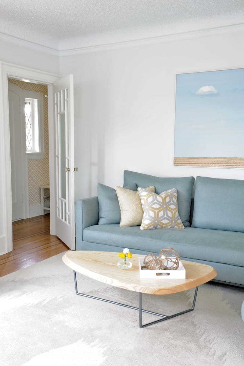
Although the couple loved the neighborhood, the house itself presented some challenges. The layout of the home, albeit sufficient for the foursome in square footage, left much to be desired in terms of light and air-flow, making it difficult to entertain or even to convene as a family.
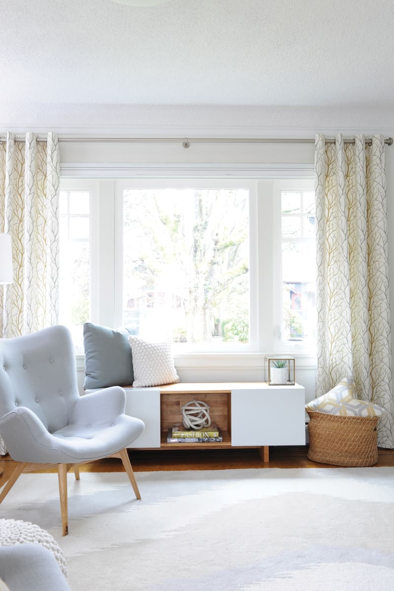
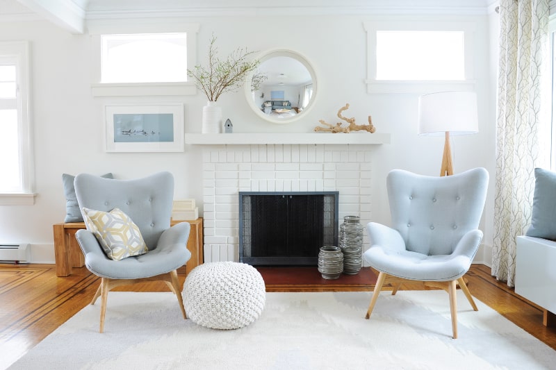
Determined to, quite literally, shed light on the potential-packed property, Steeves approached the project with a beach-theme in mind, pairing pale watery blues alongside nature-inspired accent pieces, lending freshness and brightness to the home, comparable to the shore-side itself.
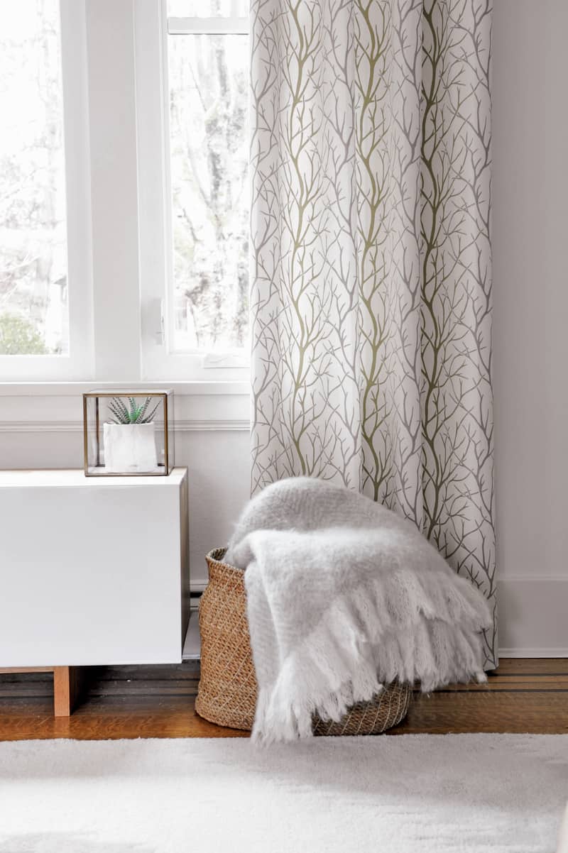
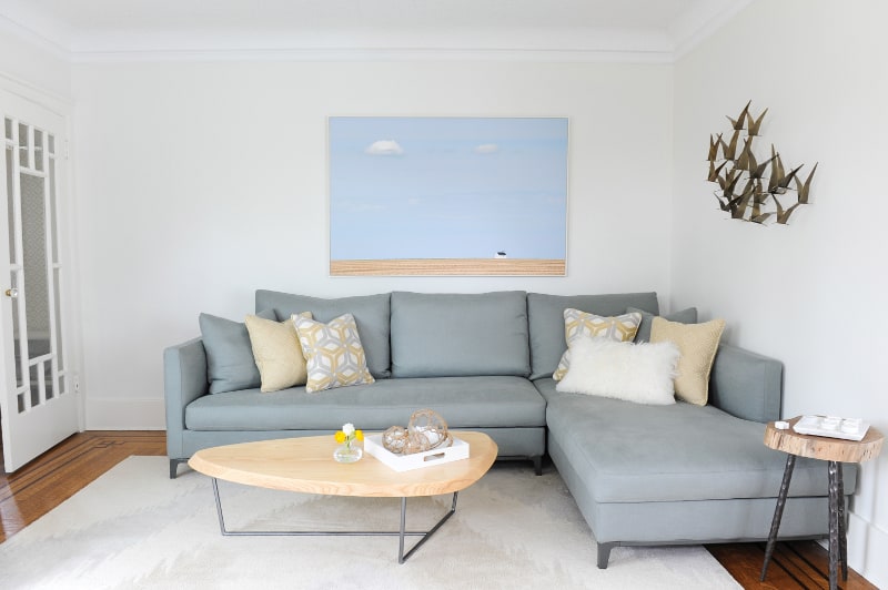
When asked about the color scheme, comprised primarily of stark white and muted accent hues, Holly revealed it to be Scandinavian inspired, a preference born from a few years the couple spent living and working in Sweden. For Steeves, the choice to go mostly white was all about making the front room brighter. “We just really wanted a lot of reflective surfaces, so the walls are light and we stuck with light colored fabric.” She adds, “The darkest fabric is on the sectional, which is for practical reasons, because it’s the most used piece.”
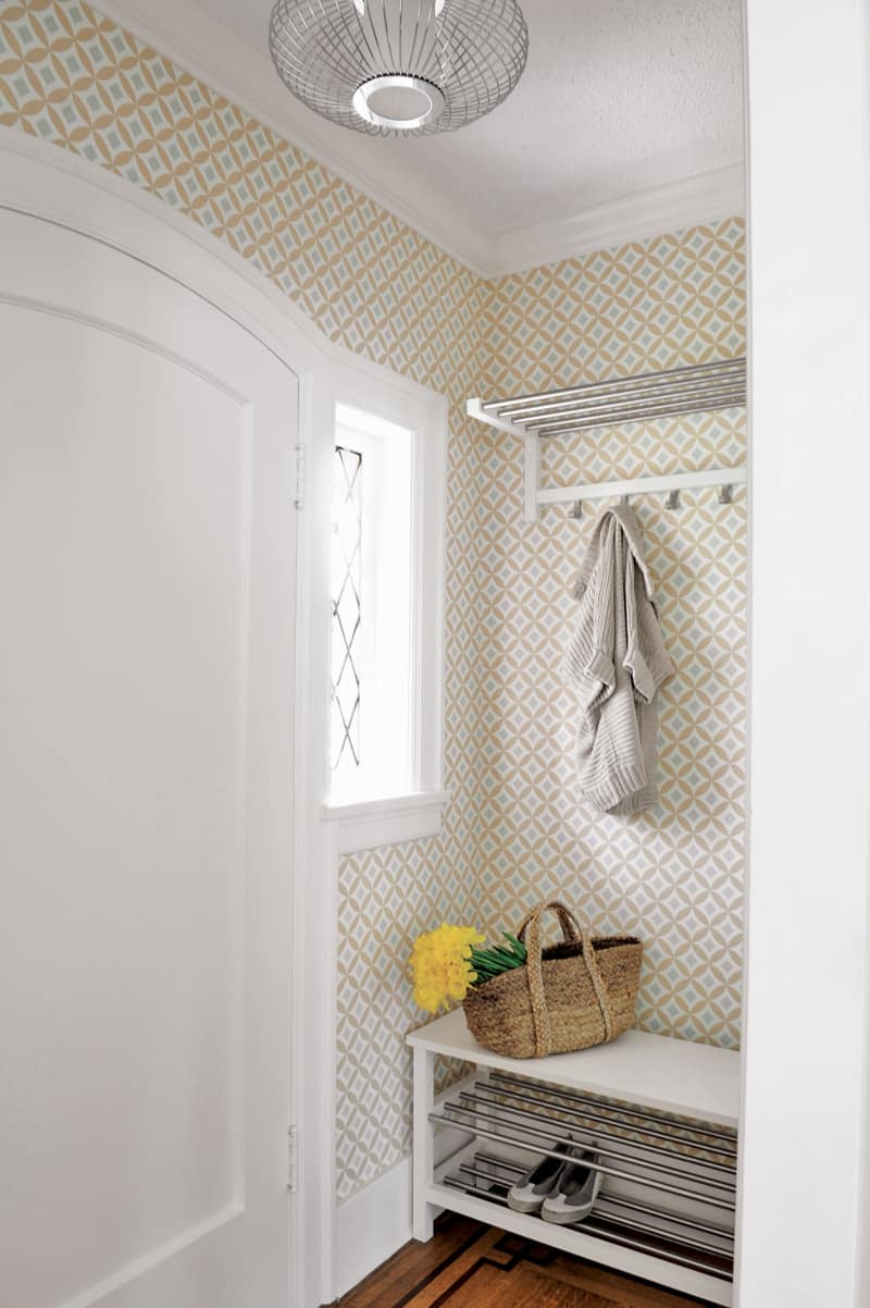
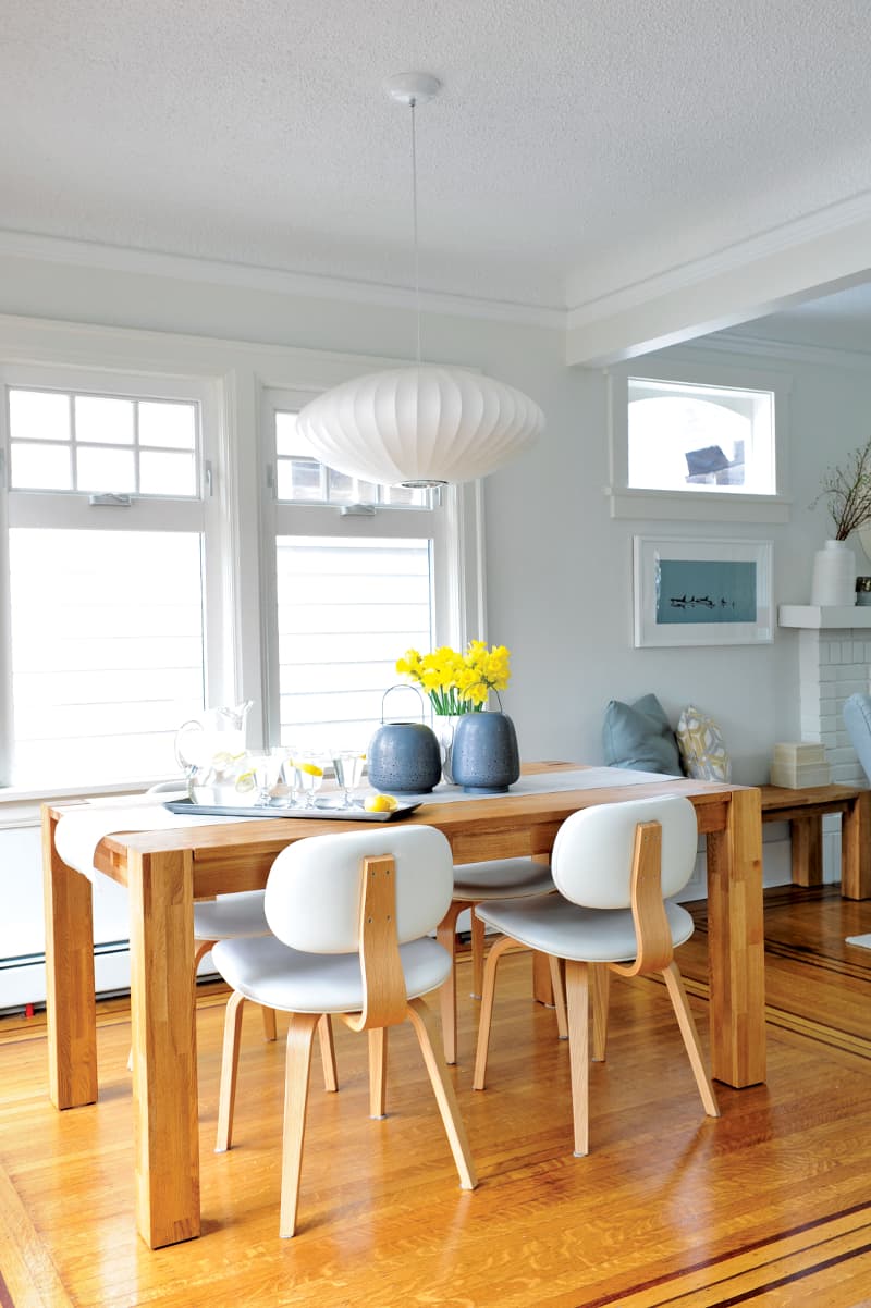
With budget in mind, Steeves encouraged the family to incorporate some existing elements into the redesign, including the original oak floors, inset with a patterned border, characteristic of the 1920’s era, and two sentimental art pieces, passed down to the couple from their parents and grandparents. In fact, Steeves describes one of these pieces, depicting orca whales, as her jumping off point for the redesign.
The rest of the décor in the home follows suit as being organically inclined, inspired by the family’s zeal for all-things-outdoors. “We really treasure the outdoors,” says Holly, “and we discovered we were always drawn to the more plant-based-feeling kind of pieces.” Like the knotted macramé ottoman, in the front room, which is reminiscent of fishing net, and the pattern on the drapes, meant to allude to tree branches or coral. Steeves adds, “A lot of what we do in Vancouver has very close ties to nature and this project was no different. People really feel close to nature here and we wanted to bring that indoors.”
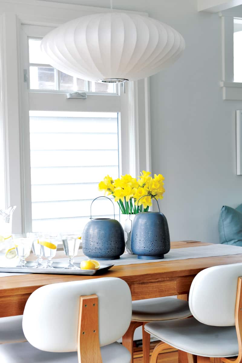
Just as an artist utilizes negative space, Steeves tactically relied on lack of color to not only enhance the existing light, but also encourage future versatility. “I like to work with a lot of color, but I’m very careful about how I use them, as colors do come and go.” She adds, “We could completely transform this scheme by changing the color of chairs, pillows, and accessories, and it would look like a completely different space.”
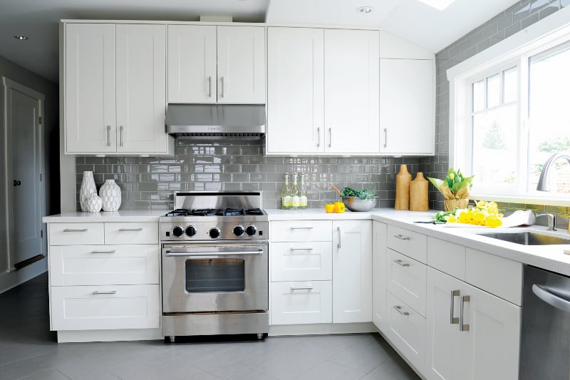
Of course, plans of further transforming the Kitsilano property are merely hypothetical for the family of four at the present. For now, they’re enjoying their home as is, in all its breathable, beachy splendor.
Text by Zakiya Kassam
Space Designed by Simply Home Decorating
Photographer, Tracey Ayton Photography
DINING ROOM: Table and Bench, EQ3; Chairs, Gus Modern; Dining Light Fixture And Lanterns On The Table, The Other Room
LIVING ROOM: Camerich Sectional, Layers and Layers; Mid Century Occasional Chairs, Parliament Interiors; Carpet, West Elm; Coffee Table And Wood Occasional Table And Metal Wall Art, Fullhouse Modern; Parabolic Mirror, Reflecting Designs; Low Cabinet Under Window, designhouse; Floor Lamp And White Vase On Fireplace, Crate & Barrel; Knitted Poof And Vases Next to Fireplace, Urban Barn; Drapery And Pillow Fabrics, Duralee Fabrics and Jo-Ann Fabrics; Kitchen Cabinets, IKEA; Counter-Top, Caesarstone
Latest posts by Canadian Home Trends (see all)
- Understanding The Importance of Great Design - January 8, 2026
- The Green Effect: To Clean or Not to Clean - January 8, 2026
- Functional Warm Addition - January 8, 2026

