Townhouse 3-Story Design – DESIGNER, MARISA LUPO, OF LUMAR INTERIORS, TOOK THE COLOR WHEEL INTO EFFECT WHEN REDESIGNING A THREE-STOREY TOWNHOME IN THE SUMMERHILL AREA OF TORONTO. The 3,100 square foot home features vibrant pops of orange and blue, against a backdrop of pragmatic neutrals. It includes four bedrooms, three bathrooms, and elevator access to the uppermost floors. The homeowners, Tracey and Kathleen were drawn to this property for a number of reasons, including its likeness to a New York City brownstone. According to the designer, the recent empty-nesters were ready to embark on their next phase of life in the big city.
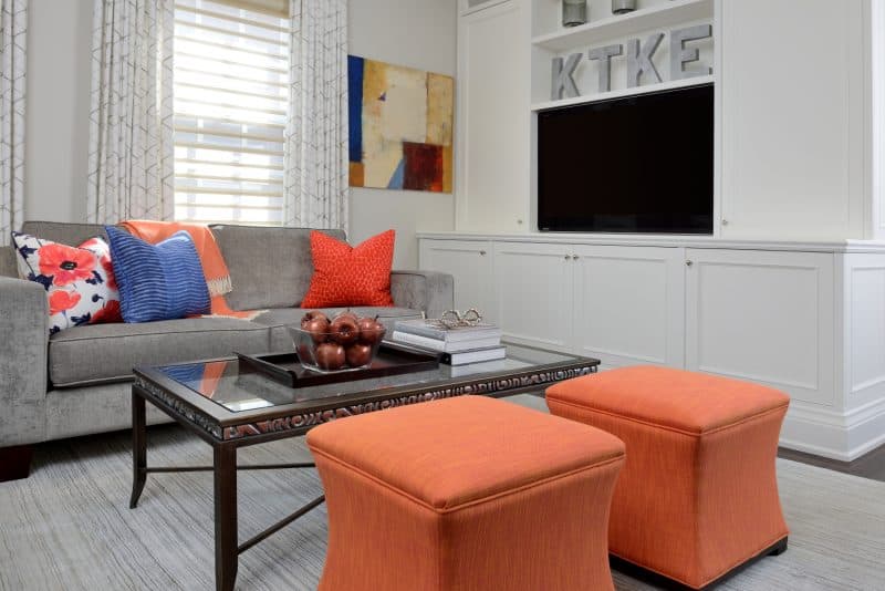
When Tracey and Kathleen first approached Marisa, they requested a contemporary look with a fresh color palette. “We wanted that wow factor,” explains Tracey. “Décor that flowed from one room to the next, leading guests to want to explore and enjoy the house with us.”
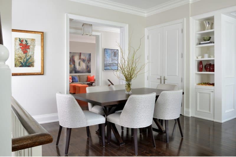
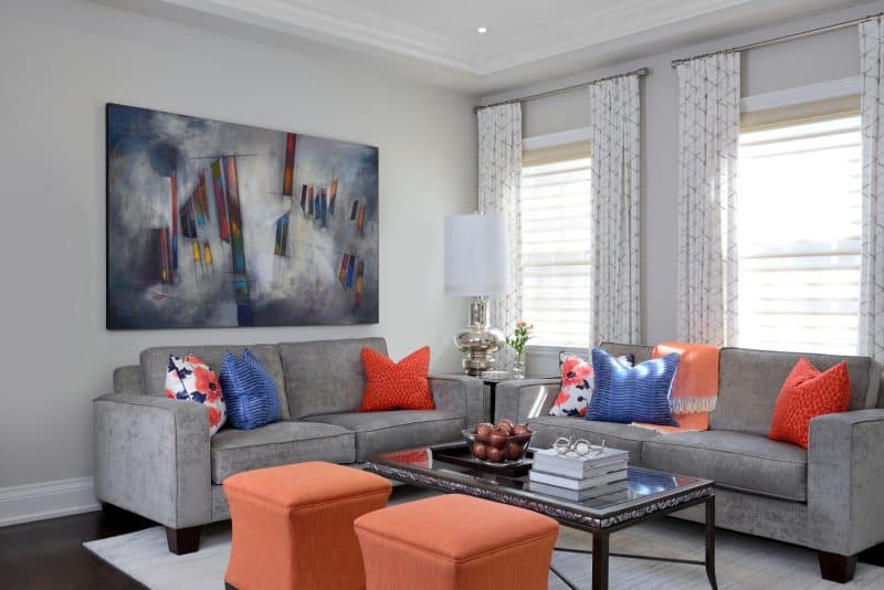
As such, the color palette was freshened up via new paint, and much of the pre-owned furnishings were reupholstered. “It was the homeowners’ idea to go minimalistic on the walls. This was on-trend and a great idea for smaller quarters,” says Marisa. “The pops of color came from their personal art collection, pillows, ottomans, and accents. Also, they had accumulated gorgeous artwork full of color over the years so this allowed the art to really pop.”
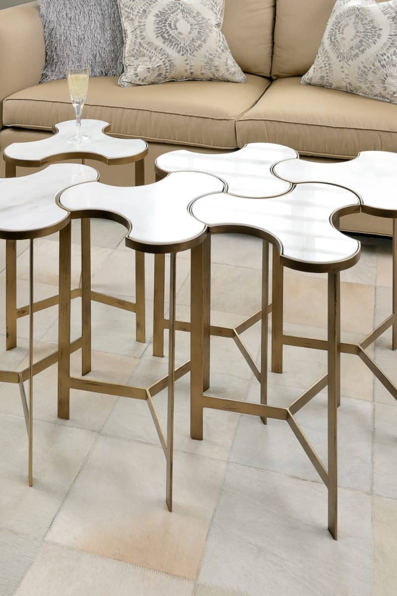
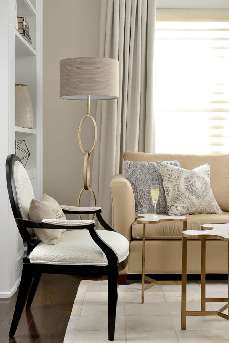
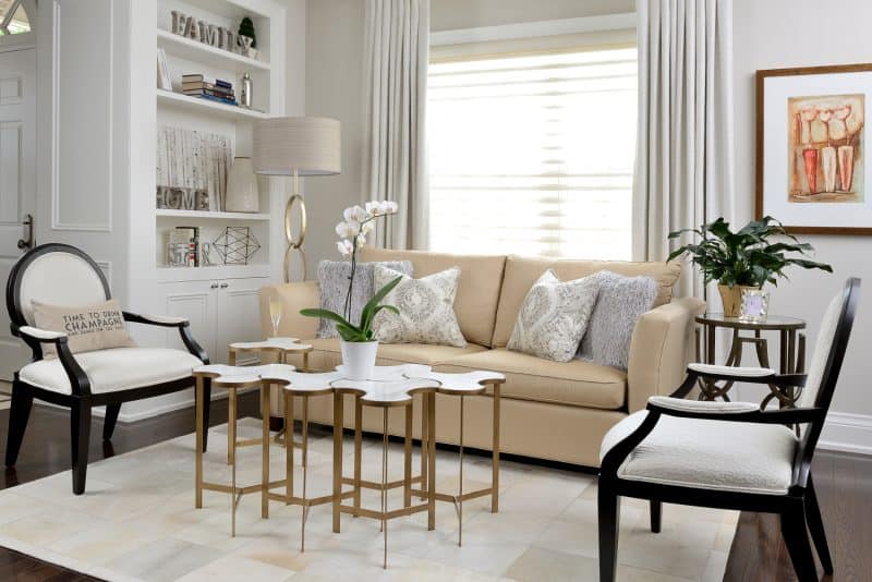
In the first family room, colorful throw pillows catch the eye and eventually draw the gaze upwards to the stunning artwork, which encompasses similar hues. In the second family room, a gold-plated nesting table steals the spotlight. “The nesting tables fit together like a puzzle and are moveable – great for a small space,” says the designer. “I also love to mix metals, so the house is a combination of gold and antique silver metals. This makes things more dimensional.”
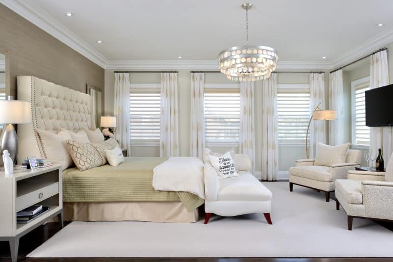
The theme of mixed metals carries on into the bedroom, where an antique silver chandelier with gold accents is suspended overhead. Besides the sporadic metallic elements, the rest of the room is subdued, featuring shades of white, cream, and light green to create a calming palette. Says Tracey, “Kathleen wanted a master-bedroom oasis, where she could decompress at the end of the day after teaching a classroom full of Grade 6 kids.” He also notes that the master bedroom is Kathleen’s favorite room, while he’s partial to the kitchen and family rooms.
When asked where they saved and splurged in the design of the 3-storey townhouse, Tracey cites the family room cabinetry, rebuilt mudroom, and garage as necessary splurges, given the property’s lack of basement and built-in storage. The couple saved by incorporating demo pieces from Lumar’s showroom, and by restoring many preowned furniture pieces.
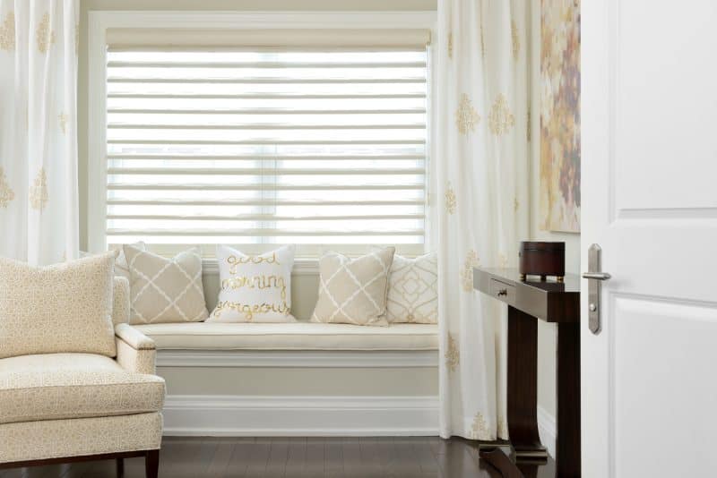
Marisa goes on to note that, though Tracey and Kathleen designed with their empty-nester status in mind, it was important for the home to remain family-friendly. Nevertheless, the finished product is chic, urban, and perfect for the new chapter in their life.
For more great ideas, click here.
For more unique items for your home, click shopCHT.com.
Latest posts by Canadian Home Trends (see all)
- 2026 Design Trends: The Evolution of Home Design - April 8, 2026
- Expert Bathroom Design Secrets from Canada’s Best - April 8, 2026
- Treasure Hunting: Discovering Unique, Locally Made & Vintage Home Décor - April 8, 2026

