Whether it is move-in time, prepping for a room remodel or it’s just time for a refresh, finding the right room colors can seem complicated and even a bit intimidating.
Taking the time to consider colors before contacting a painting professional is time well spent. Professional painting companies, such as Pacific Coat Painting, have the experience to offer useful advice on color combinations.
Having a color in mind helps move from ideas to applications. This will help with subsequent choices and avoid dissatisfaction when the work is done.
Plays Well With Others
Some colors just work well with others. Deciding which combination works in the living room and which for the bedroom is time well spent. The most important factor to finding the right room colors, designers agree, is to start with a color that is personally appealing and build on that.
Colors are very personal and using an existing element in a room, such as a piece of furniture or artwork, to draw on can provide an idea of what colors are pleasing. From there, a color palette can be created.
Darker to Lighter
Some designers advise starting with darker shades along the lower parts of a room and floor, with a midway shade for the walls and a lighter color for the ceiling. This imitates how we see the outside world with the earth at our feet, trees and buildings at eye level, and bright sky overhead.
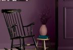
It is acceptable to bring a bold color like red from a formal space such as a living room and carry a toned-down version, like auburn, to a smaller, more private space like a den or bedroom.
Fully Clothed
When thinking about pleasing colors, consider favorite clothes. Clothing choices reflect color preferences and can be carried into color schemes for an interior room.
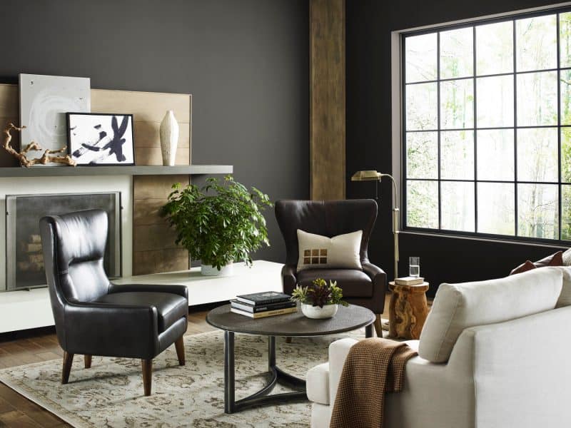
Black is useful as an accent color that helps bring out the other colors in a room. Gray, on the other hand, is useful as a neutral shade that adds warmth or coolness depending on the primary color in a room.
Three Elements
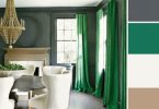
A room should be divided up into three elements that provide color. Walls should be the dominant color and provide 60% of the shade. Next, a secondary shade makes up 30% of the color and can come from furniture and upholstery. An accent color from accessories provides the final 10% and helps balance the overall feel of a room.
Small spaces should not be painted with light colors to make them seem bigger. Instead, a bold color will make a smaller space more inviting.
Runs Warm and Cool
Neutral colors can be energized by juxtaposing warm colors like gold or canary with cooler shades like smoke gray or pearl. The contrast in shades can enliven a room without taking away a restful feel.
Some spaces are well suited for a classic black-and-white treatment. With a single accent color, such as gold, a black and white room is both timeless and elegant.
The most important element in deciding how to use color to bring out the best in a room is choosing colors that are personally appealing.
Latest posts by Canadian Home Trends (see all)
- 2026 Design Trends: The Evolution of Home Design - July 10, 2026
- Expert Bathroom Design Secrets from Canada’s Best - July 10, 2026
- Treasure Hunting: Discovering Unique, Locally Made & Vintage Home Décor - July 10, 2026