Home trends’ style editor shares a kitchen makeover.
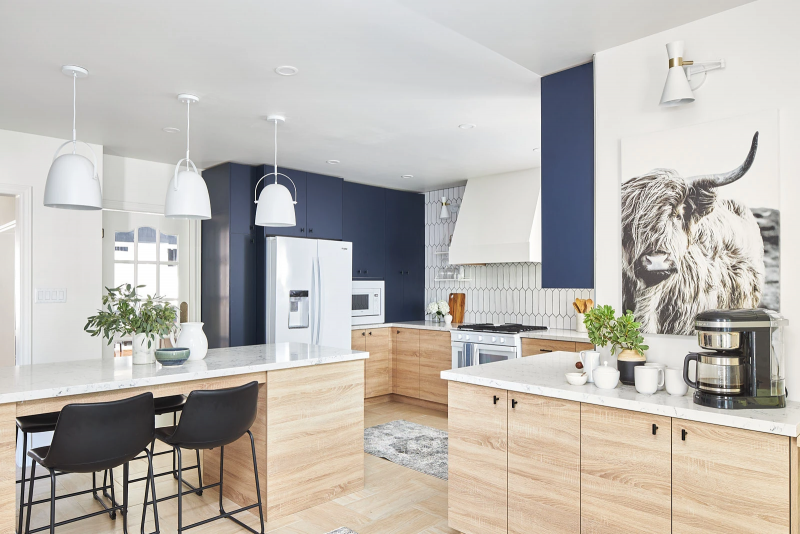
I was ecstatic when, not only did the homeowners want to completely demo their space, they also gave me cart-blanche on the entire kitchen design!We started with switching up the entire layout of the kitchen and cabinets. I went with a sturdy 3/4” woodgrain lower cabinet to tie-in the floor color, while the uppers were in a dark, solid blue to create a dramatic contrast.
Appliance selection was next in the process. And guess what? White appliances are back! First, I chose a smart gas range which allows you to send cooking instructions from your phone directly to the range. Next, I selected a french door refrigerator with a pantry inspired layout and an infinity slide shelf. Finally, we added the tub dishwasher, providing extra room for those hard to fit items.
For the countertops, I couldn’t resist the White Attica. It is primarily white but has marble ribbing that matches the uppers perfectly. When going with a material like quartz, ensure that you have it professionally installed. This is not time to try your hand at a DIY. Leave it to the professionals. We painted all the walls, trim and even the ceiling in the color Dove Tail to create a brighter space.
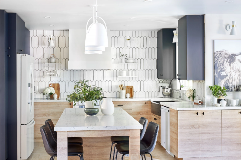
A feature that might get overlooked in a kitchen is the sink. I chose an edgy farm sink that really makes an impact. Another element I brought into this kitchen was a sleek black faucet from Delta. It features a powerful magnet to snap your spray wand into place and hold it there. In this kitchen, I opted to do the entire back wall in a gorgeous tile. I had them laid vertically to show off the tile details and elongate the wall. To make the tiled wall really stand out, I added gorgeous white and gold sconces. Countertop appliances always need to be factored into a makeover. For this family that loves to cook and bake, I chose KitchenAid. Their appliances have smart features that enhance the home cook’s experience. A coffee bar was also a must for this family. I selected a twelve cup drip coffee maker with a programmable warming plate.
For the stunning finishing touches, we shopped at Bed Bath and Beyond Canada to find the perfect accessories. We hand-picked low back black stools that tuck tightly into the island. Cutting boards, cute sugar bowls and tea pots complete the look on the open shelving.
Space designed by Jo Alcorn
Photography by Jason Hartog, https://jasonhartog.com/
Latest posts by Jo Alcorn (see all)
- Kitchen Trends with Jo Alcorn - April 1, 2026
- Trendy Culinary Haven - April 1, 2026
- Modern Country - April 1, 2026

