Bold Color Trends. Look out, color ahead! Bold is the way to go. Deep hues are all the rage right now in interior design and finding new ways to work them into your existing color palette is exciting and not as difficult as it may seem. Here are a few options to help ease you into a more colorful life.
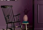
SEEING GREEN
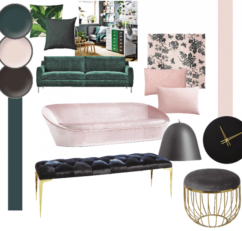
Already showing up everywhere, the new green is deep and dark, offering a sense of calm as well as providing the perfect canvas to contrast earthy textures in leather and wood. This shade of green has a luxurious look that manages to feel both classic and entirely new. All the lush, botanical pictures inundating our social media feeds have been cleverly translated into a wall color that doesn’t require a green thumb. Thankfully, this tone pairs nicely with the gold and brass accents that have been popular in recent years. Whether you go bold and cover entire walls in this rich hue, or merely add in pops of color, this design move will spice up your look.
Green Photo Credits: Paint Color, Night Watch, PPG; Throw Pillows and Sofa CF Interiors; Room Photo, IKEA
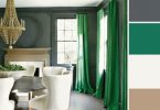
YOU’RE MAKING ME BLUSH
Strong tones can be hard to handle, especially if you consider including more than one shade. A well-chosen pastel or pale hue can help to soften the impact, complementing the darker color without competing for attention. Rather than the cool tones of spring pastels, a soft blush introduces a gelato-inspired warmth to the space. A blush pink with a little bit of a brown undertone will update and replace the default use of white as a palette cleanser. Think of blush tones as the new neutrals: colors that are light but still hold a depth and richness when layered on walls and accessories.
Blush Photo Credits: Paint Color, Wild Aster, Benjamin Moore; Sofa and Fabric Swatch, SwitzerCultCreative; Textured Throw Pillow, CF Interiors; Blush Throw Pillow, CB2
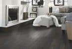
BLACK IS BACK
Bold color trends are the big news. This color palette is that even black feels new again when accenting a smart combination of jewel tones and warm neutrals. If all-over black intimidates you, try introducing matte black elements in ceramics, lighting fixtures or furniture. The new look delivers sophistication, not minimalism. Instead of severity, this color trend comes from a warm, earthy place that recalls the rich tones found in nature. In previous years, strong doses of black have infiltrated the fashion and beauty world. Now look to interior design décor items like homewares and accessories to embrace the endlessly chic color.
Black Photo Credits: Paint Color, Caponata, Benjamin Moore; Bench, Moe’s Home Collection; Stool, Renwil; Pendant and Clock, CB2
For more unique decor items for your home, click shopCHT.com.
For more great ideas, click here.
Latest posts by Kim Bartley (see all)
- Creating a Modern Laundry Room - July 2, 2025
- Small Space Furniture – Less is More - July 2, 2025
- Cottage Style Design Tips - July 2, 2025