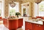
Red can be powerful, bold and stimulating. It heightens senses and is perfect for a high-energy dining room or entry. When paired with white, blue or black, it makes a crisp statement. It’s great for a room you don’t spend too much time in. Other than red accents, it’s not ideal for a child’s room where it can evoke irritability. A muddied red, like crimson, can feel sophisticated and intimate. Pair it with soft grey or blue for a rich warm feeling in a den or powder room and romance in the bedroom.
Blue is a regal colour with a history of affluence and strength. It has a calming effect with the ability to reduce blood pressure and heart rate, therefore, perfect in a bedroom, living room, kitchen or bathroom. Deeper shades can create drama and although not a neutral, most colours pair beautifully with it as an accent. To offset the cool feeling of lighter blues, add soft textures and textiles.
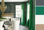
Green is the great refresher, living happily in nature. It’s restful for the senses, comforting, calm and pleasing to be surrounded by for long periods of time. It promotes concentration and allows unwinding, so an ideal colour for a home office, bedroom, den, workout room or kitchen. Blues, yellows and whites are beautiful complements to most shades of green. Plant greenery adds life and texture to any space.
Purple has long been associated with luxury and drama. It promotes creativity and although historically linked with wealth, it’s also a great choice in modern décor as a vibrant complement to an all white backdrop or equally as restful in deeper shades. Jewel tone shades are stunning in soft fabrics, such as velvet and divine in a bedroom, den or living room. Blue, green, white, yellow or red are great accent choices. Lighter hues like lavender or lilac are more feminine, feeling restful and sophisticated.
Orange inspires activity and enthusiasm. It increases energy and is believed to help heal lungs. Although great for a workout room, or a room that faces north, use sparingly or balance its intensity with white. It’s a fun, bold choice, always in style as an accent colour and a happy infusion of liveliness. It’s equally wonderful in a kitchen, stimulating appetite and not likely to feel overwhelming. Warm shades of orange are found everywhere in nature and pair well with neutrals, earth tones and shades of blue.
Yellow is a happy and uplifting, yet one of the hardest colours to get right, based on the variables of lighting. On a large scale it can evoke anger and frustration, even making babies cry more often. The bright sunshine shades are best used as accents or in a room with minimal wall space and pair well with white, black, green and blue. Slightly toned down shades of yellow can feel energizing, stimulating conversation and feel welcoming. It’s a beautiful choice for a kitchen, dining room, bathroom or entry.
Text by Michelle Cook, As Seen In Canadian Home Trends Magazine
Latest posts by Michelle Cook (see all)
- Mid-Century Modern Den/Office by Michelle Cook - July 2, 2025
- Textured Home Office by Michelle Cook - July 2, 2025
- Gifts of Relaxation and Rejuvenation - July 2, 2025