Peter Brooks, founder and principal designer of BedfordBrooks Design transforms a small builder’s condominium located on Broadview Avenue into a glamorously luxurious home. After living with the previous cookie cutter kitchen for over a year and having no time or desire to enjoy her space due to a busy schedule, Janet (the client) decided it was finally time to get the home she deserved. “I wanted an elegant space that I could enjoy and share with my daughter, something just for the girls,” she explained.
When Peter first met Janet, she was dressed in an elegant blue dress with a classic white pearl necklace. Instantly, she became the inspiration for the design. “I knew exactly what she needed, elegant luxury,” Peter speculated, and he was right.
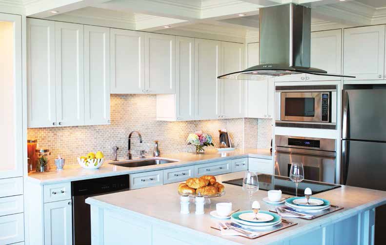
Janet’s condominium suite has a fantastic view and a great layout, but it lacked pizzazz internally. “We needed to inject character by softening up the space and adding architectural interest.” We launched the renovation from the heart of every home, the kitchen. This kitchen embodies traditional charm through the use of custom off-white shaker style cabinets, a six
inch crown molded coffered ceiling and honed Bianco Cararra marble countertops with a double ogee edge. The addition of the coffered ceiling introduced a tone of formality and concealed the hood vent ductwork, giving it a flawless look. Having pot lights is a coveted desire amongst many but the ceilings in condominiums are concrete slabs making it mission impossible for that seamless look. Taking advantage of the hollow shell within the coffered ceiling allowed for 6 pot lights to be distributed.
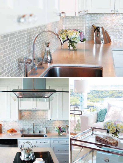
Contemporary details and finishes modernize the overall look through clear glass hardware with a touch of chrome, stainless steel appliances and mosaic glass tile mimicking opal gemstones. The kitchen shimmers as reflected light causes a remarkable play of different colour hues within the tile. “We picked up on a blue palette in the glass tile,” explains Peter, which acted as an accent through accessories. The texture of honed marble countertop and glass tile provides the perfect balance against the white finishes.
The open-concept layout is currently the hot trend especially for small spaces since it has the ability to visually expand a room. The challenge lies in making the overall space cohesive, like everything belongs with each other. Expanding the kitchen cabinetry into the living room for a built-in entertainment unit connects the two areas and makes for an easy transition. The continuation of wood flooring from the living into the kitchen diminishes any visual barriers, creating connectedness.
The overall atmosphere has an airy quality achieved through the white cotton sofa, chrome glass coffee table and cream area rug with a pale blue damask pattern. “It’s all about quality,
finish and scale when selecting furniture,” Peter affirms. Placing the sofa parallel to the window opposite to the occasional chairs creates an inviting conversation area that doesn’t revolve around the television.
Each piece of furniture has a particular style and character. Bringing in accessories is what truly personalizes the space. Accessories can introduce femininity, masculinity, playfulness and basically create a story about the person. Janet is young at heart and she has a quirky humour that can be seen in the silver pig with mini-angel wings and a horse that needs no diet!
Love for the arts is translated in the gold-leafed Venetian mirror where Janet admires her fashion look before heading out the door. A side lamp with a translucent hand-blown glass base complements the space with its blue accent colour. Finally a selfmade flower arrangement is nature’s most beautiful art. All the pretty for the girls to enjoy!
As Seen In Canadian Home Trends Spring 2013
Latest posts by Canadian Home Trends (see all)
- 2026 Design Trends: The Evolution of Home Design - April 17, 2026
- Expert Bathroom Design Secrets from Canada’s Best - April 17, 2026
- Treasure Hunting: Discovering Unique, Locally Made & Vintage Home Décor - April 17, 2026

