Taking on the role of ‘interior designer’, within your own home doesn’t have to be overwhelming. It can be a great opportunity to stretch your creative capabilities and with a few design lessons, you’ll be creating signature spaces in no time.
THE CAMERA DOES NOT LIE A smart way to begin is to take a photo of your space to help evaluate what’s currently working and what’s not. In a well-styled room, accessories are usually grouped together in clusters for visual impact. Consider that void space is a grouping, in and of itself. Not every shelf or landing surface needs to be accessorized. A good proportional relationship between the scale, colour and the quantity of items, provides interest and visual relief at the same time.
LAYERING RUGS Most homes have transitioned to hardwood, tile or other hard surfaces as the main flooring product, however, the majority of rooms can still benefit from the softness of carpets. A great solution for large spaces is to install wall-to-wall carpet. Now, splurge on a big punch of colour and interest, by layering a high quality area rug (at least two feet smaller than the room size) on top, to anchor the vignette or conversation area in your space. This combination also provides great versatility for future design changes.
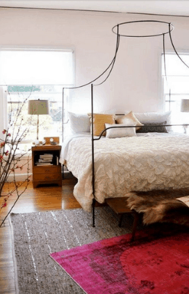
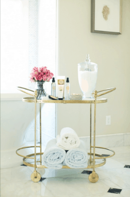
Photo Sources: The Muslin, House of Moseley
MY LITTLE FRIEND, THE BAR CART The bar cart is your new best friend. It’s one of the most versatile and classic pieces of furniture, always in style, whether it’s retro or new. Equally as appealing in a living room, office, bathroom, bedroom or patio, it’s fabulous as a side table, a stand alone display unit, towel and toiletry storage, office supplies or, the obvious, alcohol and barware. In a category all its own, it can truly look fabulous in any room. Be sure not to overcrowd the cart so it maintains its classic simplicity.
BALANCING THE ELEMENTS If you’re uncertain why your space feels cold or sparse, despite your best design efforts, evaluate its ratio of hard goods to soft goods. Large expanses of hard surfaces, such as floors, walls, high ceilings, counters, fireplaces, glass and geometric shapes can be toned down by implementing soft goods and organic shapes in upholstery, area rugs, accessories and greenery. Combining these elements and layering textures provides relief to the senses, creating a cosy atmosphere. This is another great time to take a picture of your space to see if you’ve struck the right balance.
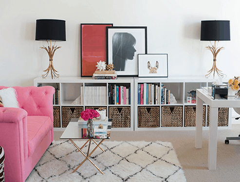
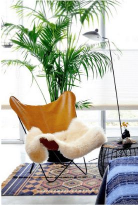
Photo Sources: At Home In Love, Kalynor
COME HERE, COLOUR! If you’re colour-shy, force yourself to embrace it. Although you may have heard this many times, you may not have confidence in properly applying the design principle. The easiest way to incorporate colour, with minimal risk, is to choose one or two bold colours to sprinkle throughout a room with a neutral backdrop. A lamp base, toss cushion and vase, all in the same colour or varying shades of the same colour family, may be enough to bring a room to life and easily swapped out to create a different look. For a greater colour infusion, paint the ceiling a bold colour, while adding a few accent pieces in similar tones to the space. The result is a dramatic yet intimately personalized look.
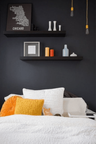
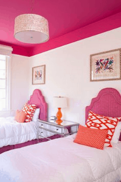
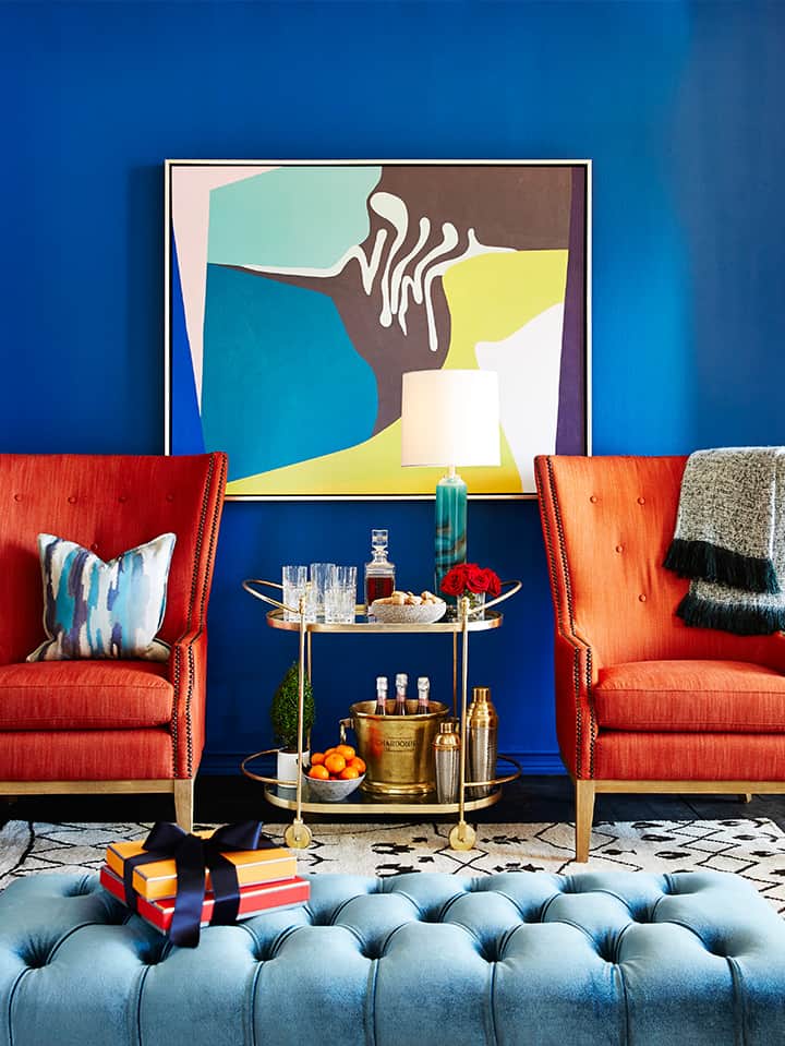
Photo Source: Daringhall, Pinterest, Modern Bohemian
Try applying these lessons to transform every space in your home and you’ll begin to see how the rooms flow together beautifully.
Latest posts by Michelle Cook (see all)
- Mid-Century Modern Den/Office by Michelle Cook - April 15, 2026
- Textured Home Office by Michelle Cook - April 15, 2026
- Gifts of Relaxation and Rejuvenation - April 15, 2026


