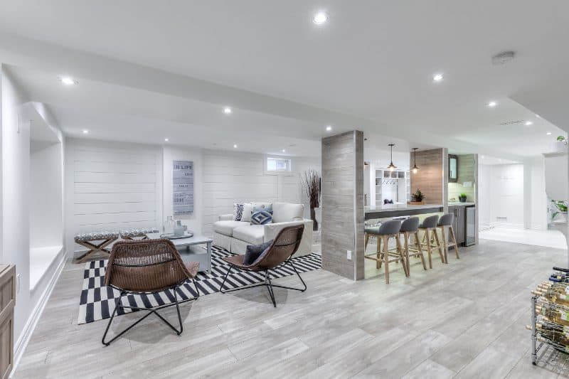
 Walk Out Basement Design – A walk-out basement gets a warm and inviting makeover with a chic, coastal vibe.
CANADIAN HOME TRENDS CAN YOU TALK ABOUT THE BASEMENT’S DESIGN AND LAYOUT?
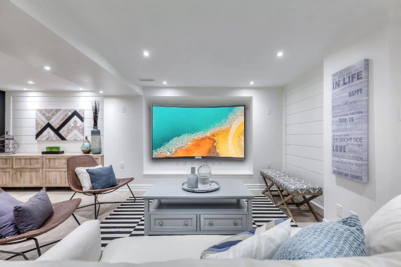
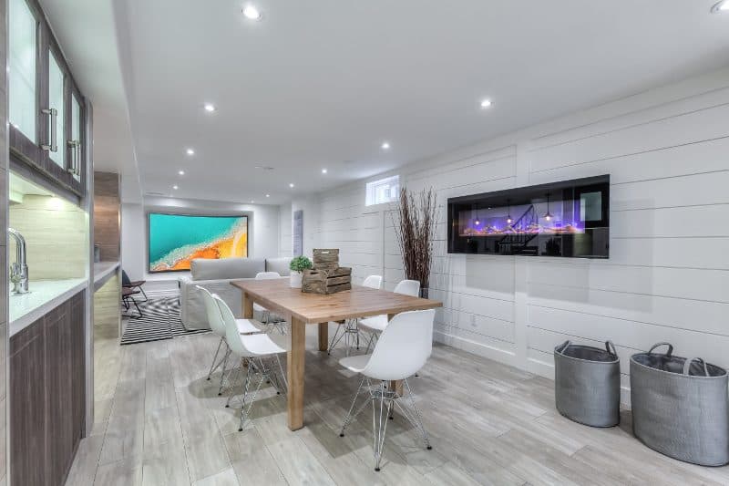
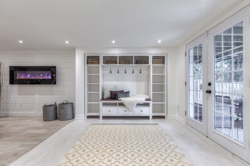
CHERYL TAY The homeowners visualized their basement as the primary spot to spend recreational time with family and friends. With 1,300 square feet to work with, we were able to accommodate everything on their list, plus a bar and lounge as well as two full baths, a separate shower room to serve the pool guests and a full private bath in the nanny’s suite. With a walk-out basement, there’s a lot more natural light. We wanted to keep the layout as open as possible to allow light to flow throughout the space.
CHT CAN YOU TALK ABOUT WHAT INSPIRED THE OVERALL DESIGN?
CT The personalities and lifestyle of the homeowners was the inspiration for my design. The goal was to maximize the functionality of the space around a great design that reflects the style of the family.
 CHT WHAT IS A COMMON MISTAKE PEOPLE MAKE WHEN DESIGNING AN OPEN CONCEPT BASEMENT?
CT Make sure you plan out all the details of the layout, design and finishes before you start. An open concept that has no defined purposes ends up being wasted space. I always say, there’s a big difference between finishing your basement and designing your basement.
CHT WHERE DID YOU DECIDE TO SPLURGE IN THIS BASEMENT?
CT We splurged on the extra costs involved in taking the bar and lounge to the next level. This included details like the widening of the whole footprint, beefing up the walls that wrap the posts, cladding them in the same material as the cabinets, quartz countertops and adding a fireplace to top it off.
 CHT CAN YOU TELL US A LITTLE BIT ABOUT THE HOMEOWNERS?
Walk Out Basement Design – They’re the cutest! It was an exciting but also nervous time for them. Stephanie and Laurence were expecting their first child at the time and her baby shower a month before the baby’s due date was our deadline for the project. They were great about being involved in the decision making process and keeping the lines of communication open. They’re laid back, young at heart, warm and inviting: just like their new space.
- Space Designed by Intrinsic Designs, www.intrinsicdesigns.ca;
- Photography by Anthony Rego Photography, www.anthonyrego.com;
- Tiles, Ciot, www.ciot.com;
- Laminate Flooring, Torlys, www.torlys.com;
- Paint, Benjamin Moore, www.benjaminmoore.com;
- Furniture And Accessories; IKEA, www.ikea.com; Urban Barn, www.urbanbarn.com; Bouclair, www.bouclair.com; Crate & Barrel, www.crateandbarrel.com; Restoration Hardware, www.restorationhardware.com; HomeSense, www.homesense.ca
The following two tabs change content below.


Canadian Home Trends magazine gives you a personal tour of the most stunning homes and condos across Canada. You'll be inspired by a selection of accessible home décor products, trend reports, simple yet stylish DIY projects, and much more. In each issue, you are given the tools to recreate designer spaces you've always dreamt of having at home, in-depth renovation and design advice, colour palette and furniture pairings, and Canada's best places to shop.
Latest posts by Canadian Home Trends (see all)
- 2026 Design Trends: The Evolution of Home Design - May 10, 2026
- Expert Bathroom Design Secrets from Canada’s Best - May 10, 2026
- Treasure Hunting: Discovering Unique, Locally Made & Vintage Home Décor - May 10, 2026




I absolutely love this design. It makes the basement not look like a basement. So bright and airy! Love Love Love!
I can’t believe how light and airy a basement can look!
no dungeon feel to this basement at all…..very nice!
sure wish my basement look liked this