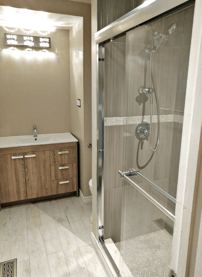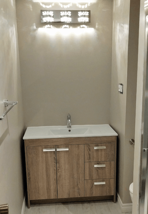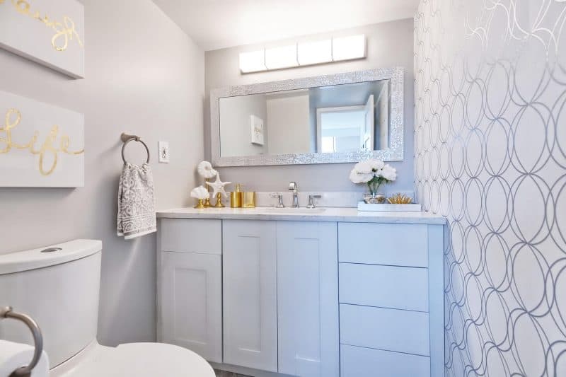
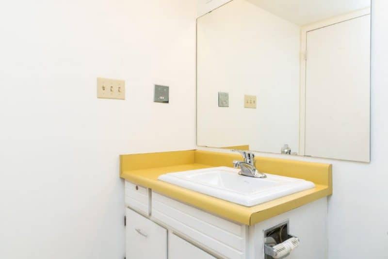
This 70s house remodels before and after pictures are great. Homebuyers tend to prefer two full bathroom homes but in this renovation project, there was not enough space to expand this powder room into a full bathroom. Instead, we focused on making it an eye-catching space that potential buyers would fall in love with despite the lack of a tub or shower! – The Property Stylist, www.thepropertylifestylist.com
BEFORE 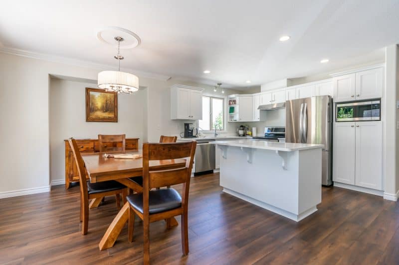
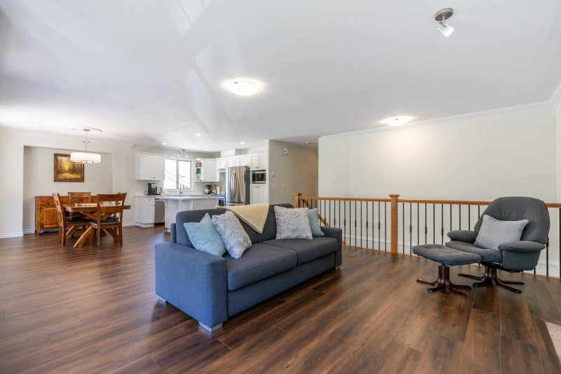
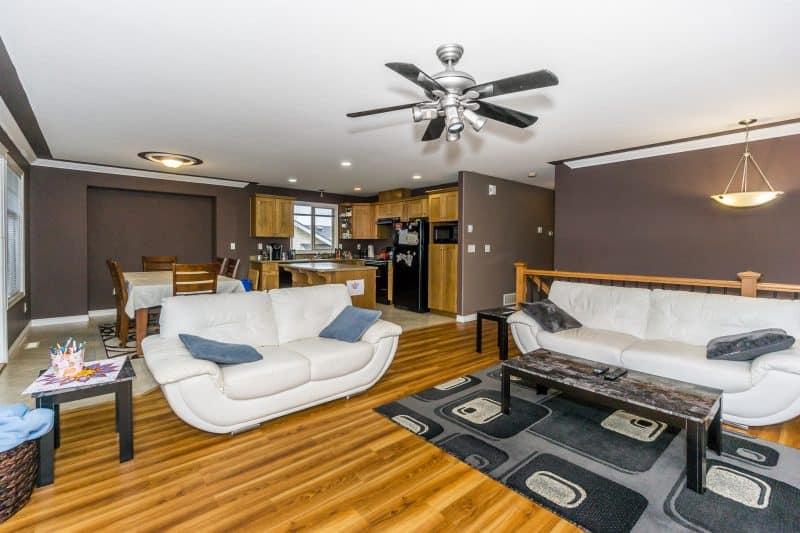
A very simple renovation that replaced a few key items helped brighten the space and make it appear larger. We painted the kitchen cabinets white and added new appliances to create a fresh modern look. When renovating, use light colors and try to build a color scheme using elements that would be costly to replace like a floor covering. In this case, we chose to replace the floor with a cost efficient laminate and staged the space in complementary earth tones. – Fraser View Home Cleaning Services, www.fraserviewhomecleaningservices.com
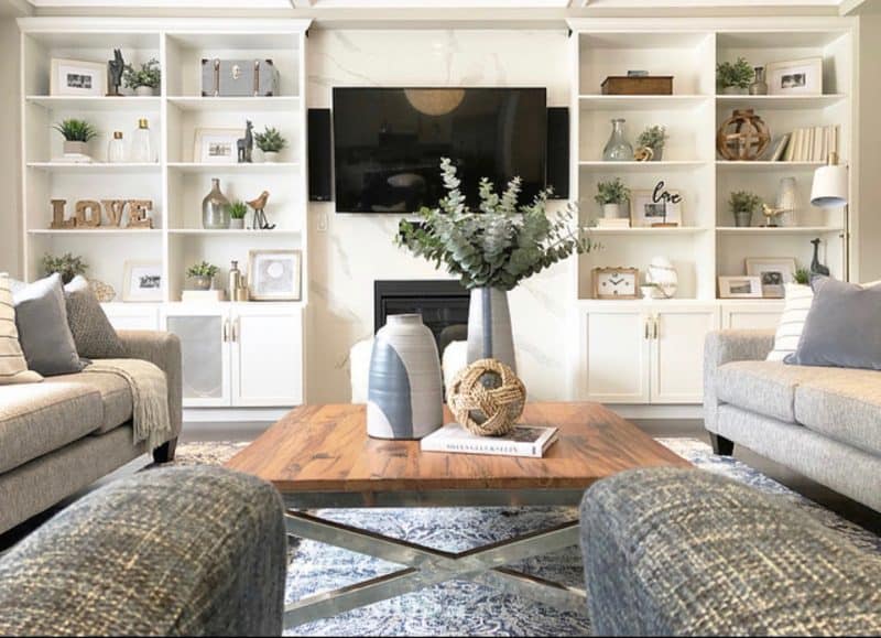
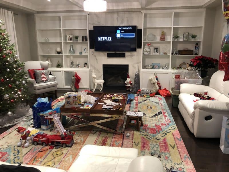
Styling your shelves correctly can make all the difference in a large space. Choosing a color scheme and grouping together items in varying heights, odd numbers and a mix of vertical and horizontal shapes to create a triangle creates a visually stunning display that optimizes the look and feel of your built-in. – Mint Condition, www.mintconditionstaging.com
BEFORE 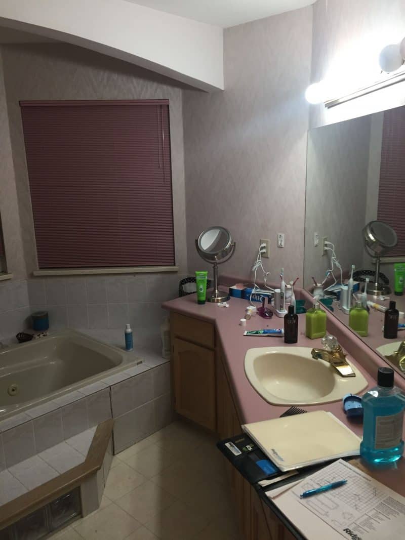
BEFORE
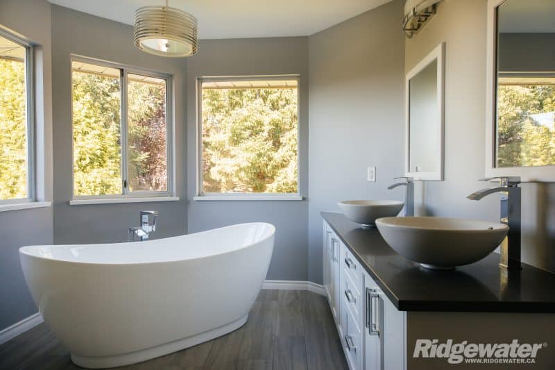
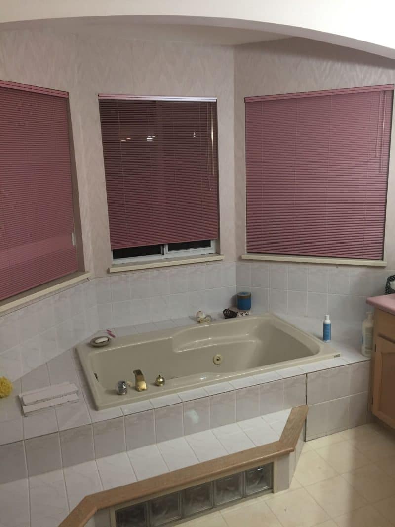
This 70s house remodel before and after bathroom seemed small and cramped but the layout of the main fixtures wasn’t the problem. To make the room feel more spacious, we replaced the outdated built-in tub and step with a modern freestanding tub and removed the arch that visually separated the tub area from the rest of the bathroom. This created a much more open and spacious feel without relocating any of the major fixtures! – Ridgewater, www.ridgewater.ca
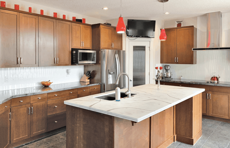
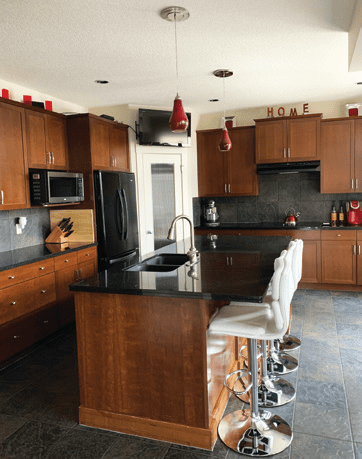
The homeowners were happy with the layout and size of the kitchen but found it dark. They made a few simple changes and their kitchen was transformed! The main focal point is now the island with a one-of-a-kind Epoxy counter, artistically created directly over the old black granite. Complementary Epoxy side counters were added in silver and titanium. Epoxy countertops are a great option for those on a budget. They are also durable, scratch resistant, heat resistant up to 400 degrees and require no annual maintenance. In addition, they aren’t porous so they won’t stain or trap bacteria. – Marnie Pallesen, www.polyboss.ca
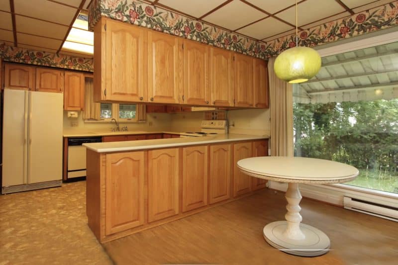
BEFORE
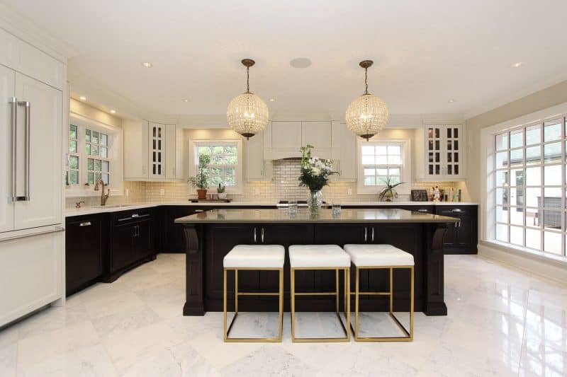
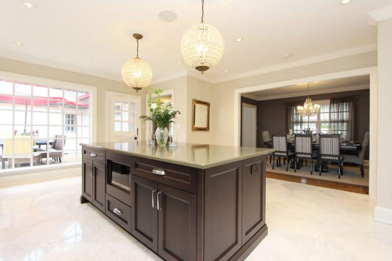
The goal with this kitchen was to maintain the feel of the original 1970s home but in a modern style with elegant, Hollywood-inspired touches. The design was carefully planned to optimize natural light and create flow through the kitchen from the backyard, side entrance, and living room. A nine-foot stained maple island, clean white upper cabinetry, a custom range hood, and elegant lighting work together to create this beautiful space. – Lev2, www.lev2millwork.com
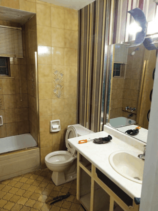
This 70s house remodel before and after shows this bathroom in sad need of a makeover. We started by swapping out the placement of the fixtures and integrating a walk-in shower. This allowed a more esthetic-ally pleasing look when entering the bathroom. The new contemporary color scheme and stylish finishes helped transform this bathroom into a beautiful oasis. – Mister Bathroom, www.misterbathroom.ca
For more great ideas, click here.
For more unique items for your home, click shopCHT.com.
Latest posts by Canadian Home Trends (see all)
- 2026 Design Trends: The Evolution of Home Design - April 15, 2026
- Expert Bathroom Design Secrets from Canada’s Best - April 15, 2026
- Treasure Hunting: Discovering Unique, Locally Made & Vintage Home Décor - April 15, 2026

