DESIGNER YVONNE WHELAN TRANSFORMS A TYPICAL COOKIE CUTTER
SPACE INTO AN AIRY, TIMELESS KITCHEN!
CANADIAN HOME TRENDS CAN YOU TALK ABOUT THE OVERALL DESIGN OF THIS TIMELESS KITCHEN?
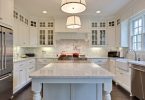
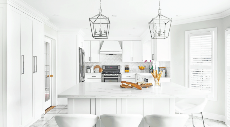
YVONNE WHELAN The home is a typical builder home in a suburb. There were certain limitations about changing the space because the homeowner wanted to maintain the floors as they were relatively new and in good shape throughout. Changing them would have required a huge increase in the overall budget. The layout was a little crammed and there was an abundance of unused space in the middle of the kitchen which screamed for an island. The room was dark and dated and needed an overhaul.
CHT CAN YOU TALK ABOUT WHAT INSPIRED THE DESIGN?
YW The homeowner wanted something more current than what she had. Brighter, an island possibly, some stone counters and an over all more updated look without being too modern. She really loves the transitional style.
CHT WHAT IS YOUR FAVORITE DESIGN ELEMENT IN THIS SPACE?
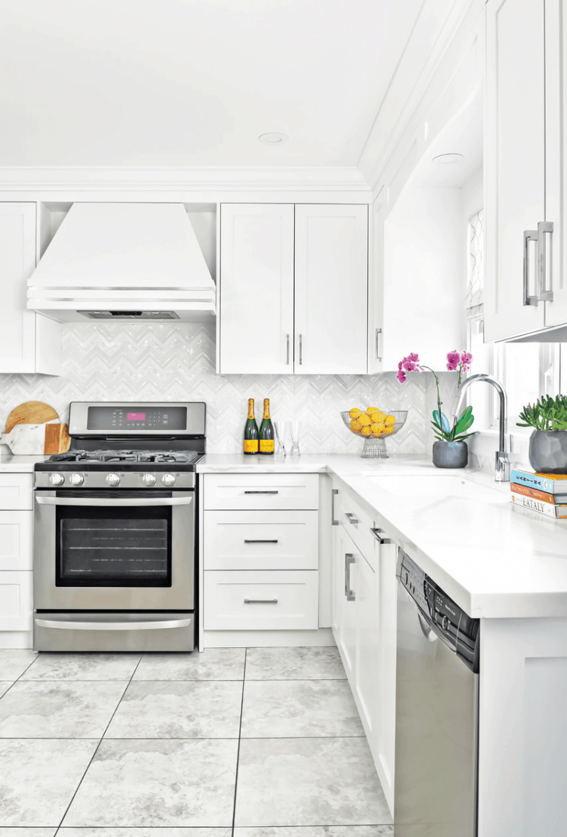
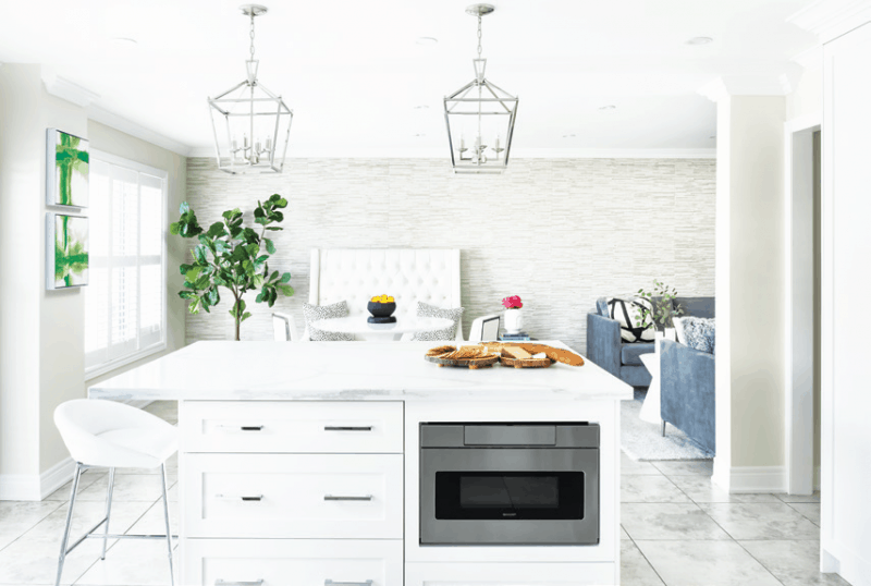
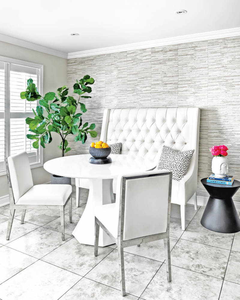
YW That is a tough question. I love the detail on the custom range hood we designed. I also adore the backsplash with the Mother of Pearl inlay. I am so glad we went with a counter depth fridge as it makes the room flow much better. I also love the stone wall we added to the back wall to give some warmth to the room.
CHT WHAT IS A COMMON MISTAKE PEOPLE MAKE WHEN RENOVATING AN OPEN CONCEPT SPACE?
YW A common mistake is not having a plan and just going with what appeals to you without thinking on how it will work with all the other elements in the space. In this kitchen, we had to maintain the floors which had a warm undertone to them. So cool grays were totally out of the question. We had to find options that had warmth to them. All the finishes were selected to work with each other to create a harmonious flow. It is important to make a plan and choose all your finishes early on.
CHT WHERE DID YOU SAVE AND SPLURGE?
YW We saved by maintaining the existing floors. We also saved on the lighting and stools by finding some great deals at big box stores. The splurges were the backsplash as well as the quartz counters. We added a pullout drawer microwave that is so much fun and functional. The stone wall is so impactful but was a pricey endeavor.
CHT IF YOU COULD DESCRIBE THIS SPACE IN A FEW WORDS WHAT WOULD THEY BE?
YW I would describe this space as a bright and airy timeless kitchen.
Space Designed by Yvonne Whelan, www.yvonnewhelandesign.com; Photography by Nicole Aubrey Photography, www.nicoleaubrey.com
Latest posts by Canadian Home Trends (see all)
- 2026 Design Trends: The Evolution of Home Design - April 6, 2026
- Expert Bathroom Design Secrets from Canada’s Best - April 6, 2026
- Treasure Hunting: Discovering Unique, Locally Made & Vintage Home Décor - April 6, 2026

