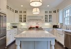
Inspired by natural light, this kitchen was reconfigured from an inefficient L-shape to an open-concept galley-style kitchen that seamlessly flows into the rest of the home. For a timeless design, this kitchen perfectly combines traditional charm with contemporary enrichments, such as a modern take on shaker-style cabinets that play off the thickness of the natural stone countertops and backsplash. Open shelving under the feature window and a textured plaster hood fan bring depth and warmth within the small space. For a clean and timeless look, the fridge and dishwasher are integrated, and the cabinetry utilizes touch-latches to keep the eye on intentional details. The only visible hardware comes from a pop of polished nickel on the tall storage. Mixing metals is the key to creating a curated space, such as the unlacquered live finish on the faucet which accumulates patina over time.
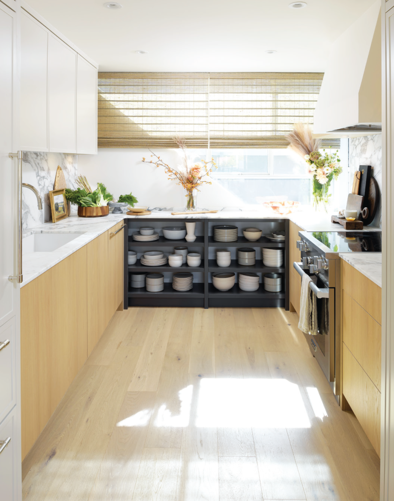
Designer Jamie Banfield www.jamiebanfield.ca
A recently retired couple desired to transform their house into their dream home. The goal was to create an open concept kitchen that would allow them to host large family gatherings. To achieve this, a wall was removed, allowing for more space and easier movement during events. The homeowners chose a white and gray color combination with gold handles for a rich, luxe look. Gold accents throughout the space help to tie everything together for this perfect kitchen! – Built by Heavy Duty Homes Inc, www.heavydutyhomes.com; Designed by SKL Designs, www.designbysk.com
Located in the heart of Shaughnessy, the goal was to transform this heritage single-family home into a triplex, with three units in the main structure. We wanted this transformation to incorporate thoughtful and innovative space planning, but keep the traditional heritage feel of the original building. The kitchen boasts clever storage, stainless steel fixtures, honey bronze hardware and Caesarstone countertops, embracing durability and maximizing efficiency. We played with sleek contrasts, where warm whites were combined with dark hardwood throughout, creating a space that feels modern, sophisticated, and timeless.
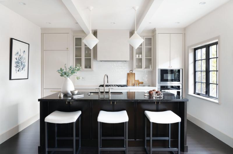
Designer Annaliesse Kelly www.annaliessekellydesign.com
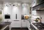
We designed a modern and refined kitchen that includes elements of warmth by introducing timeless walnut accents throughout the kitchen combined with crisp white tones. The fridge wall stands out with its custom ribbed wall that coordinates with the upper section of drawers along the perimeter of the kitchen. The stainless-steel hood with polished nickel banding is a focal piece in this kitchen, adding an industrial charm, while the polished nickel fixtures, faucets, hardware and inset drawer trims tie in seamlessly, creating a fresh use of metals. The beautiful natural stone countertops waterfall around the island and wrap the perimeter along with the backsplash to achieve a sophisticated look. The pantry tucked in behind the kitchen provides ample storage and a long run of counter space for all those small appliances. The finishes of the pantry impeccably mimic the look of the kitchen to create a harmonious flow for this attractive and functional everyday space.
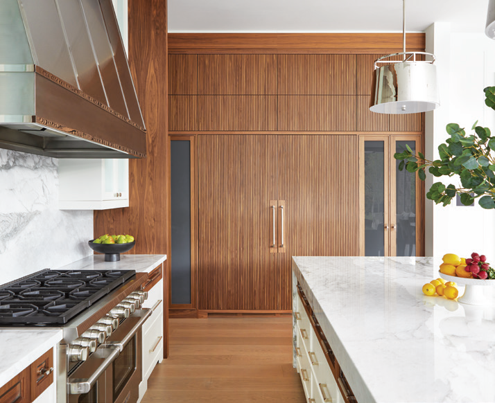


Designer Dvira Ovadia www.dvira.com
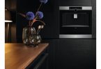
The building was converted from a warehouse to residential lofts over 20 years ago and the kitchen had not been updated since; it was in need of a refresh and something that was more in line with the aesthetic we’ve leaned into. Our goal for the entire loft was a calming space supported with a variety of neutral tones and we used that as our North Star when making design choices. The idea was to go all white for the kitchen renovation but in a variety of shades to add depth and various points of interest. White and black appliances and high gloss cupboards with hidden handles offer a more minimalist effect. White quartz countertops and the off-white vertical kit-kat style tiles draw your eye upwards to the 25 foot ceilings, ultimately elongating the space further. The grout is also a warm gray to work cohesively with the oak flooring and beige furniture. We finished the space with warm wood accents and added a vintage element with a Smeg kettle and toaster. For our appliances it was important that the aesthetics were on point and that the functionality was top-notch. The Samsung Bespoke series had to hit all the marks.
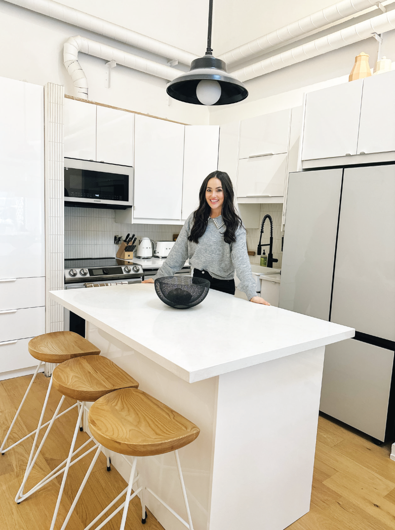

– Chloe Wilde and Ben Johnston, www.instagram.com/thechloewilde
Vicostone’s newest color, Tyrol is inspired by natural Quartzite stone, as well as sea cliffs and the combination of several shades of whites and strong dark gray veins. The background features different color bonds with a slight contrast, while still maintaining the beautiful depth of Quartzite with a smooth transition from layer to layer. With design color trends leaning toward subdued and serene tones, we are now seeing calming blues making their way to interiors. The soothing nature of cool tones makes it great for spaces that promote tranquility.
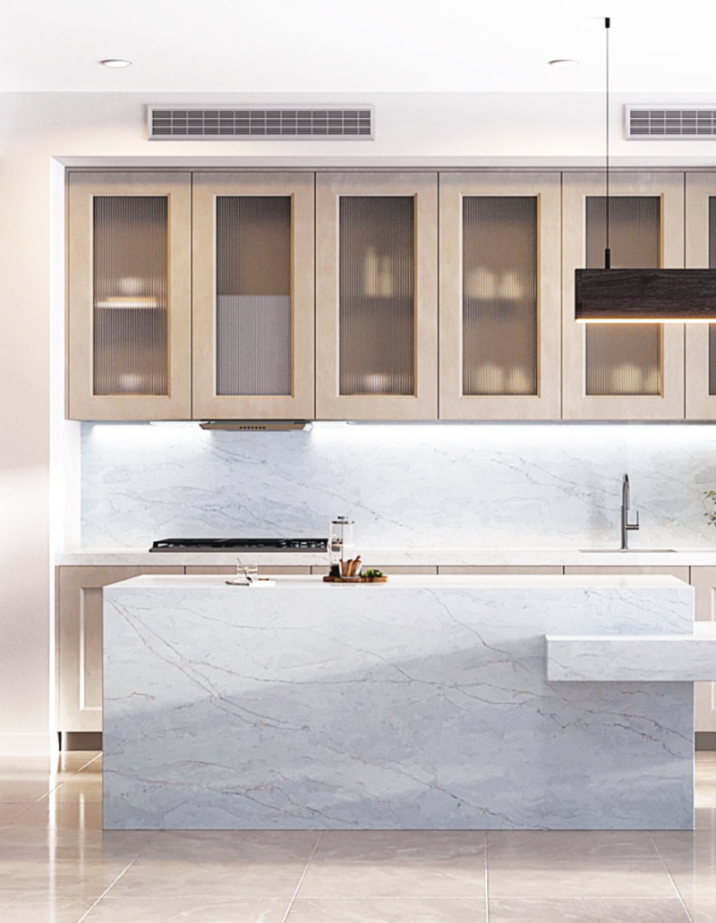
– Vicostone, www.vicostone.ca
This modern and stylish kitchen in the Beaches, demonstrates how versatile neutral gray cabinetry can be. Its shaker style cabinet doors in a beautiful gray showcases how this neutral color can either pull towards cool or warm tones depending on your desired look.
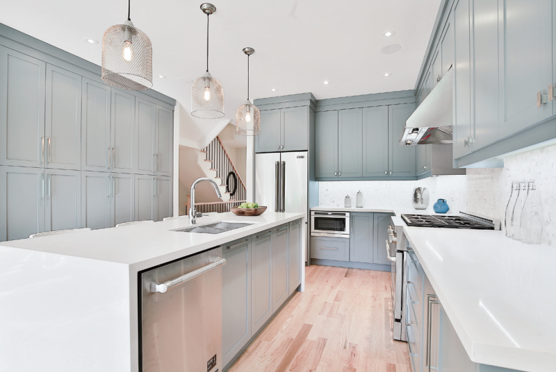

– Norseman Construction, www.norsemanconstruction.ca
Porcelain slabs are a great way to make a statement in a kitchen, bathroom or living room. They are ideal for wall cladding applications such as backsplashes, shower walls, and fireplace walls because they are available in thinner sizes. They also create a seamless look with minimal grout lines and are available in larger formats that help create a luxurious look. As for selection of pattern, the options are endless so you are sure to find a slab that fits perfectly into your space.
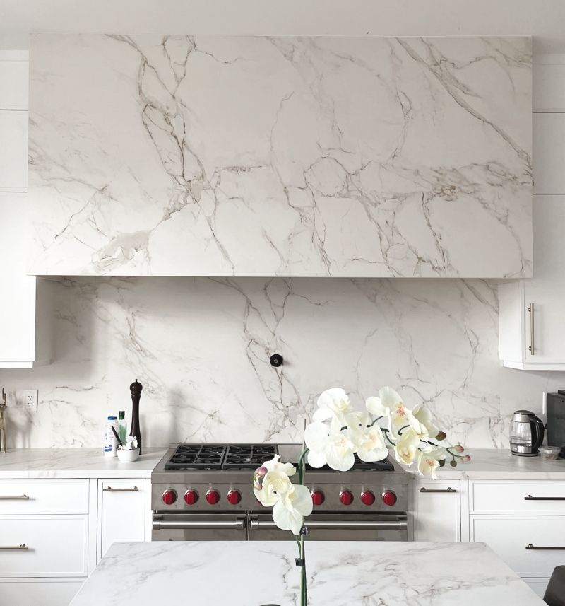
– Take Us For Granite, www.takeusforgranite.ca
Latest posts by Canadian Home Trends (see all)
- 2026 Design Trends: The Evolution of Home Design - April 29, 2026
- Expert Bathroom Design Secrets from Canada’s Best - April 29, 2026
- Treasure Hunting: Discovering Unique, Locally Made & Vintage Home Décor - April 29, 2026

