With the goal to create a fresh herb/ garden feel, evoking a sense of freshness, homeliness, and warmth, the homeowners enlisted the assistance of Taylor Reiko Design. The challenge they faced was that the home, built in the ‘70s, had its own unique architectural geometry behind the existing millwork. Despite this, Taylor ensured that the full renovation maintained the original layout, while making specific millwork customizations to achieve a cohesive space.
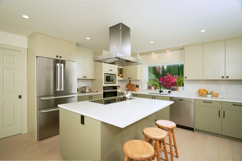
A notable design choice was the implementation of two-tone cabinetry. Taylor decided to use a lighter hue on the upper cabinets and a darker hue on the lower cabinets, creating the illusion of spaciousness and airiness. This contrast was beautifully complemented by black hardware, appliances, and fittings, providing the perfect amount of visual contrast.
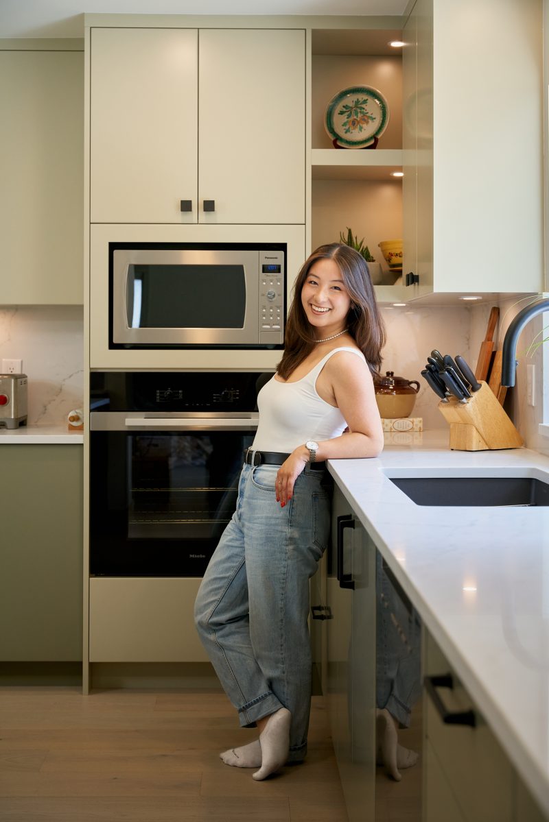
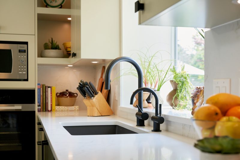
To maximize functionality and aesthetics, Taylor’s team custom designed corner shelving. These shelves were meticulously crafted to allow the client to display their favorite items as highlighting pieces. Recessed under cabinet lighting was strategically installed to enhance the display, while hidden storage compartments were integrated at the back of the shelves, providing a solution for storing seasonal items.
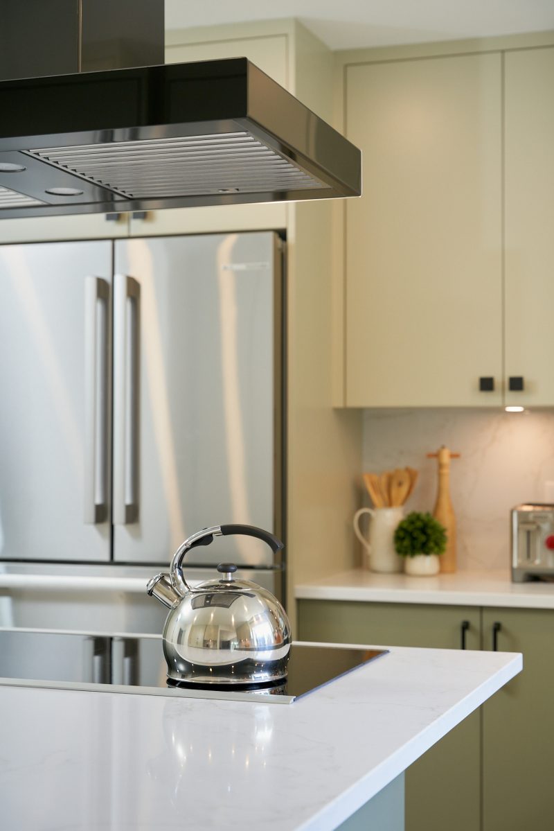
Following a modern minimalist approach, Taylor opted for painted slab doors, which added to the clean lines and simplicity of the design. They took it a step further by extending the countertop all the way up to serve as the backsplash, resulting in a seamless, uninterrupted surface that contributed to the overall contemporary feel of the kitchen.
One of Taylor’s favorite features of this project is the seamless transition between the kitchen and the garden. Taking into account the client’s preference for abundant natural light, they chose not to install window coverings. This decision allowed the natural southwest light to fill the space throughout the day. The carefully selected muted green hues, combined with olive tones, successfully brought the outdoor feel indoors, connecting the kitchen with the surrounding garden.
Taylor R. Nomura, www.taylorreikodesign.com
Taking into account the client’s preference for abundant natural light, Taylor chose not to install window coverings. This decision allowed the natural southwest light to fill the space throughout the day.
Latest posts by Canadian Home Trends (see all)
- 2026 Design Trends: The Evolution of Home Design - May 1, 2026
- Expert Bathroom Design Secrets from Canada’s Best - May 1, 2026
- Treasure Hunting: Discovering Unique, Locally Made & Vintage Home Décor - May 1, 2026


