 Canadian Home Trends’ Design and Event Editor, Evelyn Eshun helps a busy couple create a calm oasis in their backyard.
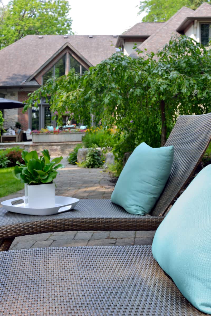
Backyards offer homeowners numerous imaginative nooks. Designer Evelyn Eshun re-imagined a busy couple’s garden bringing much needed change while creating cosy occasion seating. The garden was transformed into a series of rooms with views.
“My goal was to create an outdoor living space that paid homage to the energy
and feel of the home. It is important to consider the architecture and surrounding environment when designing an interior or exterior space. The design of a space needs to live comfortably in the footprint of the area,” Evelyn states.
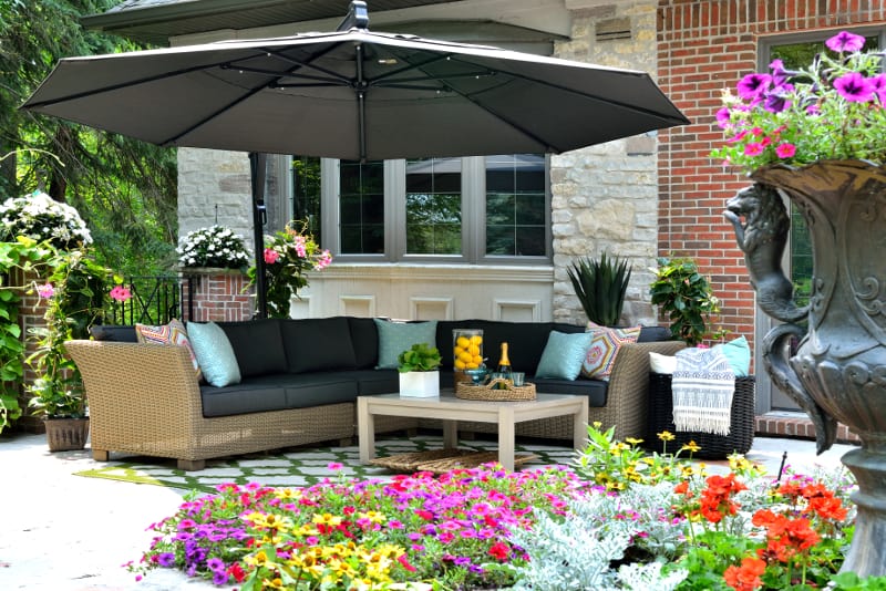
The garden had potential with its well- constructed stone porch reminiscent of an old French courtyard, according to Evelyn. However, it was overgrown and disorganized. “It was too ‘loose’ and needed freshening up to show its underlying beauty,” she comments.
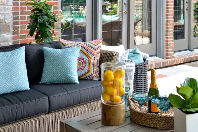
“I wanted to maintain this upscale cottage feeling by creating sitting and lounging areas within the existing floorplan.” Inspired by the home’s gentle greys and country stonework Evelyn designed a contemporary country theme. A repeating motif throughout is a weave/linked pattern that joins the rooms like gems on a necklace.
When designing garden rooms it is important to understand the movement of sun and shade through the day and the seasons. This allows the homeowner to anticipate how a garden can be enjoyed and what plants will thrive.
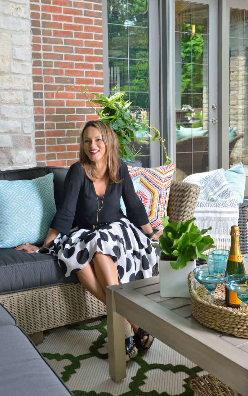
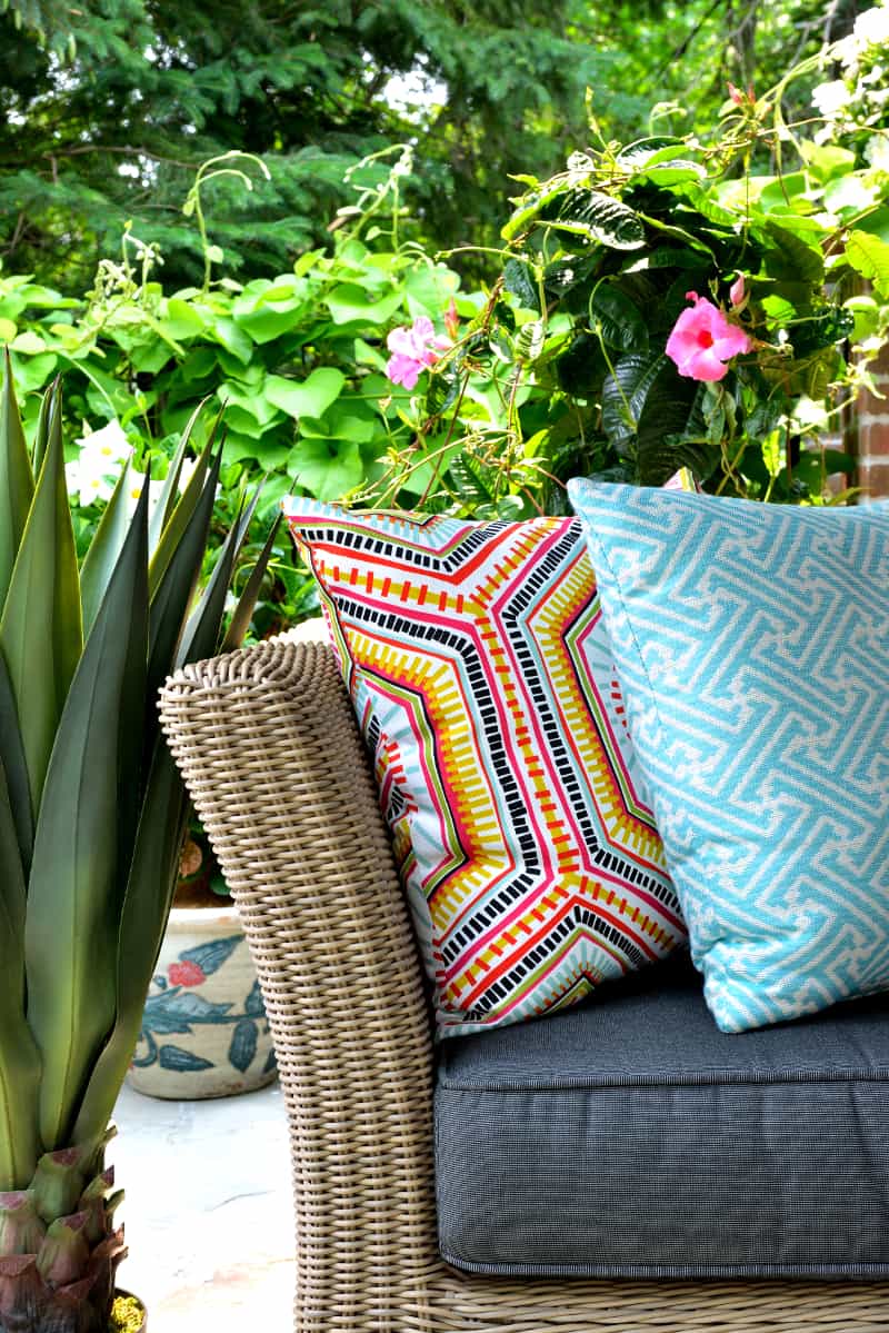
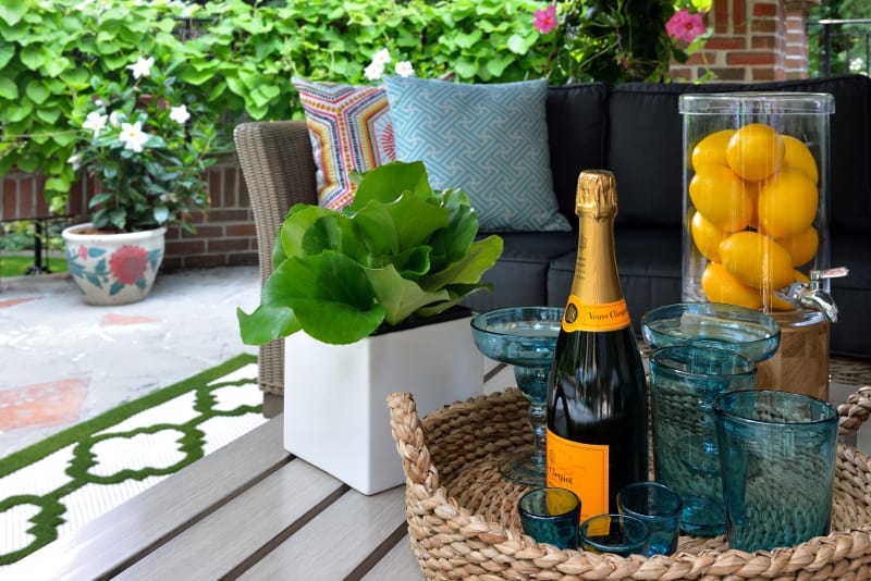
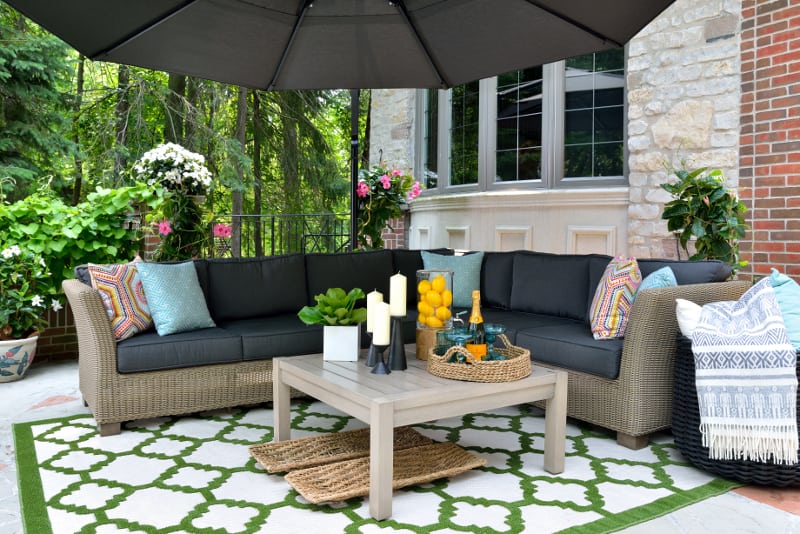
In the living room, close to the home, the furniture and baskets as well as pillows, throws, and rug have a geometric theme. The mist greys of the home’s windows and doors are complemented by the accessories’ spring greens, teals, and sunshine yellows. The umbrella, open like a blossom, creates intimacy while framing the room. “The goal was to use furnishings which suited the house’s country feeling. The fabrics pick up on the floral colours in the garden,” Evelyn observes.
In the outdoor kitchen, 20 yards away, Evelyn installed a lounge area and a round table which can be used for serving a buffet or sitting up to eight people. Her advice to homeowners when choosing outdoor furniture is to ensure it is suited to the environment and comfort level.
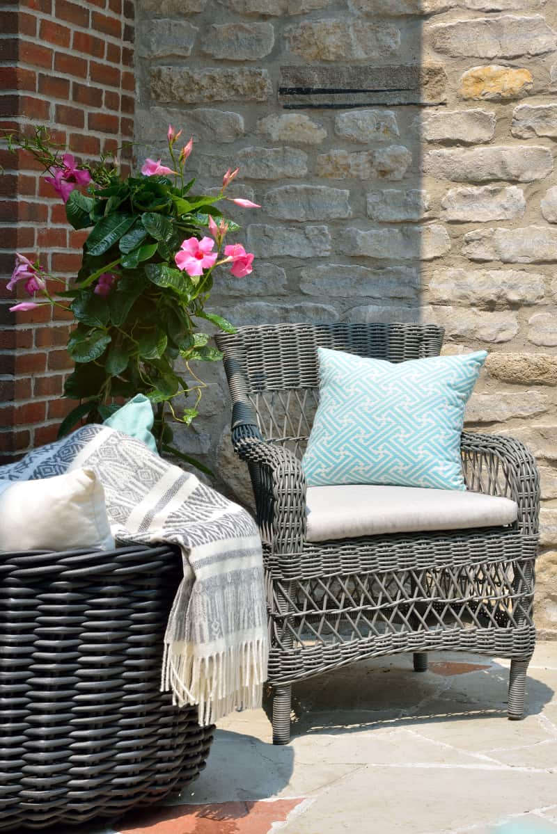
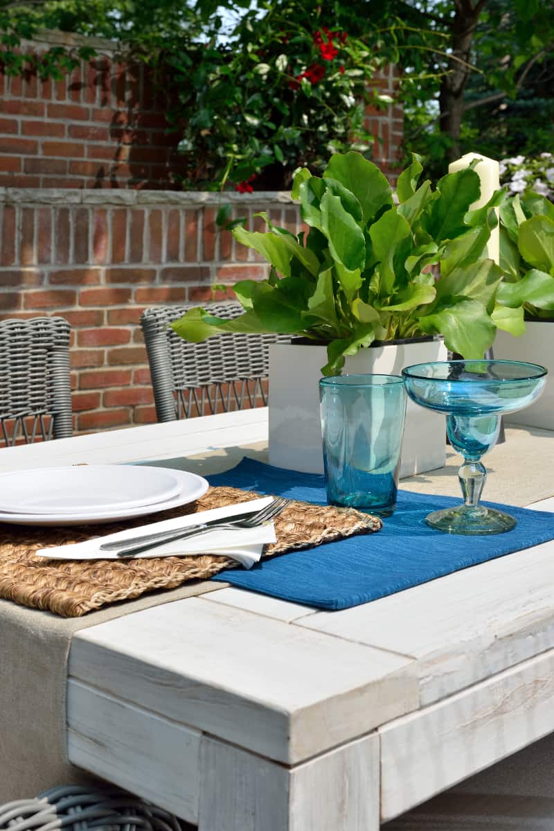
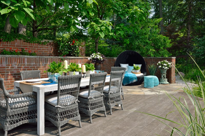
The dining area is bordered by a wall designed with rhythmically placed bricks. Their light grey mortar echoes the symmetrical weaving of the pebble grey wicker chairs. The squares and rectangles of the bleached table mirror the floor’s patterns.
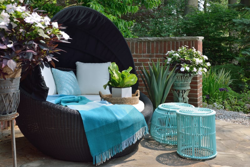
A woven wicker niche to the right of the dining area offers a quiet corner of repose. The slender spokes of the baskets and planters continue the weave/woven theme. Their shapes and verdigris colours resonate with the slender fronds of the surrounding plants, and the accessories. This is a quiet spot away from the other areas which overlook the pond and allow someone to spend time napping or reading while overlooking the entire back of the home.
“I wanted to make sure the outdoor space felt as though it had been there forever. There is nothing about this house that feels new even though it was recently built. It manages to feel like it has hosted families and friends for many years.”
Text by J. Lynn Fraser
Photography by Larry Arnal
Sources:
Space Designed by Evelyn Eshun Interior Design
Photographer Arnal Photography
Accessories, Crate & Barrel
Carpet, Canadian Tire
Furniture, Casualife
Latest posts by Evelyn Eshun (see all)
- Evelyn’s Double Take: Floating Double Vanities - April 10, 2026
- Double Take: Exterior Color Schemes - April 10, 2026
- Contemporary VS Rustic Decor - April 10, 2026


