Design and Event Editor Evelyn Eshun visits SUNPAN to create two stunning looks using Beauti-Tone’s color of the year, Green Peace. – Photography by Larry Arnal
The color of the year, like all meaningful color, evolves from what is happening in our lives and the world around us. Right now, many of us are craving simple calm. Green Peace is a soothing and balancing color with strong energy that creates a sense of ease and peace. It quiets the noise and intensity of life and creates a gentle, nurturing space in which to replenish, restore and renew. – Bev Bell, Beauti-Tone
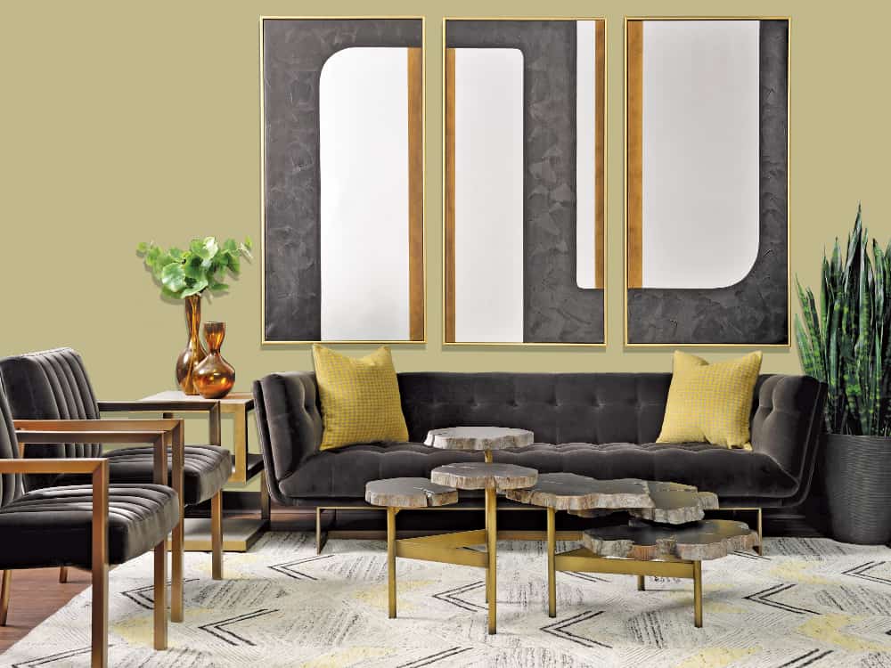
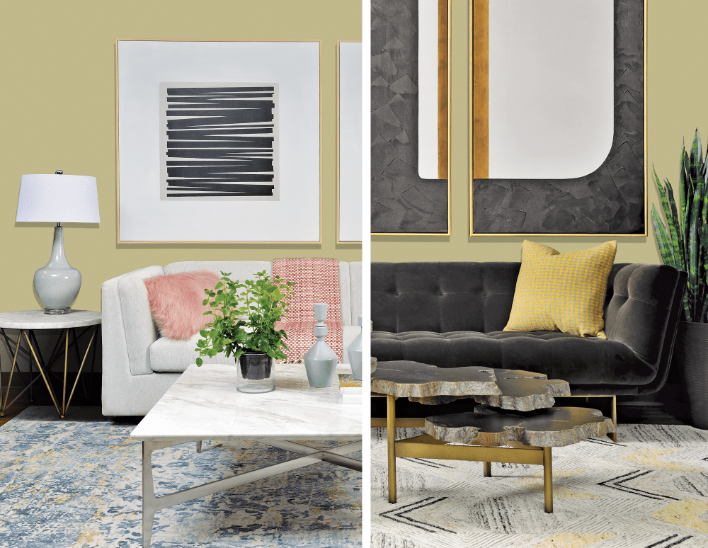
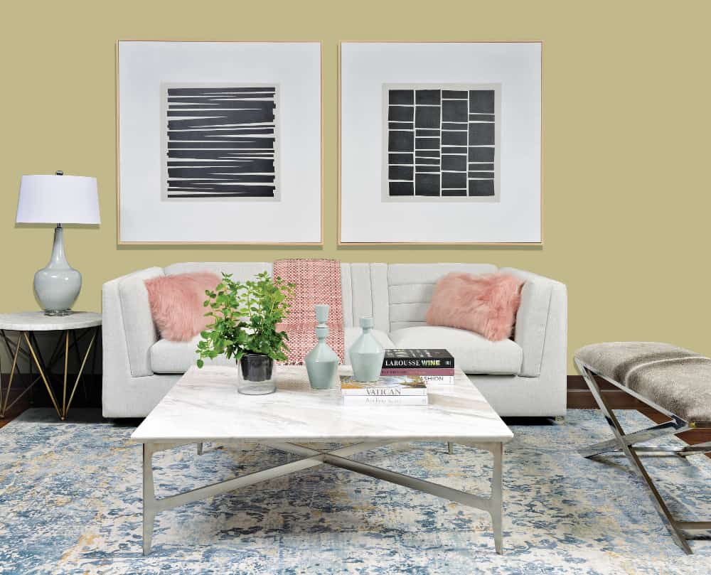
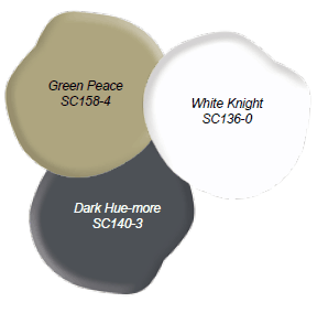
Moody & Bold Glamour
This look uses the calming effects of Green Peace to add balance to a bold, eclectic space with a touch of mid-century influence.
Evelyn’s Design Tips:
- PLACING A SIDE TABLE AND COFFEE TABLE TOGETHER creates a bold yet flexible display.
- A TRIPTYCH OF CONTEMPORARY LARGE ART brings a modern and dramatic element to this look.
- THE WARM UNDERTONE OF GREEN PEACE IS ECHOED in the mustard accents which create harmony between the metal and fabrics.
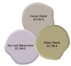
Bright & Feminine
This look plays off the natural, earthy tones of Green Peace to create a soft yet glamorous space with a touch of femininity.
Evelyn’s Design Tips
- THE LAMP SHAPE IS NATURAL AND ORGANIC which complements the paint color.
- WOOD FRAMES LOOK SOFT AGAINST THE GREEN PEACE WALL while the black and white graphics create drama.
- THIS COWHIDE BENCH IS LARGE ENOUGH FOR TWO and can double as a table in a pinch, perfect for a small space.
GET THE LOOK
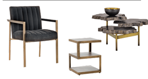
Pair Green Peace with dramatic colors, luxurious textures and gold finishes for a mid-century modern look that is both luxurious and inviting. – Nuri Coffee Table, Whilhelmina Armchair, Rubix End Table, SUNPAN
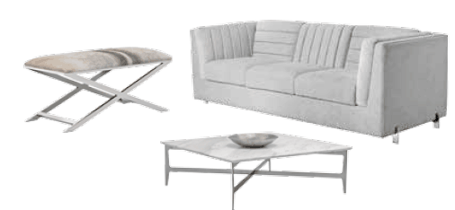
Pair Green Peace with a mix of natural textures and modern, clean lines for an eclectic, urban look that feels breezy and carefree. – Park Ave Sofa, Clearwater Square Coffee Table, Sahara Bench, SUNPAN
MORE COMBOS WE LOVE
We love these ideas for color palettes featuring Green Peace by Beauti-Tone.
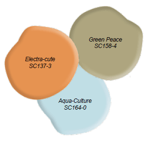
Adding a dash of orange and teal creates a lively and fun space.
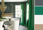
A dramatic, deep blue with crisp white accents creates a neutral palette with plenty of contrast.
A palette of earthy tones and pastels creates the feeling of a lovely spring garden.
Latest posts by Evelyn Eshun (see all)
- Evelyn’s Double Take: Floating Double Vanities - July 13, 2026
- Double Take: Exterior Color Schemes - July 13, 2026
- Contemporary VS Rustic Decor - July 13, 2026