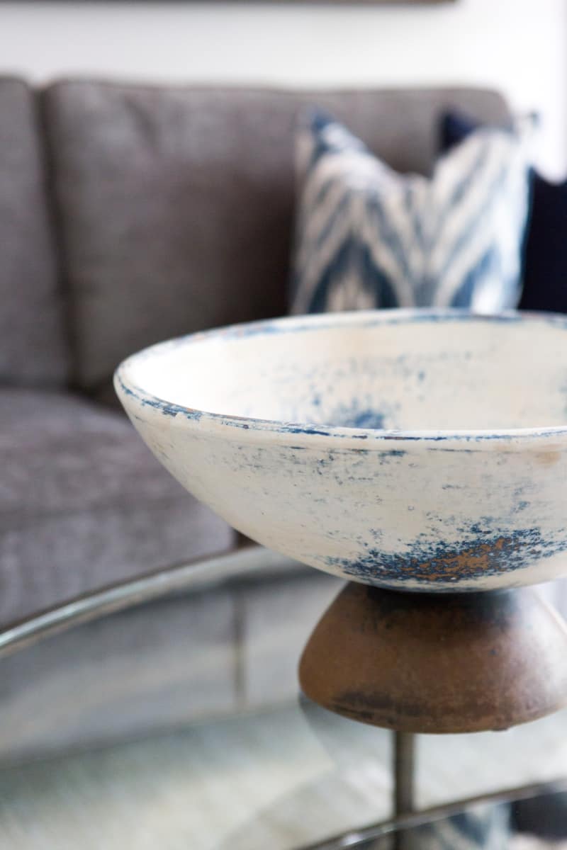
“Use what you have and love. Like I say, shop in your home first.” – JACKLYNN LITTLE, DESIGNER
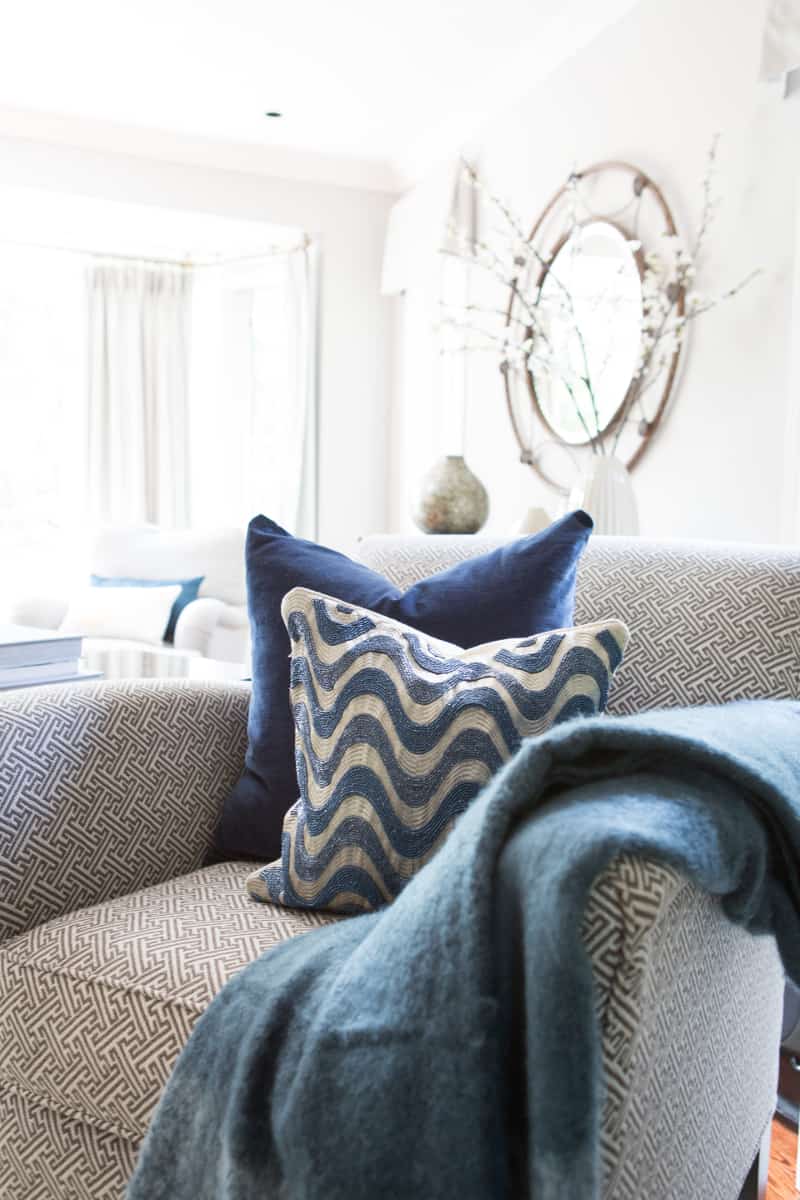
Designer Jacklynn Little helps a couple find cozy comfort in a re-imagined home.
Valerie and her husband live in a seventy-year-old home. They wanted their renovation to create a brighter, modern look for their kitchen and family room.
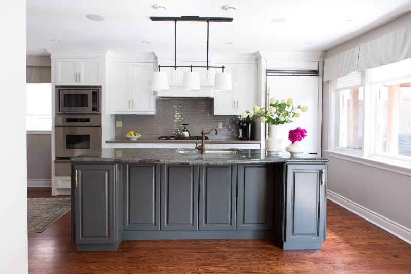
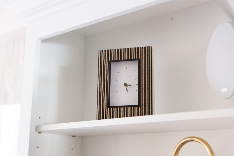
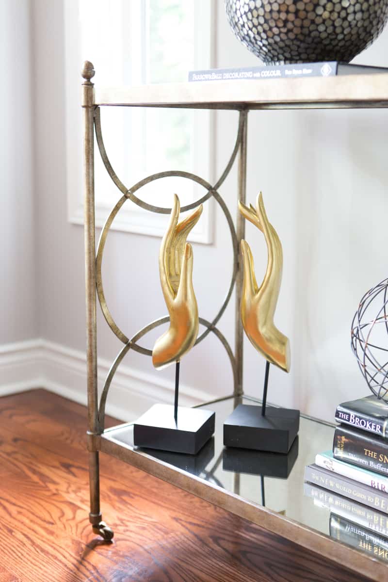
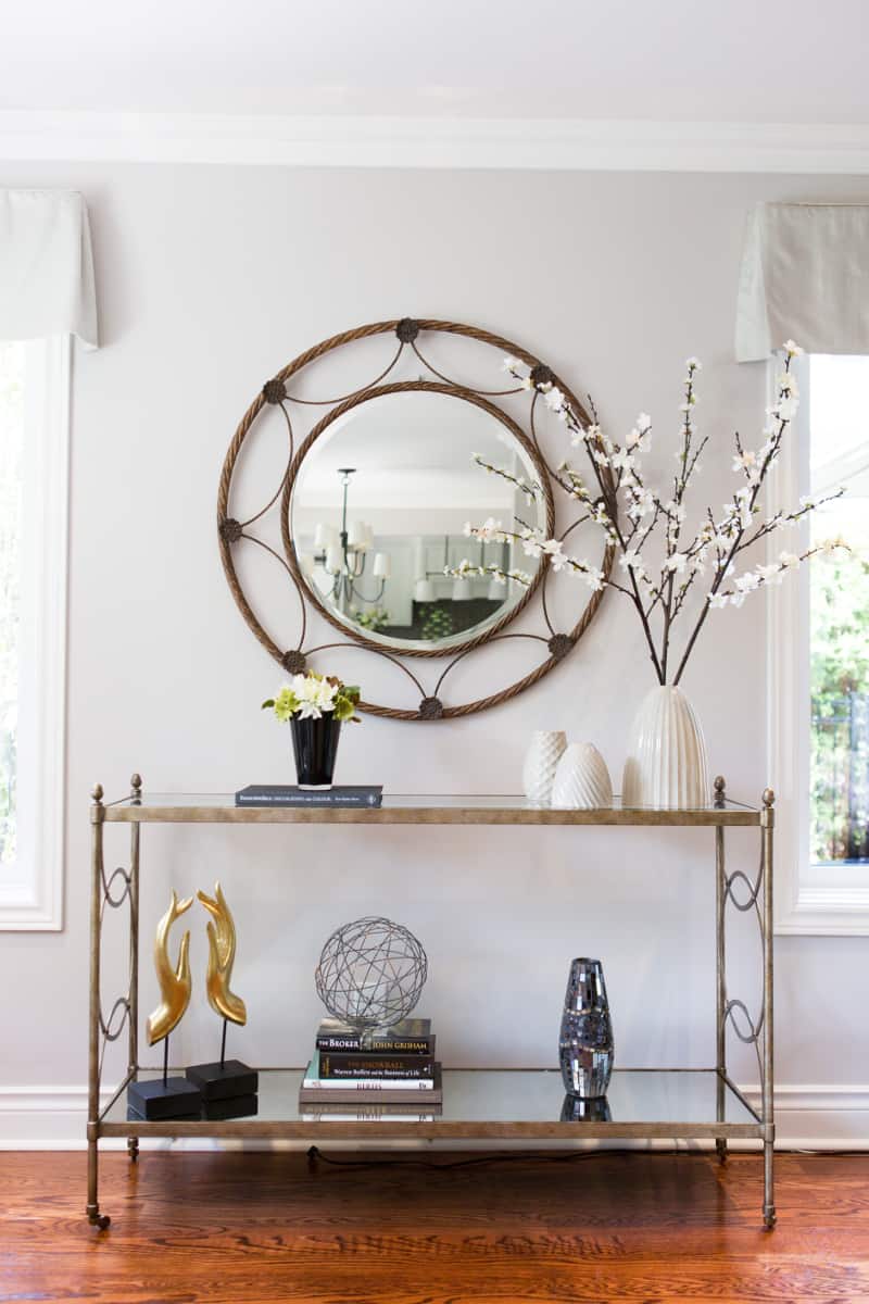
Repeating design motifs across rooms adds visual continuity and space. Slimly framed edges, graceful geometrics, burnished metals as well as reflective surfaces that move light through both rooms.
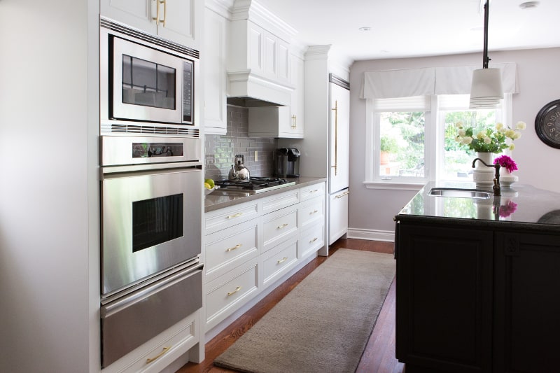
“Gold is back in home décor in a big way,” designer Jacklynn Little observes. In the kitchen, cabinet handles are jewelery-like. “They were simple but elegant. Some were the former gold matte hardware spray painted to polished gold to match some of the new handles I selected.”
The homeowners were inspired by a picture found online for the family room fireplace and built-in bookcases. Designer Jacklynn Little notes, “I added the same colors to the kitchen cabinets, island and desk area.”
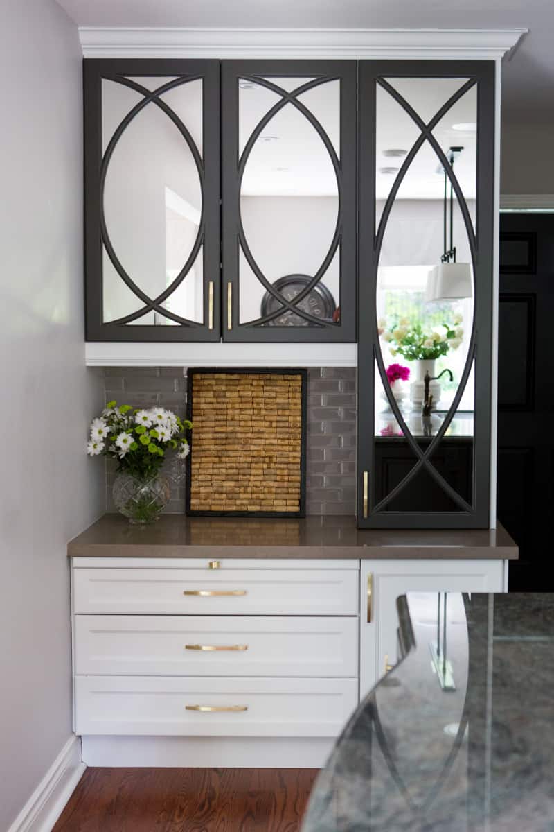
Jacklynn recalls, “They wanted the wall cabinets to be white just like the trim in the house, and the island dark to coordinate with the counter top. The desk area uses a combination of white and black to balance with the kitchen.” Cabinets above the desk are mirrored, which complement the dining room’s windows. “The reflection is amazing! The kitchen brings the outdoors in,” Valerie states.
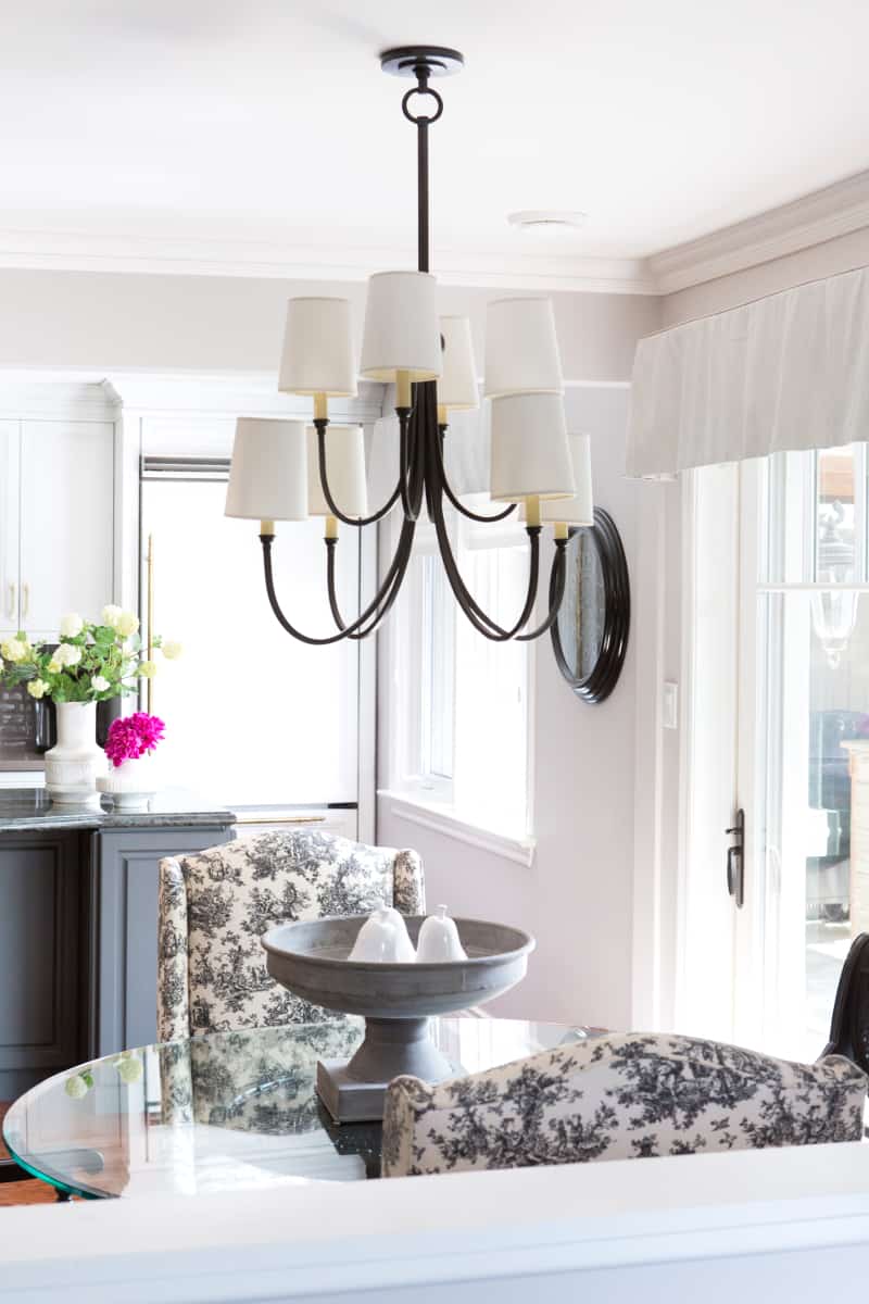
Valerie describes the home’s layout as typical for a 1940’s home with the formal dining room and living room to the right with stairs leading up to three bedrooms and two full baths.
The kitchen and living room of the two-storey, 2,800 sq. ft. home has design elements that maximize light. Slimly framed edges, graceful geometrics and burnished gold are repeating motifs.
In the kitchen, softly shimmery grays grace the tiling. “There are two different counter tops. I needed a backsplash that worked with both. The new glass tile I found was perfect,” Jacklynn notes.

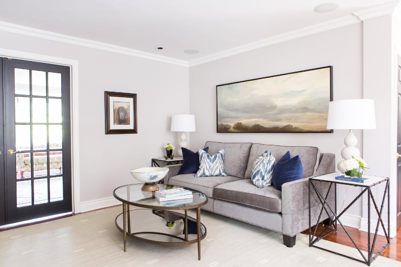
The homeowners wanted a new sofa. This alteration, as well as the color choice of charcoal gray changed everything. “I loved the curve of the lamps next to the square lines of the sofa,” Valerie notes.
Soft swatches of color in the painting inspired the heathery hues of accessories like the throw and accent pillows. “It’s good to let your accessories do the talking and keep drapery simple,” Valerie advises.
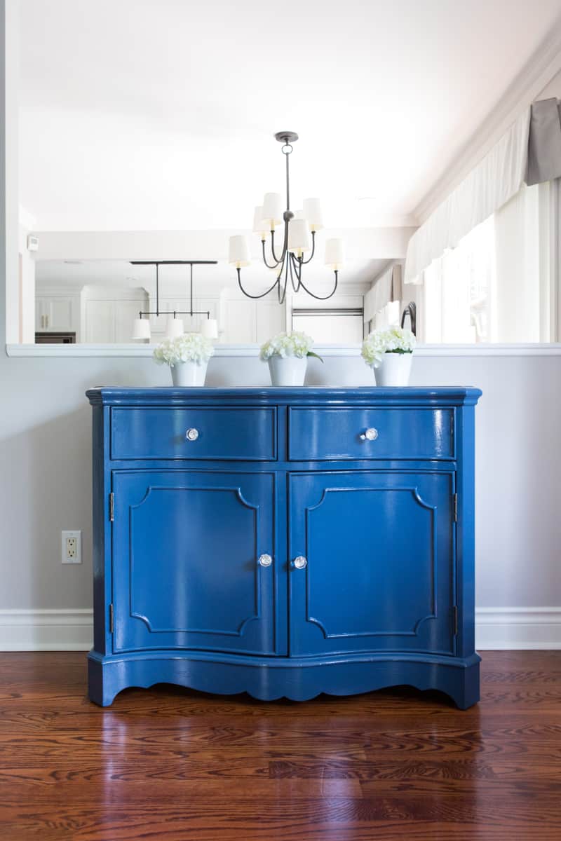
Originally the hutch was brown and green with a painted floral design on it. “I couldn’t give it away. No one wanted it,” Valerie remembers. Its new hue has created many new admirers. “Several people say they would have taken it if they knew it would look that nice painted.”
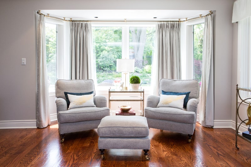
Friends and family are delighted with the renovation. “They couldn’t get over how bright and light it feels. They love the new furniture, which is more contemporary, and the punch of blue. They said it feels more updated,” Jacklynn comments.
“My husband was very happy with the look. He is like most men; you don’t paint stained wood. So he was pleasantly surprised. I get so many compliments.
Space Designed by Jacklynn Little Interiors
Photography by Zsuzsi Pal Photography
Blue and Gray Bowl and Side Tables, HomeSense
Lamps, Union Lighting and Furnishings
Sofa, Gresham House Furniture
Fabric on Sofa, Maxwell
Pillows, Tonic Living
Kitchen Cabinets Paint, Benjamin Moore
Kitchen Hardware, Richelieu
Kitchen Tile, Saltillo Tile
Text J. Lynn Fraser
Photography Zsuzsi Pal
Latest posts by Jacklynn Little (see all)
- Designer Christmas in Pink - April 12, 2026
- 5 Budget Saving Tips for Summer Entertaining - April 12, 2026
- Big Ideas for Your Powder Room - April 12, 2026


